| Image |
Comment |
| 04/19/2006 01:31:25 AM |
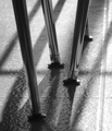
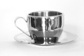
Nice Legsby yantskiComment: I really like it too, I think maybe because we all recognise it but, unlike countertop utensils etc., we rarely notice these or see them from this angle. |
| 04/19/2006 01:05:06 AM |
|
| 04/19/2006 12:19:00 AM |
|
 Photographer found comment helpful. Photographer found comment helpful. |
| 04/18/2006 10:57:13 PM |
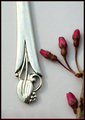
Metal Petal Studyby admart01Comment: I really like the idea, but there's just something about the composition that feels... stiff? Awkward? I'm not sure just what it is, I'm sorry. Maybe one of the pros will be able to tell me? |
| Photographer found comment helpful. |
| 04/18/2006 06:27:56 PM |
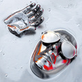
Dismembered Bratby connieComment: I gave this a 9... for me, all the important detail is there. Good job, deserved MUCH better! :) |
| Photographer found comment helpful. |
| 04/18/2006 09:28:37 AM |
|
| 04/18/2006 09:26:46 AM |
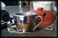
Coffee pleaseby TajhadComment: I find the background a little busy. I like the cup and bowl, contrasts in colour and materials and would like the simplicity of just the two of them. |
| Photographer found comment helpful. |
| 04/18/2006 09:22:01 AM |
|
| Photographer found comment helpful. |
| 04/18/2006 09:10:55 AM |
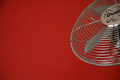
Fanby atomicshedComment: I do like the composition and colour, just needs to "pop" a bit more. Greater contrast? |
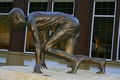
| 04/18/2006 09:08:47 AM |
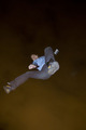
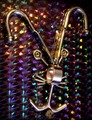
statueby payambComment: The tilted horizon, overpowering background, and the fact it's bronze rather than chrome will all bring your score down a great deal. Try bringing your subject out of center, in this case I think more space in front of him than behind, leading your eye in the direction he's about to launch into. |
Home -
Challenges -
Community -
League -
Photos -
Cameras -
Lenses -
Learn -
Help -
Terms of Use -
Privacy -
Top ^
DPChallenge, and website content and design, Copyright © 2001-2026 Challenging Technologies, LLC.
All digital photo copyrights belong to the photographers and may not be used without permission.
Current Server Time: 07/21/2026 06:30:13 PM EDT.