DPChallenge: A Digital Photography Contest You are not logged in. (log in or register
 
Browse Settings
Currently viewing:
Registered Userklstover

Show comments:

Per page:

Order:

Comments:


Comments Made by klstover
Pages:   ... [173] [174] [175] [176] [177] [178] [179] ... [358]
Showing 1751 - 1760 of ~3580
Image Comment
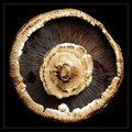
Kingdom - Fungi, Genus - Agaricus,  Species - A. bisporus
02/15/2007 12:35:52 AM
Kingdom - Fungi, Genus - Agaricus, Species - A. bisporus
by timfythetoo

Comment:
I think bisporus would be the species and A is just the abbreviation for the genus? In any case the photo is very well done. I love all the detail, and the composition is very nice.
Photographer found comment helpful.
Elegance
02/13/2007 12:04:33 AM
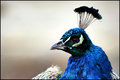
Elegance
by mia67

Comment:
You should make this into a print. Peacock photos are really appealing. This one is one of the lovelier that I've seen. Such vibrant blues! Great composition and background as well.
Photographer found comment helpful.
Speed
02/12/2007 11:56:47 PM
Speed
by gg3rd

Comment:
I like the composition of this one better than your entry, but definitely like the entry's colors better.
Photographer found comment helpful.
Hugs and Kisses
02/12/2007 11:53:18 PM
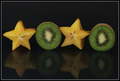
Hugs and Kisses
by CapeSail

Comment:
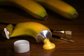
YAY! Awesome xoxo's! Just a bit more contrast/brighter fruit would have helped this be even better.
Photographer found comment helpful.
Food Coloring
02/12/2007 11:51:55 PM
Food Coloring1st Place
by scalvert

Comment:
...! Brilliantly done.
Photographer found comment helpful.
Photographic LSD
02/09/2007 01:35:39 AM
Photographic LSD
by SharQ

Comment:
Wow, congrats on this good score! I voted this an 8 but was actually thinking that it would get a very poor score dut to how unusual it was - I'm very pleased that it didn't. I think the beautiful composition and the parallel lines really made this image work. Congrats again.
Badog
02/08/2007 06:37:02 PM
Badog
by erl89end

Comment:
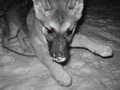
Awesome use of color to emphasize the eyes.
Winter Aspens
02/08/2007 12:24:33 AM
Winter Aspens
by rasdub

Comment:
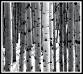
Oh congratulations! I am so pleased that this lovely abstract is in the top 10.
Photographer found comment helpful.
Brush Barn
02/08/2007 12:22:46 AM
Brush Barn
by dsterner

Comment:
Regarding your photographer's comments - one thing that a lot of people will recommend is to not use the automatic feature on your camera. I had difficulty with this first but playing around with the manual settings gave me a feel for what types of changes had what effect. You can also try this tutorial for a beginning.

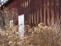
In the image I really love the red and gold tone - especially how the gold color spots on the barn are matched by the vegetation. It is a very lovely effect.
Photographer found comment helpful.
MEN -  Just another lie!
02/08/2007 12:15:39 AM
MEN - Just another lie!
by dsterner

Comment:
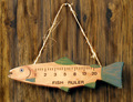
Background as mentioned is rather distracting. One thing would be to take it on a plain background - another, if that is not possible, would be to take advantage of advanced editing to selectively desaturate just the background. Sometimes people use this technique to leave the subject alone colored for emphasis. What I would do is in Photoshop, use an adjustment layer (layer --> new adjustment layer) to desaturate the shot. There are multiple ways of desaturation - see this tutorial by Leroy. Then you could use a mask (one of the little symbols at the bottom of the "layer" window) and paint black (or white, I could be mistaken) on it in the areas that you don't want that layer (the desatuation) to be (so you'd paint over the fish, leaving the fish colored.

Also in your shot, it appears that the fish is not in as much focus as would be desirable. Sharpening (I like smart sharpen in Photoshop CS or Neat Image, which is a stand-alone program that also works as a photoshop plug-in, and removes noise as well as sharpening) would be good or you could watch the focus when taking the shot. I can also see some haloing around the string - this type of effect is usually an indication of post-processing and draws attention to the processing as well as simply being distracting.

Colors are nice and composition is great. I like that you got the fish level and it's not hanging to one side or the other. In some shots, the composition being balanced is more important than others (like archetecture shots, where leaning buildings look really strange) and this is one of them (it would be just so obvious with the string if it weren't level), so I think you did a great job here.

edit: Here is a tutorial on layer masks and here is a tutorial on how to do selective desaturation under the basic editing rules (the thing I explained above, or layer masks in general, are not legal in basic).

Message edited by author 2007-02-08 00:19:54.

Photographer found comment helpful.
Pages:   ... [173] [174] [175] [176] [177] [178] [179] ... [358]
Showing 1751 - 1760 of ~3580


Home - Challenges - Community - League - Photos - Cameras - Lenses - Learn - Help - Terms of Use - Privacy - Top ^
DPChallenge, and website content and design, Copyright © 2001-2026 Challenging Technologies, LLC.
All digital photo copyrights belong to the photographers and may not be used without permission.
Current Server Time: 07/26/2026 10:32:20 PM EDT.