| Image |
Comment |
| 05/20/2007 02:56:15 AM |
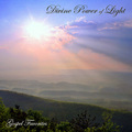
Divine Power of Lightby SJCarterComment: My fifth favorite in this challenge. I like the composition of the photo and placement of text, and really think it fits with a gospel theme. 10. |
 Photographer found comment helpful. Photographer found comment helpful. |
| 05/20/2007 02:56:04 AM |
Drain Pipe Loversby ColeyComment: Oh, I think you used the shadow as part of your text layout? That's awesome! |
| Photographer found comment helpful. |
| 05/20/2007 02:55:27 AM |
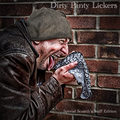
|
| Photographer found comment helpful. |
| 05/20/2007 02:54:57 AM |
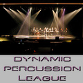
Dynamic Percussion Leagueby L1Comment: I feel like the overall layout of your entry is a bit too text-based and wouldn't do the best job, in a CD rack, of showcasing and promoting the band. Great title though. |
| Photographer found comment helpful. |
| 05/20/2007 02:53:51 AM |
Dark Planet Larksby BrianRComment: Very busy image - it really would not have been so bad if the color of the font did not conflict so much with the image itself. |
| Photographer found comment helpful. |
| 05/20/2007 02:53:18 AM |
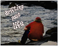
Drifting Past Lifeby abrantonComment: I like the concept but I do feel like it might have been executed better as there is one part of the image that really does keep disracting me, and not in a good way really. |
| Photographer found comment helpful. |
| 05/20/2007 02:52:33 AM |
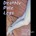
Deathly Pale Legsby snafflesComment: Not a great composition for me - the thick borders do not add much to the overall look (although I do like how you lined up the letters DPL with the border - that is nice). |
| Photographer found comment helpful. |
| 05/20/2007 02:51:00 AM |
|
| Photographer found comment helpful. |
| 05/20/2007 02:50:03 AM |
|
| Photographer found comment helpful. |
| 05/20/2007 02:49:47 AM |
Divine Porcelain Ladiesby GiorgioComment: The image is FANTASTIC. It really conveys your title. The women are lovely and really compliment the look of each other nicely. Makeup seems to be chosen with care as the colors are nice together. The neat-imaged look is usually bad for portraits when it is overdone but it works BEAUTIFULLY here. I love how the faces are symmetrical but still have these asyemetries about them, such as eyebrow shape and hair on the forehead; makes things very interesting. I also really like the two smiles that are at the same intensity - not too much of a smile, but enough. Only things I would suggest on the image are maybe to get rid of so many reflections in the eyes, and possibly (but this is drawn attention to with the text and wouldn't be so bad with the image alone) have the hair arranged so there is no background showing. Other than that, it's just really spectacular. I could really see the image being used to promote these two women in a band.
But I will be honest with you. I feel like this is so far underneath what it could have been. That is because of the text. The font seems horribly cheesy to me! I feel like it simply does not in any way do this lovely image justice. I still gave you a good score but it would have, with a nicely elegant, or simple and understated text, been a ten. |
| Photographer found comment helpful. |
Home -
Challenges -
Community -
League -
Photos -
Cameras -
Lenses -
Learn -
Help -
Terms of Use -
Privacy -
Top ^
DPChallenge, and website content and design, Copyright © 2001-2026 Challenging Technologies, LLC.
All digital photo copyrights belong to the photographers and may not be used without permission.
Current Server Time: 07/23/2026 08:05:08 PM EDT.