| Image |
Comment |
| 05/12/2007 12:25:37 PM |
Coyote Uglyby bigtreearrowheadComment: Greetings from the Critique Club -
Well - first I would like to welcome you to DPC. I see you havent been around long so welcome to the wonderful world of DPC.
Now to your image. Tough entry for a Free Study. There really are alot of things wrong with this image from a DPC point of view. Really bad focus, poor colors and most of all your model is facing the wrong way. :) Technically a poor image, compositionally a poor image, just not good overall. Not really sure what else to tell you here. You ahve some really interesting images in your portfolio that are much better than this. I think a different choice in entry image woudl have scored you much better.
That said - you can learn tons here at DPC. My first 4 entreis were all 4's. But there is such a wealth of information here that you cant help but learn. Read threads, read image descriptions, experiment and ask questions. Most epople here are very helpful. But most of all have fun. Dont let the low scores get you down. Keep working at your craft and improvemnts will come. I look forward to seeing your future entries. Hang in there.
Tim |
 Photographer found comment helpful. Photographer found comment helpful. |
| 05/12/2007 12:15:05 PM |
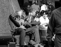
yeah! sound(\'s) lifeby pineganComment: Greetings from the Critique Club -
First off - welcome to the wonderful world that is DPC. I hope you dont find it as addicting as I do. It can lead to way too much time spent here. But you can also learn tons.
Now - to your trial by fire. ;)
You have an interesting character here for sure. But his impact is taken away by the soft focus and snapshot feel. It's cropped a bit tight around his feet and the guy walking out of the frame is a bit distracting. A better focus on what is in your frame before shooting would have helped some of these issues. That is something that comes with practice. As forthe focus/sharpness issues I cant quite tell where the focus is. Your shutter speed was fast enough that it should have stopped any action. I just cant see where you had the focus markers on. A tough first entry. But upwards is where you can go.
My first 4 entries were all 4 scores. I know how it feels to start here. Hang out, look at images that score well and study them, read descriptions, read how to threads, ask members questions. DPC has a wealth of resources to help you improve.. THats what we are here for. Most of all have fun and shoot what makes you happy. If it makes others happy too you will get better scores. If it doesnt then you won't. But try to stay true to yourself and have fun experimenting.
I loo kforward to seeing your future entries. PLease feel free to PM if you have any questions or if I may be able to help out in any way. Good luck!
Tim
|
| Photographer found comment helpful. |
| 05/12/2007 12:06:49 PM |
Lake Ellis Reflectionby cogeroxComment: Greetings from the Critique Club -
THere are a couple of things I really like about this image. I like the reflection, the clouds you caught are very nice, the light is very nice and the colors in general are good too.
But my main issue with the image is the horizon. It is so tilted that I can feel it. It kind of messes with my eyes. I think that if you had corrected this one issue you would have scored a good bit higher. You have a very pretty location but the tilt just overpowers it.
You have some very nice images in your portfolio. And your photoshopping skills are getting better. Keep up the hard work and I look forward to seeing yoru future entries!
Tim |
| Photographer found comment helpful. |
| 05/12/2007 12:00:24 PM |
Pitstopby aliquiComment: Greetings from the Critique Club -
A creative idea for sure, but obviously not what the DPC community was looking for. I am pretty sure you know what the issues here are. The big goose head is painfully out of focus and the general setup is a bit out there. But it does look like you had fun with it. You actually did a pretty good job with the merging of the geese into the clouds. Pretty clean PS work.
That said, even though the FS was expert ruleset that doesn't mean that you had to use the expert ruleset on your entry. I think most of the higher scoring images with a couple of exceptions were advanced legal.
Looking through your portfolio I can see you do nice work. Dont let this one get you down. I loko forward to seeing your future entries.
Tim |
| Photographer found comment helpful. |
| 05/12/2007 08:31:30 AM |
Alternate Realityby alexjackComment: Greetings from the Critique Club -
I will first say that I voted this high in the challenge. I really liked it during voting and I still like it now.
The flip works well. The colors are nice and the ripples just look cool. And the duck. The duck ROCKS!
This is a very artistic type image which is harder to give a critical comment too. Almost abstract you have a piece here that I can't say a better focus or cloning something out would have improved it. It is what it is.
I found it to be a pleasing and interesting image that was well captured. 5.7 is nothing to sneeze at, but a lack of real WOW power is probably what kept you from scoring higher. Nothing technically wrong with your image IMO, just maybe not everyones cup of tea. It is mine though. I enjoyed it.
Good luck in future entries!
Tim |
| Photographer found comment helpful. |
| 05/12/2007 08:24:09 AM |
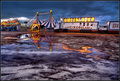
Circo Alaskaby alexgarciaComment: Greetings from the Critique Club -
Very cool shot you have here. One that probably looks even better larger than the size we are limited to here at DPC.
Very cool colors and your HDR editing is well done. It gives an almost creepy mood that can be associated with traveling circuses. I think my only suggestion would be to have a bit more sky and a bit less foreground. The reflection in the ground water is very cool and is a great balance to the trucks and tents, but the extra ground with no reflection seems a slight waste of space IMO.
Overall a really nice shot andthe voters rewarded you fo rit. While maybe not a PB a great score and excellent placing in a FS. Well done using the expert ruleset the way I think it was intended as well. Keep up the good work and I look forward to seeing more of you entries!
Tim |
| Photographer found comment helpful. |
| 05/12/2007 07:44:03 AM |
The Mother Flowerby lovethelightComment: Greetings from the Critique Club -
Let me first say congrats on getting out of your FS slump. Anything over a 6 in a FS is always great. Next let me say that I am impressed with your PS work. I figured the large flower was a secondary pic (pretty quick arent I?) but I never would have guessed any other major editing had been done. Your merging of all the parts and images is very clean.
Good story (unfortunataly I didnt get it in voting - though now it makes complete and total sense). Good composition and layout. Your stance is funny but not painfully posed. Colors are very nice, focus and details are good and you did a decent job on your background. The blur worked good to separate you fomr your background.
I dont really have a whole lot on the critical side. Maybe your border is a bit too thick, but thats just a personal preference.
Overall a very good use of expert editing ruleset, but even more so after reading your details. When you can use this ruleset without anyone being the wiser then you know you did real well.
Keep up the good work and good luck in future challenges!
Tim
|
| Photographer found comment helpful. |
| 05/12/2007 07:35:09 AM |
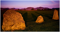
Standing Stones of Castleriggby PurpleFireComment: Greetings from the Critique Club -
You have an interesting image here. The shadows from the rocks are very cool and you background landscape looks like an awesome place to shoot.
Now I am a photoshop junkie and tend to overprocess alot of the stuff I do. I think that with this image I would have worked even more on the colors. I really like the colors of the mountain and sky. The blues and purples are very nice. I think the colors on the rocks and the grass surrounding could have been worked over better. I think a tweak onthe grass to remove the yellow cast and make it a more true green could have been nice. And then maybe a slight desat on the rocks to make them not as colorful. THese are all maybes. I don't know ho wit would be, but just thoughts.
Very good job framing your shot from the beginning. It is always cool when you get to the end of your editing never having to crop. Shows you put good thought into your composition (something I am trying to do more now myself).
Overall all a pleasing image with no major issues. I think the only thing that kept it from scoring higher is just the lack of real WOW power that DPCers have come to expect. Keep up the good work - you have some great images in your portfolio. I look forward to seeing your future entries!
Tim |
| Photographer found comment helpful. |
| 05/12/2007 07:06:03 AM |
Peacefulby sudhiComment: Greetings from the Critique Club -
You caught a pleasnat image here. Nice color and texture in the background, your subject is placed well in the frame and the head of your flower has an interesting pattern and texture.
Areas that may have hurt your score would be maybe a bit blown on the whiters of the flower. Some more detail on the larger petals could have been nice. But prbbaly the biggest thing is the lack of WOW power in the image. It has a nice simplicity to it, but that will also keep it from scoring higher IMO. Flower shots really need to be strong to score well in FS's. You have a nice and pleasing shot here and most voters felt the same way.
Tim |
| Photographer found comment helpful. |
| 05/11/2007 03:20:12 PM |
White Bengal Tigerby KaizerComment: Greetings from the Critique Club -
Congrats on a 6+ score in the FS. Always good to be above that benchmark.
I love good pics of big cats. But personally you lost me with the selective desat. You caught good focus, a decent pose, and pretty nice detail. But the desat really took away from the impact this image could have had. Either full black and white with a bit of dodging and burning to bring out the contrast of the fur or full color with saturation tweaked up a bit and then burned for contrast could have made this image pop more and easily score higher. You have a great strong animal here yet with the soft pink and baby blue being the colors showing it just leaves the wrong feel. I tend to hyper process alot of my big cat pics and I could see me going to town on this one so please take my comment with that into consideration.
Again - nice general pic, good score (and a new image in your top rated pics is always a good thing). I would love to be shooting where you are. Good luck in future challenges!
Tim |
| Photographer found comment helpful. |
Home -
Challenges -
Community -
League -
Photos -
Cameras -
Lenses -
Learn -
Help -
Terms of Use -
Privacy -
Top ^
DPChallenge, and website content and design, Copyright © 2001-2026 Challenging Technologies, LLC.
All digital photo copyrights belong to the photographers and may not be used without permission.
Current Server Time: 05/02/2026 03:32:36 PM EDT.