| Image |
Comment |
| 06/30/2006 09:26:44 AM |
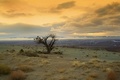
Blue Riverby GunnsiComment: I don't think the squares work, plus it is probably going to get a DQ. ISee that it has been validated. Good job on the effect. Let us know how you did it. Bumping up 2 points, but I still don't think the rectangles work here. They need some sort of context. |
 Photographer found comment helpful. Photographer found comment helpful. |
| 06/28/2006 04:43:55 PM |
Virgin Lightby sherpetComment: Should have score higher. One of the better expamples of bokeh in the challenge, IMHO. |
| Photographer found comment helpful. |
| 06/28/2006 04:00:03 PM |
|
| Photographer found comment helpful. |
| 06/28/2006 01:29:10 PM |
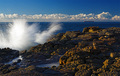
Untitled by TejComment: ---Greetings from the Critique Club!---
First impression - Great shot!
What can I say that hasn't already been said by all the commenters? You really hit the mark on this one. Meets the challenge perfectly, great colors, nice detail in the sky, on and on.
Since this is the critique club, the only element I would have done differently is the horizon. Horizons that cut right through the middle of the frame bother me a bit. If you look at great landscapes and seascapes you will see that the most powerful images have the horizon 1/3 form the bottom or 1/3 from the top. I think if you came up just a bit on the bottom and had a bit more sky this really strong image would be improved. Of course this is my opinion. I certainly think the shot is deserving of the high placement that the DPC voters gave.
Congratulations on a superb capture!
I hope this was helpful. Feel free to contact me if you have any questions.
David
|
| Photographer found comment helpful. |
| 06/28/2006 11:55:46 AM |
|
| Photographer found comment helpful. |
| 06/27/2006 12:02:57 PM |
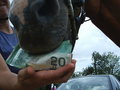
Nothing's too good for my horse!by snafflesComment: ---Greetings form the Critique Club!---
First impression - This communicates wastefulness more than indulgence.
It's not like the horse would prefer the taste of money over real food.
The composition shows good depth, but the car is distracting and doesn't really add anything to the image. The clip obviously should not have been included.
I do like the expression on the person's face.
I think better awareness of the surroundings and the light, plus the horse eating something other than money would help this good idea score better.
I hope this was helpful. Feel free to contact me if you have any questions.
David
|
| Photographer found comment helpful. |
| 06/26/2006 03:04:28 PM |
Mom's Day Offby margiemuComment: I've seen this somewhere before . . . . hmmmmmmmm . . . . Environmental Portraits, maybe?
Nice job! |
| Photographer found comment helpful. |
| 06/26/2006 01:49:35 PM |
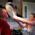
Falloutby AghrisComment: ---Greetings from the Critique Club!---
I think I critiqued your Shadows III entry! Lucky you!
First impression - Keeping his pants on was the right decision!
The landscape looks desolate, but the subject detracts from the desolation. He looks too fresh and calm IMO.
Also, I can not make out what he is holding or why he is holding it. I want to know more about what is going on in the image.
The white behind the subject is perhaps a bit too hot, although I kinda like it. I wish the blue extended more tot he left side of the image.
A good shot that lacks that elusive "Wow" factor that a lot of the voters look for.
I hope this was helpful. Let me know if you have any questions.
David
|
| Photographer found comment helpful. |
| 06/26/2006 01:36:49 PM |
KahBOOMby owenComment: splash is too over exposed inthe middle. Nice capture though. |
| Photographer found comment helpful. |
| 06/26/2006 01:33:19 PM |
|
| Photographer found comment helpful. |
Home -
Challenges -
Community -
League -
Photos -
Cameras -
Lenses -
Learn -
Help -
Terms of Use -
Privacy -
Top ^
DPChallenge, and website content and design, Copyright © 2001-2026 Challenging Technologies, LLC.
All digital photo copyrights belong to the photographers and may not be used without permission.
Current Server Time: 06/12/2026 08:47:18 AM EDT.