| Author | Thread |
Comments Made During the Challenge  |
|
|
07/04/2006 11:53:12 PM |
|
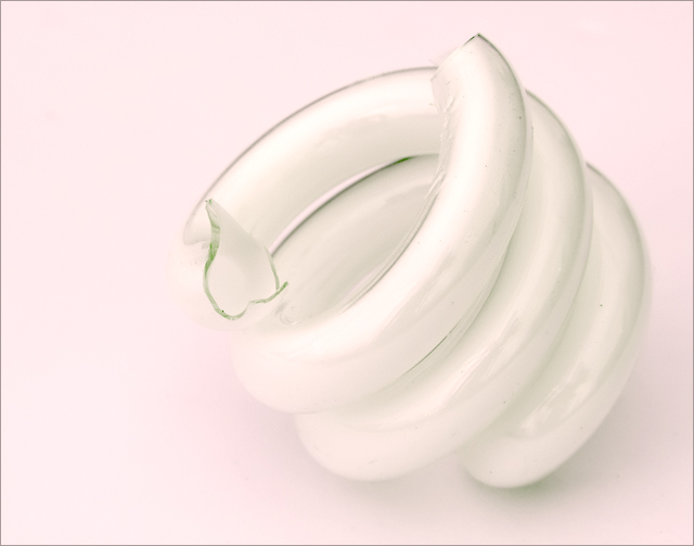
One of my top five. I like the simplicity and the "twists". |
|
|
|
07/04/2006 11:30:41 PM |
|
I think putting the bulb/glass on a different colored background would have been much better because the white on white is too much. It needs some contrast. |
|
|
|
07/04/2006 09:02:27 AM |
|
I like the simplicity of this shot, the soft focus and the high key look. |
|
|
|
07/03/2006 07:24:50 PM |
Meets Challenge: 1/1
Lighting: 2/2
Focus: 1/2
Creativity: 1/2
Aesthetics: 2/3 |
|
 Photographer found comment helpful. Photographer found comment helpful. |
|
|
07/03/2006 03:49:00 PM |
|
This meets the challenge perfectly. |
|
| Photographer found comment helpful. |
|
|
07/03/2006 10:50:13 AM |
|
| Photographer found comment helpful. |
|
|
07/03/2006 10:20:15 AM |
|
I think a darker background would have given the subject a little more pop. |
|
| Photographer found comment helpful. |
|
|
07/02/2006 08:00:59 PM |
|
I like the feel of this. Very cool. |
|
| Photographer found comment helpful. |
|
|
07/01/2006 07:21:08 PM |
|
The jagged edge is quite abrupt in the otherwise soft, delicate setting. Nice take on the challenge. |
|
| Photographer found comment helpful. |
|
|
07/01/2006 04:42:20 PM |
|
| Photographer found comment helpful. |
|
|
06/30/2006 10:56:11 PM |
|
I would have enjoyed it more with a more contrasting background. |
|
| Photographer found comment helpful. |
|
|
06/30/2006 06:39:45 PM |
|
Interesting high key effect but may be misinterpreted as overexposed. |
|
| Photographer found comment helpful. |
|
|
06/30/2006 03:35:11 PM |
|
lovely soft color. i would still prefer if part of the image were focused sharply though. there are a couple distracting black spots but obviously you cant do much about that in basic editing. great composition. |
|
| Photographer found comment helpful. |
|
|
06/30/2006 09:15:31 AM |
|
| Photographer found comment helpful. |
|
|
06/29/2006 11:46:15 PM |
|
Hah hah, very interesting idea that goes with the challenge title :) |
|
| Photographer found comment helpful. |
|
|
06/29/2006 10:26:15 PM |
|
this would have been nice with a lot more contrast |
|
| Photographer found comment helpful. |
|
|
06/29/2006 12:20:29 PM |
|
Cute title, should have taken two of those and put "II" in the title too, that would have been even funnier :) |
|
| Photographer found comment helpful. |
|
|
06/29/2006 08:09:26 AM |
|
I like the idea, and the shot....the pink colouring doesn't work for me though. I would have liked it better as a high contrast black and white shot. |
|
| Photographer found comment helpful. |
|
|
06/29/2006 07:34:46 AM |
|
nice and simple, well done |
|
| Photographer found comment helpful. |
|
|
06/28/2006 11:06:24 PM |
|
Clever title given the challenge. I like the white on white and the composition. I do think it could have been a little bit sharper. |
|
| Photographer found comment helpful. |
|
|
06/28/2006 01:15:02 PM |
|
image could use more contrast to make the glass stand out more. |
|
| Photographer found comment helpful. |
|
|
06/28/2006 11:55:46 AM |
|
| Photographer found comment helpful. |
|
|
06/28/2006 09:15:07 AM |
|
Plain and simple, Very good picture. |
|
| Photographer found comment helpful. |
|
|
06/28/2006 08:17:51 AM |
|
Should have been "Twisted Glass" |
|
| Photographer found comment helpful. |
|
|
06/28/2006 01:34:12 AM |
|
Clever take on "with a twist"! Love the high key. |
|
| Photographer found comment helpful. |
Home -
Challenges -
Community -
League -
Photos -
Cameras -
Lenses -
Learn -
Help -
Terms of Use -
Privacy -
Top ^
DPChallenge, and website content and design, Copyright © 2001-2026 Challenging Technologies, LLC.
All digital photo copyrights belong to the photographers and may not be used without permission.
Current Server Time: 06/29/2026 03:01:19 AM EDT.