| Image |
Comment |
| 01/16/2003 05:45:10 AM |
As Sceneby BullwinkleComment: I like the mood of the picture: the tower looks great and the sky has just enough structure to make a statement (cold and grey day) because it's not overexposed. What disturbes me is the snow covered stone on the left: my eyes are attracted by it, although it turn's out that it is not important. Would have liked it to see more of the trees surrounding the tower. |
 Photographer found comment helpful. Photographer found comment helpful. |
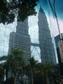
| 01/16/2003 05:40:06 AM |
Petronis Towersby ProofComment: I like the idea of this picture: placing the reflection of the two towers behind some palms is wonderful. Color and sharpness are good, maybe a little brighter in the dark regions. What disturb me though are the tree branch on the upper left side and the lamppost on the very right. They frame the picture and thus it losses the open space, something very important to landscape in my opinion. Good luck. |
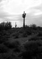
| 01/16/2003 05:30:32 AM |
Stenocereus Thurberiby AnnidaComment: The cactus and the sky are great (the sky is a little overexposed though) and using B&W was a good choice. You might have cropped the dark lower section stronger though. It's hard to see anything in there and it's not necessary, but it captures the viewer's eyes when it tries to find something without success. Still one of the many good pictures of this great challenge. |
| Photographer found comment helpful. |
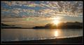
| 01/16/2003 05:25:27 AM |
Summerby pikytoComment: This is a wonderfull scene, which lives from it's stepwise buildup: the beach in the front, the ocean, the houses behind it and then the wonderfull hills and mountains.
Also that everything is alligned and oriented to the the left side is great. You might have moved closer to the colored sunshades though, making them an surface on which the rest of the scene (ocean, houses, mountain) are rested. Would have been a better choice as the white tent in the front. Sharpness and colors are great. I hope you were able to swim a little. Good luck with this. |
| Photographer found comment helpful. |
| 01/15/2003 06:59:30 PM |
Alaskan Landscape by bdshortComment: You are a lucky guy/girl to have been at that place at that particular moment. And we are lucky that you share this moment with us. As a cloud-, mountain-, sea- and shot-against-the-sun lover this picture has it all (the sun might be a little too bright though). Colors are great and natural, it's sharp and well composed.
One of the very best submissions in this challenge. Good luck to you. |
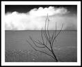
| 01/15/2003 06:52:58 PM |
Desertby JackoComment: Now that's a keeper and for the livingrooms wall! I like what I see although I have no detailed idea what I look at and were exactly it is. But it does not matter!
The cloud (water, fog, dust?) in the back is just awesome, the piece of dark sky frames it and gives structure. The structure of the sand (beach, water?!) is just in the right way: in the front it gives an interesting texture and in the back it gives the basis on which the more important clouds settle. And the branch in the front is wonderfull: it catches the eye but does not take over. For me a winner, lets see what the other think. Good luck. |
| Photographer found comment helpful. |
| 01/15/2003 06:43:53 PM |
Sydneys Greatest (Bridge)by RavenComment: The brige is great and the angle you have chosen is also great. The house in the front dsturbes a little, it catches the viewers attention although it shouldn't. Choise of color and technicaly alos good.
However, to make me rate it higher, it should better fit the challenge: it's too close to the bridge, which dominates the picture. Too me landscape pictures have to give the feeling of space, openess and details (like the bridge) have to stand back. But that's just me. |
| 01/15/2003 06:38:02 PM |
Dusky Pinkby ErastisComment: While the picture for sure shows a peace of nature, it would better fit to the texture challenge. When I look at the picture my eyes tend to follow the branches in all direction. That's somehow nice (although it makes it hard to look at for a longer time)! Color choice is good, could be less blurry, but my major concern is that it does not fit the challenge topic in my opinion. |
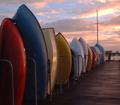
| 01/15/2003 06:30:05 PM |
Boatscapeby FreebieComment: Now this is a great picture regarding the subject (haven't seen boots alligned that was before), the color (boats and sky) and the angle of view (you might have cropped it tighter on the right though). However, the picture comes short in my opinion regarding the challenge topic: therefor you were too close to the boats and the open-feeling is missing. |
| Photographer found comment helpful. |
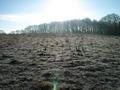
| 01/15/2003 06:25:14 PM |
Winter Sunby RoseytoneComment: I like pictures taken into the sun (I submitted one of this type too), especially in winter. The peace of land you have chosen is also very good: the empty, frosty field, the leaf-less trees in the back. However, it's too overexposed and the lens flare is not interesting enough to not beeing cropped away. You might have moved closer to the trees, so that the sun passes through them. |
Home -
Challenges -
Community -
League -
Photos -
Cameras -
Lenses -
Learn -
Help -
Terms of Use -
Privacy -
Top ^
DPChallenge, and website content and design, Copyright © 2001-2026 Challenging Technologies, LLC.
All digital photo copyrights belong to the photographers and may not be used without permission.
Current Server Time: 07/17/2026 03:51:34 AM EDT.