| Image |
Comment |
| 12/13/2003 05:43:26 AM |
Cube and Spotsby oskarComment: Good idea and well composed. Only a little too bright for me and could be also sharper too. |
 Photographer found comment helpful. Photographer found comment helpful. |
| 12/13/2003 05:09:32 AM |
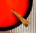
Soupby TommyMoe21Comment: What a RED! Very strong!
I like the color and the composition very much! What I do not like so much is the background: having it structured in a grid is great, but what I do not like is that you used these rubber-coated stuff. It has a sub-structure (the shadows, variing thicknesses) that attract the attention and leads it away from the main subject. Good luck to you. |
| Photographer found comment helpful. |
| 12/13/2003 05:04:47 AM |
Diaryby KociComment: Fantastic play with light an shadow! Also the compostion is great, especially that it is not fully symmetrical but the distance between the shadows vary. Technically I like very much that the full dynamic range from black to white has been used here and of course it fits the challenge very well. A 9 from me. |
| Photographer found comment helpful. |
| 12/13/2003 04:31:06 AM |
Primariesby FactoryXComment: Taht's a great concept! Acctually I had something simillar in mid but didn't do so. I like the structure of the bodies and how the light and shadow play on them (for instance the shadow of the cube on the sphere. What I do not like so much is the shadow of the cone in the back: it's not well defined, not sharp and hence should have been avoided. Also the open space on the right is not necessary IMO: a quadratic cropping might have been OK too.
Anyway, your submission fits very well to the challenge and for me it's an 8 |
| Photographer found comment helpful. |
| 12/11/2003 06:58:54 AM |
Bare Symmetryby GPComment: This image for sure fits the challenge very well, however, due to the the very bright background it looks more like a drawing and thus a little flat. A little bit of structure from the wall or a different angel so one can see the 3-dinmensionality might have been better. Still, a 7 from me. |
| Photographer found comment helpful. |
| 12/11/2003 06:55:24 AM |
attitude.by jackditchComment: It might not be the image that fits to simplicity best, but to me it's for sure one of the strongest images: great composition and strong expression. And I always honour pictures showing people, because those pictures are the hardest to take IMO. Color focus etc. are great too. Good luck. |
| Photographer found comment helpful. |
| 12/10/2003 06:50:04 AM |
Chasing the big Money! by Harz_JoergComment: Woo Hoo:
What a warm welcome to the photographer community after being absent for more then half a year.
Actually I was getting my a** up and submitted something because some friends from the Powershot A-Series-forum reminded me that there is the wonderful world of digital photography beside work and other stuff.
Congrats to the other winners of this challenge and thanx to all commenter! They make this site very special!
I was really surprised how well my entry did, because I thought that there would be many similar entries showing some lottery stuff.
I got several Lotto-tickets from a local shop (they are for free), made some crosses without much thinking, set up the light and took some shot which turned out to be better than I expected.
Thanx again to everybody here on DPC,
Jörg
|
| 12/08/2003 04:11:11 PM |
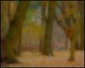
Waiting for the Elves by dsidwellComment: Absolutely fabulous! Have'nt seen such an image as a photography before. Like a painting and very inspiring. I like the enourmous variation of color very much. |
| Photographer found comment helpful. |
| 12/06/2003 11:35:11 AM |
|
| 12/06/2003 11:31:48 AM |
Promises! promises!by sulamkComment: Where in the world did you get this pick!? It\'s wonderfull and the best pick of all I have seen. A less dark background might have worked better IMO: it looks like the pick is flying, making the image a little artificial. Otherwise great (like the frame too). Good luck. |
| Photographer found comment helpful. |
Home -
Challenges -
Community -
League -
Photos -
Cameras -
Lenses -
Learn -
Help -
Terms of Use -
Privacy -
Top ^
DPChallenge, and website content and design, Copyright © 2001-2026 Challenging Technologies, LLC.
All digital photo copyrights belong to the photographers and may not be used without permission.
Current Server Time: 07/17/2026 01:40:10 AM EDT.