|
|
|
Showing 5861 - 5870 of ~6008 |
| Image |
Comment |
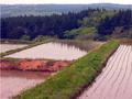
| 05/14/2003 09:19:13 PM | Rainy Day Greensby ruthiekComment: Ah, beautiful! Makes me want to be there. I like this very much. No nitpicks. ~10 |  Photographer found comment helpful. Photographer found comment helpful. |
| 05/14/2003 09:17:07 PM | shades & shadows of May greenby kenboComment: Lovely, especially the colour on the water and how far back your eyes can go over the hills. My one nitpick: There is a slight whitish line at the left hand border and into the bottom left of the pict, and at the top right corner. Where is this? ~9 | | Photographer found comment helpful. |
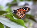
| 05/14/2003 09:13:00 PM | polka dotsby patriciaannComment: DOF is very good, the colours on the butterfly are beautiful, but ... I really, really wish this photo were bigger!!! |
| 05/14/2003 09:02:26 PM | | | Photographer found comment helpful. |
| 05/14/2003 11:50:11 AM | A Florida Lagoonby GraciousComment: From the Critique Club
Hi Gracey,
First things first. I really like your "username". OK, that's out of the way, and I'll get to the picture next.
First impressions: The two things that most caught my attention in this entry are the beautiful, soft, almost pastel colours, and the text as flag.
Light: The light really is beautiful, probably the best part of the picture. I am not sure if the peach/pink/white border helps or detracts. I am wondering if as a postcard this picture would be more effective without a border, as you are stating your case already with the colours and the words, and the border doesn't really add much to that.
Focus: Could be better. You seem to have focused on the clouds. I think the water and the boat need to be sharper.
Composition: I very much like the low horizon line in this photo. Works well here.
The flag: Neat idea - it jumps out at me, tells me, "This is an American photo", without imposing "Americaness". My nitpick about the text as flag is simply that the rest of the picture is so calm, and the flag is waving in the wind, but there is no wind.
Good shot, and keep up the good work! Take care,
Ursula I Abresch |
| 05/14/2003 10:56:29 AM | Looking Outby sagestudioComment: This picture should have placed a lot higher. It gives the idea of "glass" much better than simple pictures of an object made of glass.
| | Photographer found comment helpful. |
| 05/13/2003 03:24:03 PM | Primary Friendsby sagestudioComment: Lovely photo, in particular how the hair colours are matched to the shirt colours. Score = 10 | | Photographer found comment helpful. |
| 05/13/2003 03:23:34 PM | Rain, Rain, Go Away!by DougPazComment: Beautiful. I wish the little girl's face were a bit brighter, but this one gets a 10 from me anyway. | | Photographer found comment helpful. |
| 05/13/2003 03:09:12 PM | Out In the Rainby kaysrivComment: From the Critique Club
Hello,
Good closeup, focus is good, good potential. The colours are too muted, you could have brightened them and made them more intense (increased brightness and saturation). There is a dustspeck towards the bottom left. Something to consider: after increasing brighness and saturation, crop the picture all around a bit (mostly on top and right hand side, a bit at the bottom and the left hand side), add a 30 pixel white border (or something like that), and see if you like it.
Take care,
Ursula I Abresch
|
| 05/13/2003 02:40:53 PM | Key West Travel...by KneeforuComment: From the Critique Club
Hello,
This is a nice picture of a sunset, but the sailboat is so small and hardly visible - thus, for the transportation challenge, it probably wasn't your best choice for an entry.
As far as the picture itself is concerned, the colours are lovely. I like it that the sun/reflections are not right in the middle, but to one side (thirds). I think that the same division in thirds would have worked for water/sky, in other words, if the horizon were placed at 1/3 or 2/3 down. Something to try.
Take care,
Ursula I Abresch |
|
Showing 5861 - 5870 of ~6008 |
Home -
Challenges -
Community -
League -
Photos -
Cameras -
Lenses -
Learn -
Help -
Terms of Use -
Privacy -
Top ^
DPChallenge, and website content and design, Copyright © 2001-2026 Challenging Technologies, LLC.
All digital photo copyrights belong to the photographers and may not be used without permission.
Current Server Time: 07/18/2026 05:36:39 AM EDT.
|