|
|
|
Showing 2311 - 2320 of ~6015 |
| Image |
Comment |
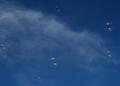
| 05/04/2007 02:10:10 PM | Bubbles and Bubbles and More Bubblesby JLCComment: Greetings from the Critique Club
What I like about the image:
The sky is a beautiful blue, and the cloud gives it depth. The bubbles have a nice shine and really look like they're floating upwards, into the sky.
Challenge:
It definitely meets the challenge. No problems there.
Presentation:
This is where the image suffers most. The presentation is nice, but rather bland, not a whole lot going on. I think that either you'd need a lot more bubbles (like your commenter suggests below), or some context, where are the bubbles coming from, a person blowing them, something of that sort. Something to tell the story better.
Technicals:
I think your choice of shutter speed/aperture is quite adequate for the image, I'm wondering if a lower ISO might have helped reduce some of the grain (although then you'd have to adjust the shutter/aperture combo). A couple of the bubbles look to be a tad out of focus. In a shot like this, it would be best to have all the bubbles in focus.
Post-processing:
Deepening the shadows a little was a good idea. You could also try lightening the bright areas, to give it even more depth. The bubbles are getting lost in the sky. Somehow you need to define them better, so that they stand out better against all that blue. I'd suggest trying to adjust curves for this.
I hope this helps. If you have any questions, comments, complaints, feel free to contact me.
~Ursula
|  Photographer found comment helpful. Photographer found comment helpful. |
| 05/04/2007 01:44:09 PM | B&W - Day 4by mkComment: Originally posted by mk:
Originally posted by ursula:
May I suggest a slightly different crop? |
Oh, yes. You win! |
What did I win? :))))) | | Photographer found comment helpful. |
| 05/04/2007 01:35:47 PM | __by undieyatchComment: I like this shot, quite a bit. My very picky mind keeps thinking, I wish the camera would have been moved just a smidgeon upwards, to show just a bit more of the of the leaf itself, a tiny bit less of the stem (but, without trying it, there's no way to be sure). I like the repetition in the light/shadows in the background. I think that possibly the leaf itself could have been dodged a bit (lightened or brightened up a tad) to make it pop. Good work! |
| 05/04/2007 01:33:51 PM | | | Photographer found comment helpful. |
| 05/04/2007 01:29:35 PM | B&W - Day 4by mkComment: I kinda like that mess at the bottom. May I suggest a slightly different crop?
 Message edited by author 2007-05-04 13:36:50.
 | | Photographer found comment helpful. |
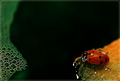
| 05/04/2007 12:04:29 PM | Lost at Seaby noranekoComment: Greetings from the Critique Club
What a joy to get this image to critique, although I'm not sure I'll be able to say much of anything helpful, it's such a beautiful image as it is. Here it goes :)
As a concept the image is great. It's a whimsical story, a little ladybug lost at sea, looking at the edge of the raft for a place to land. You could write a children's story-book about that. You pulled off the idea quite well. The title helps. Without the title, the idea would still come through clearly, but the title definitely helps.
As a composition, it's well done. Possibly the large black area in the centre is a bit too large, a bit too much dead space if you wish. It's hard to tell. I wonder if a hint of detail in all that black might work. The colour scheme is beautiful, very soothing (red/orange and green). The inline border is delicate, very appropriate to the image.
Technicals, the limitations of basic worked against you here :) However, it's possible that a bit of adjustment (either curves or S/H or maybe brightness) would do good for the image. The ladybug itself could be a bit brighter. Again, the black area could maybe have a bit of detail in it (watery detail?).
Does it meet the challenge? Yes, it does, there are bubbles in the image. It doesn't "sell" the concept of bubbles though, and that likely worked against you being top 10. It sells the story of a lost ladybug, the bubbles are somewhat incidental to that story, not main part.
I hope this helps. Any questions, complaints, whatever, feel free to contact me.
~Ursula
| | Photographer found comment helpful. |
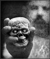
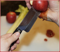
| 05/04/2007 12:32:46 AM | Why I'm Not Allowed in the Kitchenby meyersComment: Greetings from the Critique Club
I remember seeing this during the voting, and thinking, "Ewwwwwyyy!" I can so sympathize, I cut myself in the kitchen all the time, I'm really clumsy with knives.
Technicals:
Exposure/light looks right, your use of F4.5 gives enough clarity in the main subject while giving a soft blur to the context. The image is processed nicely, although I think I personally would prefer it without the red outer border (it looks a bit like overkill to me). Your main "technical" problem is that the blood doesn't look real, so you had trouble really selling the image. The back hand (the hand with the fake cut) looks a tad out of focus, and could be a bit sharper IMO.
From an artistic point of view, again, your choice of relatively shallow DOF works well with this composition. The composition itself is beautiful, there's enough context to give the image depth without clutter. The yellow/orange shadow is something I wonder about, I wonder if toning it down to a bit greyer would work. The apple being cut, it looks like two pieces in the hand, and the back piece looks like it is a bit too far back for it being cut realistically.
I am surprised at the score on this image - I would have thought it would score a fair bit higher than 4.5. I'm not sure what to tell you about that, except that it's hard to sell stuff to the DPC voters :) I think that the somewhat unreal feel of the photo hurt it quite a bit.
One little detail I love is the oof light spots on the blood in the sink. They make the blood look shiny wet, and that's a quirky little detail that I love.
I hope this helps.
~Ursula | | Photographer found comment helpful. |
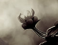
| 05/04/2007 12:22:50 AM | A "high whisk" game of hide and seek...by splidgeComment: Hello from the Critique Club
This is a beautiful image, very creative, it relies on a gentle hint for it's impact. It definitely meets the challenge. It also tells a story, a whimsical story at that, somewhat funny, somewhat scary - IMO this is wonderful photography.
From a technical point of view, I don't see anything wrong with it. The exposure is spot on, the colours are vibrant without being overdone, it is sharp without being oversharpened.
From an artistic point of view, the composition is very good, as is the presentation.
I'm trying to come up with something that might be helpful for you, and all I can think of is, "Keep up the good work!" | | Photographer found comment helpful. |
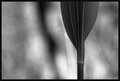
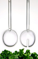
| 05/04/2007 12:15:13 AM | On Stand-By by JasComment: Greetings from the Critique Club:
First of all, congratulations on your ribbon with this image :)
This is an excellent image, both technically and artistically. I am not sure that I can give you much useful information or advise, as it looks like you know quite well what you are doing here. So I'm going to try to approach this from a bit different point of view.
I remember when I first saw this in the challenge (during voting - I actually remember it). I thought, now here's one of the top 10 at least. Then I started thinking, wait a minute, something's off with the image, the right spoon (the spoon with the slot) looks bigger than the other, they should look the same! It still does, I'm not sure if that's an illusion or if it actually is bigger in the image. Anymore that illusion/reality sort of grew on me, I like it. I also really like it that the tops of the spoons are not the same.
This really is a well thought out and executed image. The only thing that I can think of to offer as a possible improvement (and that's very iffy) is that I wish the lettuce went across the whole of the bottom part - it sort of seems to peter out at the ends, especially the left side.
Congratulations again, and keep up the good work. | | Photographer found comment helpful. |
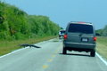
| 05/03/2007 11:52:59 PM | Rush Hour in the Swamp.jpgby MelonMusketeerComment: Wowzers! I've never seen anything like that. What a dangerous place you live in. We see bears on the road ocasionally, and the usual deer, moose, coyotes, turkeys, whatever. I've seen one (and only one) wolf by the road (no camera with me). But an alligator? That's special.
And a Canadian alligator would be really special :) | | Photographer found comment helpful. |
|
Showing 2311 - 2320 of ~6015 |
Home -
Challenges -
Community -
League -
Photos -
Cameras -
Lenses -
Learn -
Help -
Terms of Use -
Privacy -
Top ^
DPChallenge, and website content and design, Copyright © 2001-2026 Challenging Technologies, LLC.
All digital photo copyrights belong to the photographers and may not be used without permission.
Current Server Time: 05/04/2026 06:39:15 PM EDT.
|