| Image |
Comment |
| 12/29/2006 09:19:11 AM |
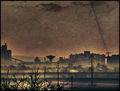
Waste Landsby GiorgioComment: structures in the sky are a bit too prominent for my taste. otherwise well done, you created a very uncomfortable mood |
 Photographer found comment helpful. Photographer found comment helpful. |
| 12/29/2006 09:14:33 AM |
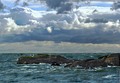
The Living Seaby JunieMoonComment: it's obvious you brightened the rocks. also, there are clearly visible post-processing artefacts at right edge that could have been cropped off. horizon looks kinda hand-drawn |
| Photographer found comment helpful. |
| 12/29/2006 09:10:42 AM |
don't jumpby skewsmeComment: soft leaves at bottom are kinda distracting. good color. |
| Photographer found comment helpful. |
| 12/29/2006 09:07:57 AM |
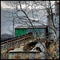
Frozenby mediamstComment: overall a tad too dark and lacking of contrast. crop at top a bit too tight. otherwise nice idea and very realistic |
| Photographer found comment helpful. |
| 12/29/2006 09:05:35 AM |
|
| Photographer found comment helpful. |
| 12/28/2006 06:49:16 AM |
Three Speed Boyfriendby lkn4truthComment: nice idea, composition and lighting, but will probably be hammered by the voters (and have lots of views, who wouldn't be curious who posted this?) |
| Photographer found comment helpful. |
| 12/28/2006 06:47:03 AM |
|
| Photographer found comment helpful. |
| 12/28/2006 05:23:08 AM |
|
| Photographer found comment helpful. |
| 12/28/2006 05:21:54 AM |
|
| Photographer found comment helpful. |
| 12/28/2006 05:20:43 AM |
|
Home -
Challenges -
Community -
League -
Photos -
Cameras -
Lenses -
Learn -
Help -
Terms of Use -
Privacy -
Top ^
DPChallenge, and website content and design, Copyright © 2001-2026 Challenging Technologies, LLC.
All digital photo copyrights belong to the photographers and may not be used without permission.
Current Server Time: 04/28/2026 05:51:18 PM EDT.