| Image |
Comment |
| 05/15/2007 03:10:55 AM |
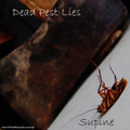
-Dead Pest Lies-by tfarrell23Comment: overall a tad too dark, crop at top is a little tight. otherwise well composed, font matches the subject. the web adress is a bit overdone. 7 |
 Photographer found comment helpful. Photographer found comment helpful. |
| 05/14/2007 08:13:28 AM |
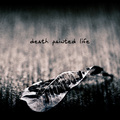
Death Painted Lifeby aznymComment: goos shot, like the graininess and toning. picture and typography go well together |
| Photographer found comment helpful. |
| 05/14/2007 08:10:49 AM |
|
| Photographer found comment helpful. |
| 05/14/2007 08:09:46 AM |
|
| Photographer found comment helpful. |
| 05/14/2007 08:06:39 AM |
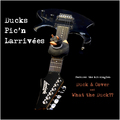
Ducks Pic'n Larrivéesby Art RoflmaoComment: at least you could have cloned out the AXE logo. Besides that, the shot is nice, but there's too much text on the cover |
| Photographer found comment helpful. |
| 05/14/2007 08:04:58 AM |
|
| Photographer found comment helpful. |
| 05/14/2007 06:06:08 AM |
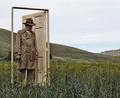
Dynamical Placed Lighthouseby UNCLEBROComment: overall too dark and lacking of saturation. the bird at the edge is rather distracting, would have been a nice touch if it were a bit more left. The border takes away from the image |
| Photographer found comment helpful. |
| 05/14/2007 06:04:03 AM |
|
| Photographer found comment helpful. |
| 05/14/2007 03:46:57 AM |
|
| Photographer found comment helpful. |
| 05/14/2007 03:46:25 AM |
|
| Photographer found comment helpful. |
Home -
Challenges -
Community -
League -
Photos -
Cameras -
Lenses -
Learn -
Help -
Terms of Use -
Privacy -
Top ^
DPChallenge, and website content and design, Copyright © 2001-2026 Challenging Technologies, LLC.
All digital photo copyrights belong to the photographers and may not be used without permission.
Current Server Time: 05/06/2026 05:03:21 PM EDT.