| Image |
Comment |
| 09/18/2007 08:53:36 AM |
|
 Photographer found comment helpful. Photographer found comment helpful. |
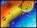
| 09/18/2007 08:50:03 AM |
Further than Far Awayby levyj413Comment: nicely done, though you have less drops (you haven't been as far away probably) and the color transitions aren't as smooth as in Ursuals shot. I prefer her crop and placing of the larger drops, but think the sharpness and saturation in your shot are better. |
| Photographer found comment helpful. |
| 09/18/2007 07:00:55 AM |
|
| Photographer found comment helpful. |
| 09/18/2007 06:57:05 AM |
|
| Photographer found comment helpful. |
| 09/18/2007 06:56:04 AM |
|
| Photographer found comment helpful. |
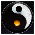
| 09/18/2007 06:51:47 AM |
Jacko's "Two Classics"by dannyleeComment: except for the tight crop at top this is better than the original: better DOF and sharpness, less dirt and noise, more subtle lighting and contrast. Irene? |
| Photographer found comment helpful. |
| 09/18/2007 06:48:32 AM |
The Screamby GueDesignsComment: close to the original and almost as good, POV is slightly higher, laces are thinner, that'd make it hard to see the face if one doesn't know the original. PUMA logo distracts a bit, that area could have been darkened more |
| Photographer found comment helpful. |
| 09/18/2007 06:44:12 AM |
|
| Photographer found comment helpful. |
| 09/18/2007 06:42:33 AM |
Keeping "In Touch"by _DaveA_Comment: overall a tad darker, less detailed and more "reddish" than the original, the inner ball merges with the background. Aspect ratio is quite different, liked the additional space in the original better. |
| Photographer found comment helpful. |
| 09/18/2007 06:38:23 AM |
|
Home -
Challenges -
Community -
League -
Photos -
Cameras -
Lenses -
Learn -
Help -
Terms of Use -
Privacy -
Top ^
DPChallenge, and website content and design, Copyright © 2001-2026 Challenging Technologies, LLC.
All digital photo copyrights belong to the photographers and may not be used without permission.
Current Server Time: 05/09/2026 05:08:49 AM EDT.