| Image |
Comment |
| 06/07/2007 08:22:55 PM |
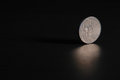
day 6 - nickelby rachelellenComment: Nicely done... the shape of the reflection seems odd, but that's ok. Keeps it interesting. When I read another commenter saying they expect it to topple, I thought it would be interesting to catch it in motion spinning... maybe you can get the dime to spin! Great job! |
 Photographer found comment helpful. Photographer found comment helpful. |
| 06/06/2007 08:08:03 PM |
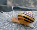
day6by scwalshComment: Love the different color lines in his shell, and that you can see scrapes in the texture of the shell too. |
| Photographer found comment helpful. |
| 06/06/2007 07:58:20 PM |
Daisyby ElaineComment: I agree with Sheryll about the red bug/dot. I like that you didn't center this one, but left it slightly off to the right, and it looks like you chose to show us the whole petals of the prettiest side. I think this could use just a bump as far as either levels or contrast too. Nice job! |
| Photographer found comment helpful. |
| 06/06/2007 07:53:54 PM |
Day05: Card Caseby citymarsComment: I like the colors here and the metallic area in the front of the case. Overall though, this shot just doesn't pull me in like some of your other shots. Perhaps more dramatic lighting, or a slightly different angle/perspective would help? I feel like there is so much negative space there, and I just want to look at that small metallic area on the left. |
| Photographer found comment helpful. |
| 06/06/2007 07:50:48 PM |
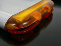
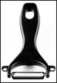
Day06: Door Handleby citymarsComment: Love how you can see the textures in the brushed metal here. I find it strange that even though the button part is centered left to right, it still feels like it follows the rule of thirds to some extent from the rest of the composition. A nice shot of such an ordinary object. |
| Photographer found comment helpful. |
| 06/06/2007 07:48:02 PM |
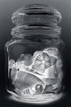
Day 6 - Shell Jarby rox_roxComment: Interesting the way the negative version makes it look illuminated. Something about the top half with all of the horizontal lines around the lid just doesn't feel like it flows with the contents of the jar for me. But I don't have any suggestions for improving it either, so I guess it can't be that distracting to me! |
| Photographer found comment helpful. |
| 06/06/2007 07:44:48 PM |
|
| Photographer found comment helpful. |
| 06/06/2007 02:57:51 AM |
Day 5 - Take 2by kteachComment: Originally posted by pcody:
yes. The deep curve adds much more to the flow. Just gotta ask, do you have your camera set to incandescent wb? I love the color. |
The blue in this case is actually done in photoshop. The wb was set to a preset that I use with my lightbox setup so I would get a more accurate silvery tint of the metal. The original version of this shot was done with the wb on automatic, so when I tried to adjust the coloring on that it had to go from a yellowish tint to blue, which I think made the noise even worse. |
| 06/05/2007 09:21:52 PM |
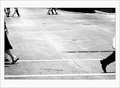
Hoovesby JutildaComment: Unique... interesting how they're all walking out of the frame. I wonder what they're trying to get away from! |
| Photographer found comment helpful. |
| 06/05/2007 09:20:23 PM |
|
| Photographer found comment helpful. |
Home -
Challenges -
Community -
League -
Photos -
Cameras -
Lenses -
Learn -
Help -
Terms of Use -
Privacy -
Top ^
DPChallenge, and website content and design, Copyright © 2001-2026 Challenging Technologies, LLC.
All digital photo copyrights belong to the photographers and may not be used without permission.
Current Server Time: 07/27/2026 04:15:57 PM EDT.