| Author | Thread |
|
|
06/06/2007 10:12:05 PM |
|
Put me down for liking take 2 better too! Very cool- you have such a good eye! |
|
 Photographer found comment helpful. Photographer found comment helpful. |
|
|
06/06/2007 07:47:12 PM |
|
The noise in the first one didn't bother me (at this size anyway) but I definitely prefer the composition of this one. Well done. |
|
| Photographer found comment helpful. |
|
|
06/06/2007 04:52:14 PM |
Both shots are good, but the brightness on the second one is a bit too bright, but this is such a pretty image of such a simple object! I like the angle on this image better....both are pretty.
|
|
| Photographer found comment helpful. |
|
|
06/06/2007 03:18:56 PM |
|
Great do-over! I like the second one best. It's much more lively. |
|
| Photographer found comment helpful. |
|
|
06/06/2007 02:57:51 AM |
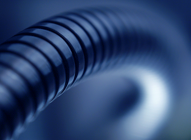
Originally posted by pcody:
yes. The deep curve adds much more to the flow. Just gotta ask, do you have your camera set to incandescent wb? I love the color. |
The blue in this case is actually done in photoshop. The wb was set to a preset that I use with my lightbox setup so I would get a more accurate silvery tint of the metal. The original version of this shot was done with the wb on automatic, so when I tried to adjust the coloring on that it had to go from a yellowish tint to blue, which I think made the noise even worse. |
|
|
|
06/06/2007 02:33:34 AM |
|
| Photographer found comment helpful. |
|
|
06/06/2007 02:17:00 AM |
|
As long as we're all voting, I very much agree 2 is better with the twisted bend being much better than the "rainbow" bend of 1 and a better angle on the in-focus part. |
|
| Photographer found comment helpful. |
|
|
06/05/2007 10:43:27 PM |
|
yes. The deep curve adds much more to the flow. Just gotta ask, do you have your camera set to incandescent wb? I love the color. |
|
| Photographer found comment helpful. |
|
|
06/05/2007 10:42:23 PM |
|
I agree the first one is more static. I like the sinuous quality of number 2 better. |
|
| Photographer found comment helpful. |
|
|
06/05/2007 10:29:12 PM |
|
door number 2 for me as well! Way more intresting with the composition than the first. I think how the lamp arm comes in and out of the frame makes this photo, well done! |
|
| Photographer found comment helpful. |
|
|
06/05/2007 10:08:13 PM |
|
The second one also get my vote. I love the softness and the blue tones. Most of all I love the detail that you have focused on, as it has such wonderful clarity and deatail, so very rich in that blue colortone. |
|
| Photographer found comment helpful. |
|
|
06/05/2007 10:00:56 PM |
|
The second one gets my vote. Good job. |
|
| Photographer found comment helpful. |
|
|
06/05/2007 09:18:03 PM |
|
After carefully contemplating...I like take 2. |
|
| Photographer found comment helpful. |
|
|
06/05/2007 09:18:02 PM |
|
Hey, I like the first one, too, but this is great. Good eye to see the importance of subtle differences. Nicely done. |
|
| Photographer found comment helpful. |
Home -
Challenges -
Community -
League -
Photos -
Cameras -
Lenses -
Learn -
Help -
Terms of Use -
Privacy -
Top ^
DPChallenge, and website content and design, Copyright © 2001-2026 Challenging Technologies, LLC.
All digital photo copyrights belong to the photographers and may not be used without permission.
Current Server Time: 07/15/2026 12:45:50 AM EDT.