| Image |
Comment |
| 06/11/2007 12:02:55 AM |
Good doggies! by xtianComment: Congratulations! Two weeks in a row that you get into the top 5 and get a little icon on your profile sidebar!
Way to go teammate!! Great shot, keep up the good work. |
 Photographer found comment helpful. Photographer found comment helpful. |
| 06/08/2007 01:18:25 AM |
Golden Eyeby rinacComment: Live lizards at the museum? crazy! I guess we'll have to go there one winters weekend and see. Great shot and good editing given the hue changes you needed to do. |
| Photographer found comment helpful. |
| 06/07/2007 04:05:53 PM |
Oh Porcelain God, I Pray to Thee!by ZeusComment: This is a great image that did not deserve it's placing. I didn't vote in this challenge but it would have got a 6 or higher from me. It is technically better than many that scored higher. I can see how those with "traditional" religious beliefs would be offended by the material and thus score this low. The topic description was however " What do you believe in?" so the image fits...the person being depicted clearly belives in drinking too much :)
I wonder if changing the title would have made a big difference to the score. "God help me for I have lost my way" may have appealed to the masses more as the message in the image would have turned from one of a godless person after too much drink to someone who understands they need help but feel powerless at present. Just my thoughts.
In any case, well done on an image that provokes discussion. |
| Photographer found comment helpful. |
| 06/06/2007 12:46:58 AM |
" Dear God... " by xtianComment: Way to go teammate!!!! Congrats on the blue!
Team Trigger Happy has two shots on the front page at once!!!! |
| Photographer found comment helpful. |
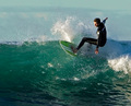
| 06/05/2007 05:07:40 AM |
surf_kingby owenComment: Hi from the Critique Club
Fit: This fits the challenge well, no problem there
Composition: Nice, you have placed the subject well and left plenty of room for them to surf into
Technical: I'm not sure I can find anything here to say that will be constructive.
Feel: The image is nice, and the score reflects that. This was a funny challenge in that it was very much a free study as long as you could find a username to fit the image. Given this you have achieved a very good result. Well done. |
| Photographer found comment helpful. |
| 05/31/2007 05:45:37 PM |
|
| Photographer found comment helpful. |
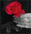
| 05/31/2007 05:39:40 PM |
2 VERY good ways to say "I love you"by Delta_6Comment: Hi from the Critique Club
Fit: The image fits the topic.
Composition: Composition is good. We have our eye drawn nicely around the frame with points of interest along the way.
Technical: Here's where the 100+ 5's came IMO. While you have sharpened (twice) the image has a soft feel to it. DPC doesn't often like that. There also seems to be some noise in the black background, the hand may be a bit close to the velvet so the lights are showing that up a bit? I also think that have two saturated objects that aren't too linked may have caused confusion in some voters ie: what is the element I am supposed to be focused on?
Feel: I think the image is good but it lacks that something that makes me want to linger and examine it. More sharpness in the rose may have helped a lot.
PM me if you have any queries. |
| Photographer found comment helpful. |
| 05/31/2007 05:21:23 AM |
Home Sweet Homeby alpharichComment: Hi from the Critique Club.
Fit: Well, almost any shot fits this challenge, but does it benefit from the treatment...?
Composition: The Composition is good. You have clearly thought about placing your subject according to the rule of thirds. I do feel that the snail is too low in the frame. Placing him higher with more empty space in the foreground may enahance the idea that he has a long way to travel. Either that or a much tighter crop on the snail?
Technical: The DOF is great. I love it. The colours in the shell seem a little oversaturated for my taste. I don't think the noise in the background is a benficial element in this image as it steals attention form the snail. The slimey snail also seems to lack detail. I think this is because he is slimey but maybe masking around him out and treating him differently would have been an idea. That way you might have been able to keep detail in him and the rest of the image.
Feel: The shot feels average to me. The sheel is great and deserves to be in colour but the issues mentioned above take away from any "wow" that I may get from the colours and patterns in the shot a bit.
PM me if you have any queries. |
| Photographer found comment helpful. |
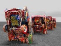
| 05/31/2007 05:13:23 AM |
The Cadillac Ranch on Route 66by m_sarzynskiComment: Hi from the Critique Club
Fit: Almost any picture will fit this challenge but the question is does the image benefit from the treatment. Your image fits but lets see if I think it benefits...
Composition: Composition is ok but there are areas for improvement. One of the "rules" (I say that in quotes because rules are never fixed in stone) is that horizon should be level. In this case it should. You have a nice sight line formed by the cars as they recede into the distance but the titled horizon competes for our attention as it slopes down to the right.
Technical: This image is one that is fitting for the selective desaturation. There are some aspects that mean that this has not been realised to the potential ot could have been. First, outside of the colour areas we have no intest. This means that while you have the cars in colour, that is all we see in the image to it almost feels as if nothing has been desaturatd. Secondly, the sky is blown out a bit. More detail in the sky would have aided the above point but also not given us that bright area at the top that we can't help but be drawn to. Do you shoot in RAW? If so then maybe it's time to think about HDR and Tone Mapping. Do you have photoshop CS2? If so then the Shadow/Hilights tool may have brought some detail out in the sky. I also wonder if this isn't overexposed a litte.
Feel: I didn't vote in this challenge but I do like this image. The subject is unique (that is getting harder and harder on DPC). The colours are vivid. The image has interest. It's just that once my eye has run along the line of cars I feel like there should be more but that is all there is. I think this would have easily passed a score of 6 if there was more detail outside of the cars.
PM me if you have any queries and good luck in future challenges. |
| Photographer found comment helpful. |
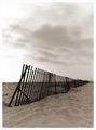
| 05/27/2007 03:55:30 PM |
Beach Fenceby xtianComment: Hi from the Critique Club teammate!
Fit: I'll start by saying that I'm not sure why you worried about this before voting. It clearly has a vanishing point.
Composition: The composition has all the right things...level horison, horison not in middle, leading lines, etc. I do wonder if portrait was the best choice for this though. A landscape orientation may have enhanced the fenceline and thus the vanishing point. We'll not know unless we saw it ;)
Technical: Done well. As commenters said, a little blown in places. Good detail in the sand. I'm guessing that you could't get more from the clouds without destroying the sand?
Feel: The shot meets challenge well but does lack much for the viewer to connect with, hence the many 6's rather than something higher.
Good luck in the upcoming challenges (especially since we are on the same DPL team!)
PM me if you have any queries |
| Photographer found comment helpful. |
Home -
Challenges -
Community -
League -
Photos -
Cameras -
Lenses -
Learn -
Help -
Terms of Use -
Privacy -
Top ^
DPChallenge, and website content and design, Copyright © 2001-2026 Challenging Technologies, LLC.
All digital photo copyrights belong to the photographers and may not be used without permission.
Current Server Time: 07/16/2026 02:36:29 PM EDT.