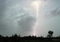
| Image |
Comment |
| 09/04/2008 12:17:40 PM |
|
| 09/04/2008 12:17:17 PM |
The Golden Yearsby HipychikComment: Interesting colours. Almost seems like a painterly effect applied to the image. But overall it just seems a little cluttered to me, and I don't like how her eyes are obscured by the reflection in her glasses. |
 Photographer found comment helpful. Photographer found comment helpful. |
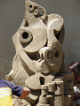
| 09/04/2008 12:14:22 PM |
Sculpting in Sandby GeneralEComment: The composition is a bit off. Those kids either seem to be in the way, or are not there enough... I like the sculpture though - that's a work of art. And you chose the right lighting to show off all its angles. |
| Photographer found comment helpful. |
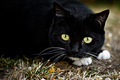
| 09/04/2008 12:13:13 PM |
Spirit of the Wildby CaravelaComment: Beautiful cat. Maybe a square crop would have done away with that empty blackness on the left and emphasised those remarkable eyes more. Still, a nice shot. |
| Photographer found comment helpful. |
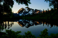
| 09/04/2008 12:11:18 PM |
Mount Shuksanby cabaComment: This is a very beautiful scene. Something about the composition doesn't feel balanced enough to me, and maybe the peaks of the mountain aren't quite sharp enough. There is a lot of detail lost in those dark tones, yet somehow I like the mood it creates. |
| Photographer found comment helpful. |
| 09/04/2008 12:08:32 PM |
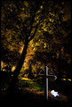
Memoriesby BogiComment: This image disturbs me. Maybe it's just the juxtaposition of teddy bears and graves... Still, I find what you did with the lighting and the use of negative space very interesting. Nice work. |
| Photographer found comment helpful. |
| 09/04/2008 12:07:25 PM |
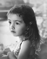
Tender Heartby JutildaComment: Maybe it's just the mood I'm in tonight, but I keep seeing b+w photos that I wish were in colour because they'd make the subject seem so much more alive and vibrant. Kids are great models - I'd prefer to see them in a more colourful lively scene, than this one which is more sterile and artsy (although well taken and processed). |
| 09/04/2008 12:05:05 PM |
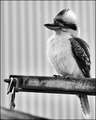
Where's my dinnerby CraftyComment: Nicely taken. Although the B+W emphasises the strong shape of the bird, I also feel it drains a bit of the life out of the creature - I'd like to have seen what it looks like in colour. |
| Photographer found comment helpful. |
| 09/04/2008 12:02:47 PM |
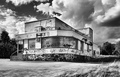
Cafe No Moreby SoulMan1978Comment: You did an excellent job of controlling the tone in this b&w image, but I don't know if the monochrome really helps it. It sterilizes the unclean building and graffiti too much, and so I think the building loses a bit of its impact as a run-down relic. Well taken though. |
| Photographer found comment helpful. |
| 09/04/2008 12:00:44 PM |
|
| Photographer found comment helpful. |
Home -
Challenges -
Community -
League -
Photos -
Cameras -
Lenses -
Learn -
Help -
Terms of Use -
Privacy -
Top ^
DPChallenge, and website content and design, Copyright © 2001-2026 Challenging Technologies, LLC.
All digital photo copyrights belong to the photographers and may not be used without permission.
Current Server Time: 06/24/2026 02:27:12 PM EDT.