| Image |
Comment |
| 07/18/2006 04:07:50 PM |
|
 Photographer found comment helpful. Photographer found comment helpful. |
| 07/18/2006 04:07:23 PM |
|
| Photographer found comment helpful. |
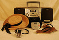
| 07/18/2006 04:06:47 PM |
Beach Music - Boombox->Discman->Ipodby sabrizzComment: You need to work on your backdrops. If you're going to use a white, cloth backdrop, make sure it drapes in a nice long curve under the subject, instead of having perpendicular surfaces - the edge where the wall meets the floor/table is messy.
Also, your lighting needs work: to get that bright white, studio type background that you see in stock photography you need to light the background quite brightly, and get your subject further away from the background. You can even overexpose the subject a bit to really wash out that background.
Finally, the white balance wasn't quite correct in this shot either. Find out how to set it in-camera, or read some of the tutorials on this site to learn how to adjust it in your photo software.
Although my comment may seem long and critical, don't despair. I think it's a great idea, and a decent shot. But it can be improved, and I'm sure you want to learn how. |
| Photographer found comment helpful. |
| 07/18/2006 04:00:43 PM |
Quiet Progressionby MelethiaComment: Narrow DOF aids in making this a really nice, simple composition. However, the lack of sharpness all the way across the wire is a bit distracting. Still, nice image. |
| Photographer found comment helpful. |
| 07/18/2006 03:59:10 PM |
by a thread...by shaundpComment: DOF is good, focus is a bit soft. Composition good too though. But the photo lacks a wow factor (unless you're an Animal Planet fan...) |
| 07/18/2006 03:50:56 PM |
Seeds of Progressby theyetifanclubComment: I know you were going for a very specific look with the post-processing on this one, but it just feels too washed out and bland. It's a pity it was basic editing - if you'd had advanced rules and could have selectively saturated and boosted the colour of the seeds, it might have been quite a striking image.
Also, for the whole minimalist feel, I think placing the seeds off-centre might have been more appealing. |
| Photographer found comment helpful. |
| 07/18/2006 03:48:33 PM |
|
| Photographer found comment helpful. |
| 07/18/2006 03:48:07 PM |
Isn't It Ironicby jonnieComment: Ironic indeed. Nice idea, but the photo seems a bit too "snapshotty". Maybe if you'd used a more dynamic angle, or desaturated the colours and underexposed for a bit of a grungy look, it might have conveyed your message better. |
| Photographer found comment helpful. |
| 07/18/2006 03:46:25 PM |
Beautiful Pollutionby rpwsrwComment: Not sure the idea/theme gets communicated as powerfully as it could in this shot. Interesting idea though. |
| Photographer found comment helpful. |
| 07/18/2006 03:45:23 PM |
|
| Photographer found comment helpful. |
Home -
Challenges -
Community -
League -
Photos -
Cameras -
Lenses -
Learn -
Help -
Terms of Use -
Privacy -
Top ^
DPChallenge, and website content and design, Copyright © 2001-2026 Challenging Technologies, LLC.
All digital photo copyrights belong to the photographers and may not be used without permission.
Current Server Time: 06/18/2026 09:39:39 PM EDT.