| Image |
Comment |
| 05/06/2006 11:51:07 PM |
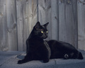
Renaissanceby prenticeComment: great comp and skintones. Maybe get rid of the flag on the left. |
 Photographer found comment helpful. Photographer found comment helpful. |
| 05/06/2006 11:49:55 PM |
|
| Photographer found comment helpful. |
| 05/06/2006 11:49:07 PM |
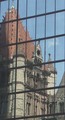
The Princeby photobytesComment: Maybe a little more contrast and a tighter crop would have made this better. |
| Photographer found comment helpful. |
| 05/06/2006 11:48:03 PM |
|
| Photographer found comment helpful. |
| 04/30/2006 06:12:57 PM |
|
| Photographer found comment helpful. |
| 04/30/2006 06:11:22 PM |
|
| Photographer found comment helpful. |
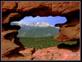
| 04/30/2006 12:31:31 PM |
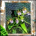
Breakoutby sherpetComment: just a little too much sat. or some REALLY green plants |
| Photographer found comment helpful. |
| 04/30/2006 12:29:34 PM |
|
| 04/30/2006 12:23:38 PM |
|
| Photographer found comment helpful. |
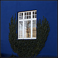
| 04/30/2006 12:20:35 PM |
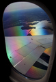
Light on the other sideby stanm2Comment: i like the semmitry in the shapes, i think it needs a little more post prosessing in order to give a little pizaz. |
| Photographer found comment helpful. |
Home -
Challenges -
Community -
League -
Photos -
Cameras -
Lenses -
Learn -
Help -
Terms of Use -
Privacy -
Top ^
DPChallenge, and website content and design, Copyright © 2001-2026 Challenging Technologies, LLC.
All digital photo copyrights belong to the photographers and may not be used without permission.
Current Server Time: 07/16/2026 05:34:33 AM EDT.