| Image |
Comment |
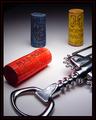
| 05/13/2003 03:23:48 PM |
Vino Italianoby jmsetzlerComment: The clarity and lighting in this shot are fabulous. It's crisp yet soft and intimate feeling. I would like to see a little space between the red cork and the border, but can see that you wanted it touching so as to balance the corkscrew being off the frame. Good gradients and saturation throughout. Very well done! 9 -danny |
| 05/13/2003 03:21:16 PM |
The Colors!by AntithesisComment: Simple, silly and goofy, but it works for me! Your colors may not be true blue, yellow and red, but what the heck! I do think that you may have wanted to meter on the bright reflections to minimize your hot spots. 9 -danny |
 Photographer found comment helpful. Photographer found comment helpful. |
| 05/13/2003 03:19:54 PM |
primary curvesby shutterflyComment: Perhaps a little dark, but the overall abstract nature of this shot is pleasing. I like how the bowls to meet the corners of the frame. 9 -danny |
| Photographer found comment helpful. |
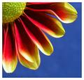
| 05/13/2003 03:18:56 PM |
Petals by agwrightComment: Although we have had many flower shot recently, this one stands out nicely. It meets the challenge very well and I love the soft tones throughout. 9 -danny |
| Photographer found comment helpful. |
| 05/13/2003 03:18:04 PM |
Primary Glass by JackoComment: Perfect! There is something to be said to paying attention to details! You have mastered this technique! Good job! 10 -danny |
| Photographer found comment helpful. |
| 05/13/2003 03:17:22 PM |
Butterfly Fantasy by dsidwellComment: Saturation may be a little high, but I love the feel of this shot. The composition and simplicity really make for a pleasing viewing experience. 10 -danny |
| Photographer found comment helpful. |
| 05/12/2003 02:46:36 PM |
Confusion. Which Shall I Choose?by RefocusedComment: Have a headache? :-) The time to lay those out paid off. The symmetry is nice. I do feel however that the lighting and saturation make the photo seems flat. Boosting the saturation and contrast may have made this a more lively photo. |
| Photographer found comment helpful. |
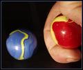
| 05/12/2003 02:44:53 PM |
The Shooterby autoolComment: Bouncing the flash to prevent the harsh lighting on the marbles might have made this a stronger shot. I like the colors and layout. |
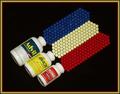
| 05/12/2003 02:41:01 PM |
Early Primary Colorsby ploogieaComment: Nice leading line to have the viewer see the blue slide in the middle. I think that a closer in shot without the clutter around the equipment might have made for a stronger shot. Colors and saturation are good. |
| Photographer found comment helpful. |
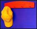
| 05/12/2003 12:20:17 AM |
Primary Pegsby sherComment: This is very well lit and saturated. A little more blue to the left of the hat and above the pegs would really make this a 10+ shot! -danny |
| Photographer found comment helpful. |
Home -
Challenges -
Community -
League -
Photos -
Cameras -
Lenses -
Learn -
Help -
Terms of Use -
Privacy -
Top ^
DPChallenge, and website content and design, Copyright © 2001-2026 Challenging Technologies, LLC.
All digital photo copyrights belong to the photographers and may not be used without permission.
Current Server Time: 06/11/2026 10:25:02 PM EDT.