| Image |
Comment |
| 01/13/2003 12:20:18 PM |
|
| 01/13/2003 12:12:53 PM |
|
 Photographer found comment helpful. Photographer found comment helpful. |
| 01/13/2003 12:07:45 PM |
|
| 01/10/2003 01:29:14 PM |
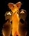
Silk Road Travelersby WarpComment: ~~~~Critique Club Comment~~~~
Silk Road Travelers
Composition (Content)
First, I don't feel this photo met the Travel theme of the challenge. That being said. The composition of the critters is a little off center. This makes the scene feel heavy on the right. A more balanced composition would work better I think.
Background
The black background works well for this shot. I do feel that some fill lighting on the subjects would again make for a more pleasing composition.
Camera Work (Technical)
Your DOF and focus are good. Very low noise at ISO 50 and .1 shutter speed.
Digital Processing (Technical)
Sharpening is good( Crisp, no artifacts)
Balance between light and dark is fair. ( creatures are a little dark)
Compression is good( No noticeable compression artifacts)
My opinion
This would be a fine Macro, or other subject matter shot, but it does not meet the challenge theme in my opinion. I feel that with a few tweaks, these guys could come to life in another challenge more fitting with their personalities. |
| 01/08/2003 03:48:32 PM |
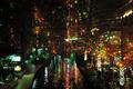
The riverwalk, San Antonio at Christmasby GordonComment: ~~~~Critique Club Comment~~~~
The riverwalk, San Antonio at Christmas
Composition (Content)
The use of lights and reflection create a sense of dreamland in the picture. The colors really draw me in and make me want to know more of what is going on in this nightlife setting. That being said, the composition could be made a little stronger if the cropping would have been adjusted to exclude the stores on the left side just left of the side walk. I feel this would have kept the viewer's intrest more focused on the activity of lights to the right.
Background
Some may see this as a busy picture, to cluttered, I see an interesting array of lights and color. The DOF is good so as to not have a blurred background, and the different shapes of the lights hanging down off the building create an appearance of lights raining down onto the river below.
Camera Work (Technical)
Good use of a small aperture to keep everything in focus. Your shutter speed is good to capture enough light for a dramatic shot, but not to long to blow any one light out too much. The high ISO of 800 also allowed for good light without too much grain or noise added.
Digital Processing (Technical)
Sharpening is good( May be a little soft, but not bad)
Balance between light and dark is good. ( Not a lot of light areas, but I wouldn't expect there to be)
Compression is good( No noticeable compression artifacts)
My opinion
I like your mood in this shot. I feel like I'm watching a fun place and want to be part of it. The sign on the left could be removed to add a better balance to the picture, but all in all this is a fine shot that should make the viewer want to know more about what happens during the night on the riverwalk in San Antonio. |
| 01/07/2003 01:20:25 PM |
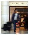
rushby FranziskaLangComment: ~~~~Critique Club Comment~~~~
rush
Composition (Content)
Near perfect! I am drawn to the clear crisp pillar and sign as well as the nice reflections in the tile flooring. The colors are warm and inviting in contrast to the cool color of the subject moving in the middle of the frame. This gives me a feeling that even in the comfort of our surroundings life is busily passing us by.
Background
Even though this is at a train station, the colors and sharpness of the background make this an inviting place to be. Your use of verticals and horizontals with the building and sign, help to frame the subject well.
Camera Work (Technical)
Being that this was not a staged shot and you are working within an active area of the train station, I commend you on your ability to capture this shot. As others mention, it's a shame that both legs are not visible, but I feel that in the bigger scope of the picture, that is not as important as the feeling of hurrying through a train depot. That said, a slightly faster shutter speed may have added in both legs being visible.
Digital Processing (Technical)
Sharpening is good( Lines are crisp and clean)
Balance between light and dark is good. ( Nice warm colors all the way to the cool colors of the traveler)
Compression is good( No noticeable compression artifacts)
My opinion
I really like this photo. I really gives me a sense of what it would be like darting through the station on my way to see family or friends. Your location for this shot is perfect with the warm colors and inviting doorway. Your subject although in a hurry, does not seem in a foul mood and that adds to the overall pleasant mood. Message edited by author 2003-01-07 13:22:17. |
| Photographer found comment helpful. |
| 01/06/2003 05:48:52 PM |
Kissed by a Roseby RiderGalComment: The only thing that bothers me about the shot is that the light on the roses is perhaps a bit strong in contrast to the softer lip print. Putting my browser window over it to crop out the left most rose and making it a portrait shot with just the middle rose and the lip print also, in my opinion, makes it a stronger composition. Gives more of an illusion that the rose made the kiss print. The lip print is either somewhat smudged or blurred in contrast to the sharp edges of the rose. All of these factors culminate into a score of: 6 |
| Photographer found comment helpful. |
| 01/06/2003 02:36:46 PM |
|
| Photographer found comment helpful. |
| 01/06/2003 02:36:08 PM |
Stranger in Candy Landby karmatComment: Other then a piece of fruit, I don't know if there is anything that could have improved the composition of this shot. Colors and lighting are good. |
| Photographer found comment helpful. |
| 01/06/2003 02:35:07 PM |
Hey...How did I get here?by AntithesisComment: A shot like this needs to have a perfect crop. This would have gotten a higher score from me if the floppy was equal distance from the edge on both sides. Also the fleck of dust on the top left distracts my eye. The color, lighting and tone are right on though. Nice abstract, I'd like to see the same shot with the camera a little lower to be horizontal with the top CD so as to not see the blue of the top and the floppy centered. |
Home -
Challenges -
Community -
League -
Photos -
Cameras -
Lenses -
Learn -
Help -
Terms of Use -
Privacy -
Top ^
DPChallenge, and website content and design, Copyright © 2001-2026 Challenging Technologies, LLC.
All digital photo copyrights belong to the photographers and may not be used without permission.
Current Server Time: 06/10/2026 11:41:12 PM EDT.