| Image |
Comment |
| 02/10/2003 12:13:53 AM |
|
 Photographer found comment helpful. Photographer found comment helpful. |
| 02/07/2003 09:08:23 PM |
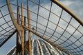
"thro'golden squares"by FreebieComment: Critique Club Comment:
This is a really interesting abstract. I am fond of this style of photography. To me it shows that the photographer isn't afraid to try new angles to bring a feeling of art to his work. You have a very crisp well in focus shot here. The colors and depth are great. I feel that I might like to see it cropped differently. With the curve of the structure dropping off on the left, the eye isn't sure which way to flow into and out of the picture. You may want to try cropping so there is no down curve on the left. This would make the eye naturally flow from left to right out of the frame. Other then a slight illusion of the dome being unlevel, this is a unique photo with intersting characteristics that make me interested in know more about it.
-danny |
| Photographer found comment helpful. |
| 02/06/2003 04:59:32 PM |
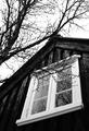
Window to the Pastby arnitComment: Critique Club Comment:
This is a strking photo full of a lot of detail, textures and emotion. I wonder who looks out this window every day, and what do they see? The aged wood around it has a story of its own. Your black and white conversion is beautifully done and you have very minimal sharpening contrast around the branches. If you were going for an aged weathered look by using the ISO 400, then you did well. I might like to see it done in iso100 too as a crisper shot. The only other thing that my eye is drawn to is the branch appearing to touch the peak of the roof. A slighty different angle might have given a little more space there and added depth between the two.
I really like this shot. I rated it high during the competition. Keep up the good work. |
| 02/05/2003 09:54:18 PM |
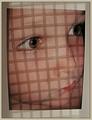
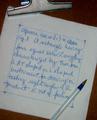
Seeing Squaresby JeanComment: Critique Club Comment:
I like the concept of the shot. The child peering though the matte leads me to wonder what he's looking at. I however am unclear as to how the squares were done. Some Photographer Comments would help here. Based upon what I see, I think that you must of projected them with a transparency projector. With your camera settings as they were that light must have been really bright. That said, the lighting seems a little flat. I would like to have a true white within the border or darker black in the shadow or perhaps it's just that the squares are at an angle... I can't pindown what it is, but the image doesn't grab me. The elements are all here it but don't click for me.
-danny
|
| Photographer found comment helpful. |
| 02/05/2003 07:12:18 PM |
Out of paper...by cnobreComment: Critique Club Comment:
A nice idea. Your layout and the tech look of the writing is pleasing to the eye. I do feel that the lighting or white balance may be off some. An adjustment in post processing for this as well as an unmask sharpen would help the white towel jump out at the viewer more. I like the texture in the clip and wood of the board.
Compositionally I feel this is a strong picture, some minor post processing work and this picture would stand strong.
-danny |
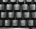
| 02/05/2003 07:01:05 PM |
deskworkby leko2kComment: Critique Club Comment:
This may have been a shot better done with some setup. This picture looks to much like a last minute shot. Your use of lighting, focus and cropping could have been changed to help make this a more dynamic picture of a keyboard. Crop out the top and bottom partial rows, use a desk lamp instead of your flash, either backup some to get better focus or use a step up ring to get the detail of the keys in sharper focus. Post processing your levels to get a deeper black and solid white would help your grey gradients to give a better balance.
Sometimes prep work pays off.
-danny |
| Photographer found comment helpful. |
| 02/04/2003 01:20:15 PM |
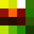
Abstractby stephanComment: Critique Club Comment:
Well other then the actual colors and pattern there isn't a whole lot to critique on this shot. :-D
I believe that I scored this high. I love abstract photography and those who use the medium for more then portraiture. The pattern you choose has enough randomness in it to make it interesting, but enough similarity with the greens that it is pleasing to the eye. Your color saturation is good as well as your sharpening and jpeg compression.
Way to think outside of the 'box'!
-danny |
| Photographer found comment helpful. |
| 02/04/2003 12:46:51 PM |
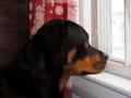
Waitingby emorgan49Comment: Critique Club Comment:
This photo shows a dog waiting patiently for his owner. I think that the emotion of the moment was captured well. I do however feel that the main focus seems to be the dog and not the window. Seeing that the camera was set in auto-mode, it did the best it could to expose properly for the brightness outside the window and the dark inside. The focus seem a little soft, not enough to lower the score as if it was too sharp I think that would destract from the emotive aspect of your shot. A slight Unmask Sharpen may have improved on the sharpness.
This as you know, would have been perfect for the cliche' competition! You have a good looking dog, and have shown a side of his personality not normally seen. |
| Photographer found comment helpful. |
| 02/03/2003 10:44:56 AM |
|
| 02/03/2003 07:54:19 AM |
|
| Photographer found comment helpful. |
Home -
Challenges -
Community -
League -
Photos -
Cameras -
Lenses -
Learn -
Help -
Terms of Use -
Privacy -
Top ^
DPChallenge, and website content and design, Copyright © 2001-2026 Challenging Technologies, LLC.
All digital photo copyrights belong to the photographers and may not be used without permission.
Current Server Time: 06/11/2026 08:11:33 AM EDT.