| Image |
Comment |
| 02/17/2003 12:30:16 AM |
She Measures Upby ShiiizzzamComment: Tone and lighting are perfect. Your off center crop with the tailing tape off the edge of the frame lead the eye through the frame nicely. Well done! |
 Photographer found comment helpful. Photographer found comment helpful. |
| 02/14/2003 12:38:35 PM |
Hello?by tiffComment: Critique Club Comment:
Greetings! Interesting shot. You have chosen to go artsy with this by adding noise. Your composition is good. The lines leading into the frame are nice. The color conversion is good with nice gradients. Being that this is more artistic then photographic, it is a little difficult to recommend anything to 'better' the shot. This is truely a photo that is 'in the eye of the beholder'. Some people will not like it, while others love it. That's what art is. It invokes emotion, either good or bad.
I honestly like the shot. It's simple but artsy. |
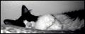
| 02/12/2003 07:56:41 PM |
three movie starby ivanaComment: Critique Club Comment:
Hello from a fellow s602z user! This is a good cliche shot. You have captured 3 felines in 3 different poses. Your key light is good as well as your focus and exposure. You have captured the cats personalities well, playful, shy and bossy. It's to bad that the cat on the right is so far to the right. The bright area in the upper right of the frame is a somewhat distracting, but to crop it out, you'd have cut the back off the cat. The color of the chair and the cloth draped behind the cats gives this shot a royal feel to me.
I'm not usually fond of feline shots, but you have captured them well.
Good job!
-danny |
| 02/11/2003 10:16:41 PM |
Rising Tallby timj351Comment: Critique Club Comment:
Excellent contrast between old and new. The straight lines of the bridge and the earthy brick below really make for a great feeling of how man progresses and leaves the old behind to make room for the new. Your exposure is real good, you have enough light in the foreground to make out details, but not so much as to washout the background. The clouds in contrast to the darker stone work adds another nice element to the shot. Due to your vantage point there isn't much you can do about the pole with wires other then just crop the whole thing out. This would have left you just the two main poles and the brickwork below. The biggest concern if you had done that is that you may loose the before and after feel of the shot.
I really like how the bridge 'grows' from the old. You have presented a strong image. |
| 02/11/2003 10:18:09 AM |
Caught Nappingby AnnidaComment: Critique Club Comment:
Knowing the camera you're working with, I will try to address what you can do from a composition stand point more then from a technical stand point.
What you can work most with is composition. That means to me, filling the frame with just enough content to make your statement. Less is usually more. In this shot it's not a matter of too much content, but perhaps the angle from which it is taken. Being that the camera is limited in its DOF and focus range, having the low angle with the pillow in the foreground is not as pleasing to the eye. Perhaps a higher camera angle to capture more of the cat's head and less pillow and would have made a stronger composition. This too would have had you shooting down at the cat some causing the less glare from the wall behind it. With the lighting coming from what appears to be an on camera flash, you will have a challenge with lighting indoor subjects well. You will need extra light to fill in where the flash can't. In this shot you can see that the right part of the photo is much darker then the rest. Working with a sleeping cat is tough enough, but maybe putting a reflective white surface out of sight above the cat so as to bounce some light down on her would have evened your lighting across her. Color, or lack of it. I appreciate the pink nose and the desaturation of color, but in this case, I think either a complete black and white with a good gradient, or full color would have been stronger. What you have now looks like the camera is unable to correctly capture colors. I'm all for artsy shots, just make sure that you pull it off to the rest of your audience. Post processing is critical too. Learn to use curves, brightness contrast, hue/saturation and unmask sharp. These are invaluable with any photo, be it a $50 webcam or a $2000 DSLR.
I like the crop on this photo, and the cat looks cute.
You have a strong desire to push your photography further, just start with paying attention to composition and lighting. The rest will follow.
Good Luck! |
| Photographer found comment helpful. |
| 02/10/2003 08:49:43 AM |
|
| Photographer found comment helpful. |
| 02/10/2003 08:49:05 AM |
Two Classics by JackoComment: Beautiful shot! Well deserved win. The pattern in the drop really makes this shot!
-danny |
| Photographer found comment helpful. |
| 02/10/2003 08:47:18 AM |
Self Portrait by jjbeguinComment: Excellent portrait and black and white study. Congrats on the ribbon!
-danny |
| 02/10/2003 08:46:22 AM |
Growing Upby jenaromComment: Excellent shot! This was one of my highest rated last week. Well deserved win!
-danny |
| Photographer found comment helpful. |
| 02/10/2003 12:17:02 AM |
It's Just A Gameby ShiiizzzamComment: Excellent detail. I like that you thought outside the large box and went small for this one. Your white balance is perfect! Nice shot. |
| Photographer found comment helpful. |
Home -
Challenges -
Community -
League -
Photos -
Cameras -
Lenses -
Learn -
Help -
Terms of Use -
Privacy -
Top ^
DPChallenge, and website content and design, Copyright © 2001-2026 Challenging Technologies, LLC.
All digital photo copyrights belong to the photographers and may not be used without permission.
Current Server Time: 06/11/2026 08:10:52 AM EDT.