| Image |
Comment |
| 10/07/2005 09:09:22 PM |
Jewels of the fieldby wally5656Comment: Bold vibrant yellow and purple hues can be seen in this composition. The purple flower in the center is the star of the show and unfortunately she is not getting the attention it should. A closer composition where that flower dominates 75% of the frame would have strengthened this image. A smattering of the yellow flowers would be present but only to "adorn" this unique jewel of a flower. I would have loved if you had gotten closer to show us all the unique shapes, textures, and those "purple squiqlly lines" radiating from this unusual flower. |
 Photographer found comment helpful. Photographer found comment helpful. |
| 10/07/2005 09:03:46 PM |
Pomodori nel sole di seraby bobdaveantComment: Good lighting and excellent focus on the main subjects. I like the shades of green and reds seen on these developing tomatoes. However, a closer zoom or crop on just those three would have greatly strengthened the image which has too much "empty space" floating around it that does nothing to add interest to the overall image. |
| Photographer found comment helpful. |
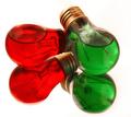
| 10/07/2005 09:00:45 PM |
colorful ideaby rwaudioComment: Interesting idea, composition, and objects. It appears as if the light bulbs are filled with colored liquid. Not to sure that the white background works with giving the colors a warm tone. The white seems to stark and contrasts a little too much for my taste with the bold colors of the red and green. Mayhap a dark background like black would have better suited the subjects not to mention strenthen the imagery that the lightbulbs are to bring light up a dark space. |
| Photographer found comment helpful. |
| 10/07/2005 08:55:33 PM |
Complementary drops by InnaNComment: Nice bold and vibrant reds and greens and an interesting checker pattern going on. Also there is the action of a suspended water drop and the ripples radiating out. Techniqcally good but the overall interest of the composition lacks something that I cannot put a finger on what would spruce up the elements contained within the frame. Hmmm, one thing I can think of at the moment to suggest is that if you could have just shifted the captured the water drop and ripples radiating out a tad to the right and up it would have appeared that they were spot on the center of where those 2 green and 2 red squares meet. |
| Photographer found comment helpful. |
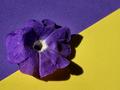
| 10/07/2005 08:49:51 PM |
voilet and yellowby U622Comment: Love the textures on the floral petals - the whole composition almost appears abstract. The only thing that really detracts is the center of the flower - most likely this was part of the flower but those white filiaments call attention away from the yellow center. |
| Photographer found comment helpful. |
| 10/07/2005 08:46:39 PM |
African Violetby holyfamComment: Brilliant bold colors on the yellows, purples and yes, greens. The lighting is very good. Techniqually good but the composition is weak. The only thing that weakens the strength of the shot is that the straight eye level shot does not hold the eye's interest for long. It has no 'umph' or pizzaz that makes it unique. A change in shooting angle (i.e. a side shot with the camera looking up at this floral arangement) can add a whole new dimension/ a new way of looking at this flower that will make the viewer stop, stare, and smell the flowers. |
| Photographer found comment helpful. |
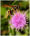
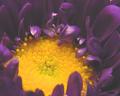
| 10/07/2005 08:41:39 PM |
Bee's Dinerby BKerrComment: Very nice close-up. The yellows and purples do well together here. The sharpness and clarity on the hornet and the flower is "sharp as a tack". My only critique is that a square crop might frame this shot and the action going on far better than the vertical rectangle here. A closer crop would get the viewer even more "up close" and personal with this nature scene. |
| Photographer found comment helpful. |
| 10/07/2005 08:36:29 PM |
My Petuniaby KarenNfldComment: Nice bold hues on the purple and the yellow. I like the beginnings of the abstract which has a "still life" (the flower) thrown in for added interest. However I think the placement of the flower weakens the composition. I would have been better to have moved the purple flower to be in the yellow triangle area - giving the impression that the purple is escaping outside the confines/border of it's color. Not to mention it would give an off balance presentation in the colors and their positions such that it captures and holds the eye's attention. If you wanted to go for a fully balanced symetry shot it would have contained a yellow flower in the purple triangle and the purple flower in the yellow triangle. |
| Photographer found comment helpful. |
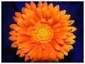
| 10/07/2005 08:30:57 PM |
Orange Beautyby stekComment: Brilliant, bold orange zinnia that just jumps out at the viewer's eye. While beautiful it is not as sharp in details as it could be especially around the petals. I would have preferred a cropped version that had the whole flower captured within the frame - as it stands here it the edges are chopped off both top and bottom. The blue background is a tad too dark and some of that beautiful shade of royal blue is lost in the shadows. |
| Photographer found comment helpful. |
| 10/06/2005 10:25:22 AM |
Mum's the Wordby mkalandrosComment: Better lighting could have really made this image "pop" off the screen. As the picture stands the lighting gives it a dull flat look especially to the purples which I envision as really being a deep rich purple hue. Not to mention some of the sheen on the purple petals causes them to appear "plastic". |
| Photographer found comment helpful. |
Home -
Challenges -
Community -
League -
Photos -
Cameras -
Lenses -
Learn -
Help -
Terms of Use -
Privacy -
Top ^
DPChallenge, and website content and design, Copyright © 2001-2026 Challenging Technologies, LLC.
All digital photo copyrights belong to the photographers and may not be used without permission.
Current Server Time: 06/08/2026 10:39:24 AM EDT.