| Image |
Comment |
| 12/17/2006 09:53:13 PM |
Bold and Daintyby karenkComment: I would have loved to see the front view that would show this beautiful dog's face and possibly show some emotion such as a 'happy' smile or sad eyed face. Here, the composition shows us the back view of the dog which does little to hold interest for the viewer because it lacks the emotion or visual interest that one can typically show with a facial portrait. If you capture an animal from a back view there has to be some dynamic action present like the dog jumping to catch a ball in mid-air or the dog avidly watching a soccer ball getting kicked by a soccer player. Including a dynamic action would have some interest to the shot. But as the composition stands now, all we see is the backside of a dog looking at a fence. What it may be looking at, we don't know. What it's face might look like, we don't know. What emotion is on the dog's face (happy, sad, or curious), we don't know. Don't show the viewer less of the main subject show us more. |
 Photographer found comment helpful. Photographer found comment helpful. |
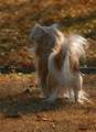
| 12/17/2006 09:43:18 PM |
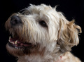
Mr. Majesticby FotoMunkiComment: Wow, look at that commanding stare! Now that is where you want to keep your viewer's attention hypnotized on! Don't be afraid to get closer to your subject, zoom in to so that his face fills the frame. As this composition sits now, I think that all the space surrounding the cat's face just takes attention away from the strong focal point of the image - that commanding stare which holds emotion and interest. Bring the viewer closer to your subject and it would move this composition out of the 'good' category' into the above average exceptional category. |
| Photographer found comment helpful. |
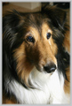
| 12/17/2006 09:38:08 PM |
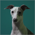
Sad Eyesby EssAreDubyaComment: Lighting is very good on this Collie portrait - a nice soft lighting that plays softly on the colors of the dog and waves in it's long hair. I really like just off to the side frontal portrait pose of the Collie. It really shows off the beauty of this dog's features and colors. Not a big fan of grey borders that has faded lines (thought I am not going to dock you for that because it is minor). I think this could have done with a sharp line, high contrast border (thin line of white bordered by a thick black border or vice versa) for a clean, polished look. Last little critique is the top portion that shows the corner wall of a room could be cropped out without effecting the portrait negatively. It would in fact help it for that top portion does nothing to enhance the image. Yes, a closer crop would trim some of the ears but it would not be too noticable because the closer crop would keep the attention focused tightly on the facial features of the dog's face, and it is a beautiful face at that, so you should play it up and keep the eyes attention focused there. |
| Photographer found comment helpful. |
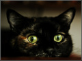
| 12/14/2006 09:54:46 AM |
I see dead people...by MontagueComment: Amusing title and certainly with the wide staring eyes that quote really seems to fit the emotion of the picture:-) The single weakness that this photo suffers from is lighting. I see the eyes but cannot make out much of the details of the right half of the cat's face including the nose. Either a better lighting set up is called for to illuminate the cat's entire face or playing around with Brightness & Contrast tools or even upping the Gamma slightly could help to make this a better composition. |
| Photographer found comment helpful. |
| 12/14/2006 09:48:59 AM |
redby yianisnComment: Subject is too far away for the viewer to fully appreciate that annoyed stare on the cat's face. You have way too much negative space that does nothing for the overall composition. The cat is literally swimming in this space. A closer crop or zoom on the cat will greatly increase the visual impact and appeal. As I said, it appears that he/she has an annoyed expression but we don't get to see it clearly for the focus is not squarely on the cat. Show us that expression bring us closer. |
| 12/14/2006 09:44:49 AM |
Stanley IIby ChasSourekComment: Stanley really needs to shine but unfortunatly the poor lighting makes this composition flat. There seems to be a single light source off to the left causing a harsh shadow to fall on Stanley's right half. Illuminating the subject's face in entirety will strengthen the visual appeal and impact. The teal green background just is not allowing this greyhound to pop off the page. The color is dull and flat in color contrast and thus it does not allow the subject to visually pop. Hmmm, mayhap a lightsoure behind the dog would create a halo effect sort of what Arnit did in his photo called Caught Up //www.dpchallenge.com/image.php?IMAGE_ID=143446 . The photo has some strong bones but better lighting would really help it shine. |
| Photographer found comment helpful. |
| 12/14/2006 09:34:08 AM |
Archieby JedusiComment: What a wonderful expression on this doggie! Love the open mouth which I see as an open smile and you caught a bit of light reflected in the eye that makes me think he has a 'twinkle' in his eyes. Lighting is spot on perfect. Focus is great. The simple and clean black background offers the highest contrast such that Archie can really pop off the page visually. You made him the star of this composition as it shows. Great job. |
| Photographer found comment helpful. |
| 12/14/2006 09:30:27 AM |
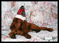
Athena - Daughter of Zeus, The Embodiment of Wisdom, Reason, and Purityby ZeusComment: The set-up is cute but the choice of background is way too distracting for the viewer to fully appreciate the poochie. The lace background is good to create the illusion of a white christmas or snow but one has to remember you can see through it. And there is alot of distracting colors and objects behind that lace backdrop. Placing a solid white cloth behind the lace one will help create a subtle idea of a white christmas/snow AND provide a solid white background for Athena to visually stand out on. As the composition stands now she is just lost in a jumble ot colors and textures that don't allow her to shine as the main subject. |
| Photographer found comment helpful. |
| 12/14/2006 09:24:06 AM |
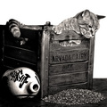
Bogartby heathenComment: Cats will curl up just about anywhere they take a liking too:-) I like the sharp focus and the B&W tones are excellent. But I feel the composition needs tweeking. The jug with the asian characters and the 'rocks' at the foot of the crate really add nothing to your overall composition. They actually take some focus away from your main subject of this photo - Bogart. A square crop that shows us the cat and a portion of the crate would increase this composition's visual impact and appeal. Keep the "Arvada Dairy" in the cropped shot because the viewer will instantly associate the word dairy with milk and because cats stereotypically love milk it is in the crate. This is a good photo with some strong bones. It just needs a little tweeking to bring it out of the good category and into the exceptional category. |
| Photographer found comment helpful. |
| 12/14/2006 09:16:15 AM |
Caught in the Actby EmerkazaComment: A cute candid photo of the ferret 'borrowing' objects that catches it's eye. However the green basket is far too distracting and takes the attention away from your main subject. One sees far too much of the basket rather than the cute ferret. A closer crop to just the ferret and the purloined pen would help strengthen the composition. Lighting could be better as that I think you might have used flash. Nothing wrong with using flash as long as it does not create harsh shadows (none are in this picture) or cause an object to reflect back the light resulting in blow-outs/overexposed areas. The top left hand portion of the 'wood' is reflecting back the light resulting in that area to be washed out. |
| Photographer found comment helpful. |
Home -
Challenges -
Community -
League -
Photos -
Cameras -
Lenses -
Learn -
Help -
Terms of Use -
Privacy -
Top ^
DPChallenge, and website content and design, Copyright © 2001-2026 Challenging Technologies, LLC.
All digital photo copyrights belong to the photographers and may not be used without permission.
Current Server Time: 06/16/2026 10:54:27 PM EDT.