| Image |
Comment |
| 05/08/2007 09:42:38 AM |
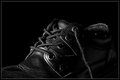
Day 07by darnokComment: Wonderful job on the lighting! The dark tones of the shoe doesn't get lost in the dark tones of the background because the object is perfectly illuminated to show all the details in texture and the shape outline. It is the outline and details of textures that really pop visually off the page. The balance of tones and contrasts in your photograph is wonderful because the dark tones of the shoe COULD have been lost in the dark tones of the backdrop. |
 Photographer found comment helpful. Photographer found comment helpful. |
| 05/07/2007 11:27:35 PM |
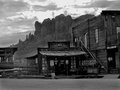
Goldfieldby BAMartinComment: I really like how the B&W adds to the mood and feel of a vintage era gone by - pioneer days of old. I like the composition of all the elements for not only do you have the 'olde tyme' wooden buildings of pioneer days but you have the lovely backdrop of the desert environment they exist in. The only problem with the photo is that alot of the tones and contrast are rather flat - such that the detail of the color variations in the rock face and the the buildings. Playing around with color adjustment in the channel mixer, the brightness/contrast levels and sparingly use of the clarify tool would really make the tones, contrast, and details pop. It might also take care of the problem of the blown out contrasts in the sky but if it does not experimentation and careful use of the burn tool will diminish the blown out contrasts. |
| Photographer found comment helpful. |
| 05/07/2007 11:17:32 PM |
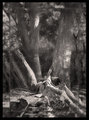
DAY 7. B&W. bush scene .by rozComment: Hey Roz, I did something similar to this with the border in a woodland scene photographed back in 2004. It helps add visual interest and adds drama to the scene so I think you are on the right track in jazzing up the composition. I don't think that the border around the composition should be blurred though for it makes the scene a little too busy and makes it stand out that the scene is being repeated. Instead you might want to try keeping that outer border in sharp focus but overlay the original version of the photo onto a black background at 30% - 40% oppacity. Then a copied version of your original of the full photo will be resized smaller and placed in another layer on top of the 'border background with overlay'. That way the border will be a dark one that makes the center portion of the photograph really pop because of the contrast. But a careful look at the border will yield subtle details of the woodland scene that are repeated in the border - sort of like the detailed engraving of patterns and shapes on a leather belt. Now the main portion of your photograph the tones seem a little flat - playing around with levels, dodging and burning or maybe even the channel mixer could bring out the textural details of the tree trunk and make it pop visually. |
| Photographer found comment helpful. |
| 05/07/2007 10:35:47 PM |
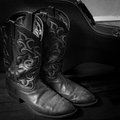
Boots_sm.jpgby eamurdockComment: You did a great job on the lighting so that the dark tones of the boots doesn't get lost in the dark tones of the floor and the musical instrument carrying case. The outline and details in the of the cowboy boots really pop visually off the page. The balance of tones and contrasts in your photograph is wonderful because the dark tones of the boots could have been lost in the dark tones of the backdrop. Love the details in the design patterns seen on the boots. |
| Photographer found comment helpful. |
| 05/07/2007 10:30:00 PM |
Hiddenby RetroesqueComment: I love the B&W presentation for your model's skin tones and hair really pop visually off of that stark white backdrop. Contrasts and tones are great with lots of detail to be seen. The lighting is wonderful because it picks up on her lovely skin tones in her arms and the portions of the face that are not hidden behind the hands. This photo has personality even though the subject's eyes which normally show alot of personality are hidden behind the hands. The mood is anything but playful. She hides herself behind the hands for she does not desire to be seen. We are invading her privacy by staring at her. I get the sense that she is a mostly private and introverted person just from the captured pose here in the photograph - and we are intruding on her private space. My only critique is that I think the top third of the photograph can be cropped out so that the square format keeps the attention tightly focused on your main subject. As it is here it is just empty space that does nothing to compliment or add to the composition. |
| Photographer found comment helpful. |
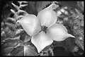
| 05/07/2007 10:16:32 PM |
Dogwoodby noranekoComment: Wow! The post processing you did really brings out the details of the flower and really makes it the star of this composition. Love the textures you can see on each individual petal of the flower - one can almost reach out and touch the softness. Love the details of the background environment that this dogwood flower exists in. The surrounding nature is lovely and it does not overwhelm or detract attention away from your main subject. In fact it greatly complements it. Tones and contrast are absolutely wonderful in this shot. I really don't have any suggestions on how to improve or any critiques on this one for you did a fabulous job. |
| Photographer found comment helpful. |
| 05/07/2007 10:09:30 PM |
Day 6by TDCollinsComment: What a wonderful happy expression on your mother's face!!! It is that wonderfully joyful & warm expression that light's up her face and you cannot help but to smile back. This is a wonderfully done portrait well suited for B&W presentation - although the color version might also be a wonderful one too with what I think is a red hat and what I imagine a colorful jacket to match the wonderfully warm, vibrant and happy personality that the model projects. Sharpness of detail is wonderful here from the textures on her hat to clarity of the eyes behind the glasses to the pattern on her jacket. My only critique here is that the feather boa/fur lined collar tones get lost in the tones of the background -they are too similiar. Perhaps playing around with channel mixer, a little dodging and/or playing with the brightness/contrast levels would make it stand out more. |
| Photographer found comment helpful. |
| 05/07/2007 10:09:30 AM |
Preparationby jdannelsComment: There are such dramatic and graphic shapes and lines in this composition! It is the bold play of the geometric shapes and lines that really captures the viewer's attention in this 'abstract' composition. I love the perspective for the lines of the building lead up and away to the horizon line above. For an accidental shot this yielded an interesting result that is appealing. |
| Photographer found comment helpful. |
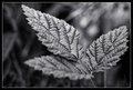
| 05/07/2007 09:49:33 AM |
Day Six: Appena una piantaby Art RoflmaoComment: Wow, I love the details & textures you can see in these leaves. Very sharp focus and the details really pop off the page...I don't know what aperture & shutter speed you used but if you use a higher aperture & slower shutter speed you could get the leave in the foreground to be in as sharp detail as the other two (although that would also increase the DOF and probably eliminate or lessen the bokeh effect such that the leaves don't pop off there background environment as much). |
| Photographer found comment helpful. |
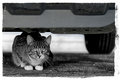
| 05/07/2007 09:45:22 AM |
Day Four: CORNEREDby Art RoflmaoComment: Yes, this cat does make an excellent photo subject:-) I like that intense stare as he/she is crouched down under the car - the mood projected is that he/she is threatened by our presence and that we are invading this cat's space as it looks at us suspiciously. Lighting and detail are great in this shot. |
| Photographer found comment helpful. |
Home -
Challenges -
Community -
League -
Photos -
Cameras -
Lenses -
Learn -
Help -
Terms of Use -
Privacy -
Top ^
DPChallenge, and website content and design, Copyright © 2001-2026 Challenging Technologies, LLC.
All digital photo copyrights belong to the photographers and may not be used without permission.
Current Server Time: 06/18/2026 10:41:51 PM EDT.