| Image |
Comment |
| 08/25/2008 09:07:31 AM |
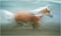
~ Seahorse ~by hihosilverComment: While most may find the blur annoying I find it very interesting and visually compelling to the shot. A great many times we catch the majesty and speed of these beautiful creatures in a static shot. Your shot captures the majesty and speed of the horse by showing us movement. It is not static at all. The lines blur literally as you SHOW us what it is to ride a horse; to feel the wind whip by as we speed along. While there is motion blur you still managed to capture some details of the horse from the face to some of the muscles rippling in the upper legs. I do have one critique though that I think could have made your composition stronger. A lower angle would have created greater visual interest. The shot was shot at a straight and level angle. Had you shot it at a lower angle looking up you would have effectively made the horse appear larger than life. In other words increase the beauty and majesty of the horse by placing it 'on a pedestal'. Still kudos to you for a lovely composition 7. |
 Photographer found comment helpful. Photographer found comment helpful. |
| 08/25/2008 08:46:15 AM |
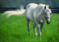
The Princeby violinist123Comment: Love the rich tones of greens and the soft whites in this composition. The soft focus adds a lovely sense of dreaminess to this photo. It also greatly adds to the sense of softness such that we can almost feel the soft touch of the grass and the silky smooth swish of the horse's tail. Love how you captured the horse's tail blowing in the breeze for it too adds to a sense of carefree days; one just spent feeling the softness of the grass upon the feet and the wind in the hair. Great job; 8. |
| Photographer found comment helpful. |
| 08/25/2008 08:41:05 AM |
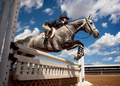
Sky High by RistyzComment: Wow! Great action shot - given the angle I say you were fairly up close to get this great shot. The lower angle shooting up gives this composition some wonderful visual interest because the horse & rider look much more impressive as they take the leap over the fence. The shot has more of the horse & rider on the sky as their backdrop adding more visual impact to the jump and playing well with the title. If you had taken this at a straight and level it would not have had the same impact. Lighting is fabulous too with a great many elements of the main subject and it's surroundings very well lit. Great capture; 8. |
| Photographer found comment helpful. |
| 08/25/2008 08:35:44 AM |
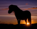
Tableau by BrinComment: Lovely hues and tones in the sunset which acts as a wonderful backdrop to the main subject: the silhouette of this wild pony/horse. I love how you can see the details of the silhouette elements not only in the wisps of hair of the mane but also the reeds on the hillside. Love the mood you captured here as well. Because of the setting sun, the dark hues and the horse in silhouette it creates a mood of feeling lonely - 'another day has passed and I still stand alone' is the feeling that this composition projects to me. Wonderful job 8. |
| Photographer found comment helpful. |
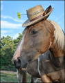
| 08/25/2008 08:29:13 AM |
"Tell the truth, Honey... Does this hat make me look fat?"by LydiaComment: Great lighting and great pose capture on your horse photo. Details are nice and sharp and the colors are fantastic! Title adds that bit of humor that just adds to the shot. My only critique is that the main focus is a head portrait shot of the horse and as such you could have cropped more (perhaps even a square crop) to eliminate the lower body. Still, this is a wonderful photo; 8. |
| Photographer found comment helpful. |
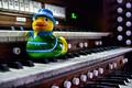
| 08/17/2008 10:15:00 PM |
Toccata and Duck in D Minorby banmornComment: Love the title! I also like the angle in which you composed your shot. The organ keys are shot at a diagonal. That helps to create strong visual interest with the keys cutting across the composition on a diagonal. This sets the stage for your duck to be posed in such a way that it appears that he is 'swimming/dancing' across the keys and coming right for us. You could have said Duckatta & Fugue as my husband is commenting over my shoulder:-) Still, not a bad title as that I got the connection immediately:-) So the title is still strong. I am not sure I like the all the level of keys that creates a three tiered 'stage' because it makes the image a bit busy. But since you choose the Toccata & Fugue which I believe was written for a pipe organ you cannot deviate by using a piano and keep the title. One way to make it less busy might be to increase your angle to be even more on the diagonal or crop closer such that the duck takes up the greater portion of the left half of the shot. In this way it would greater strengthen the focus on the ducky being the main subject of the shot. The second thing that detracts from the strength of the shot is the ducky itself. Sometimes rubber duckys can be hard to find so it maybe that this is the only one you had on hand BUT the you can hopefully not deny that green shirt and hat gives him a beachy type feel which conflicts with the classical music 'feel'. A plan ducky would have been better so as to not invoke conflicting or mismatched ideas/feel. But as I said that may have been easier said than done. Nonetheless you do want to pay attention to the choice of elements you compose within your shot such that it adds too and strengthens the shot. |
| Photographer found comment helpful. |
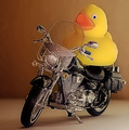
| 08/17/2008 09:44:15 PM |
Born to be wild !by TruegshtComment: Love the idea and composition of elements in this shot. Lighting is really well done. The two main elements really fill the frame so it keeps the eye's attention were it needs to be. The only thing that really bothers me is that their seems to be an odd 'halo' that outlines the front portion of the bike - it is really noticable around the tire. The ducky also has something odd going on with it as that the edges appear to be too jaggy. A guess is that you might have over-sharped the image. |
| Photographer found comment helpful. |
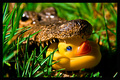
| 08/17/2008 09:34:17 PM |
Rubber Ducky Dinnerby semperwifeComment: That is either a real a real alligator or a stuffed one. Either way, this composition definately caught me by surprise. This is definately a unique and interesting composition that stands out from the rest of the crop or should I say flock:-) Anyway, nice detail on the main subjects - the teeth and the smooshed rubber duck are in sharp focus. Not quite sure if the narrow DOF that has the alligators eyes and rest of it out of focus is a plus or a minus. I will say one thing the DOF does force the eye to focus more on the jaws and the ducky. So in that respect it is a positive. If this was a real gator, as I suspect, then your control of the environment is rather limited. If this was staged in such a way that you COULD have controlled your elements then the blades of grass that obscure & cause a bit of distraction from the main focus of the shot could/should have been removed. Now onto color hues. For the most part they some nice color hues in the shot - but the green from the blades of grass look at tad too oversaturated. If you did a color adjust then I would recommend you tone it down just one tick to give it a bit more of a natural hue. |
| Photographer found comment helpful. |
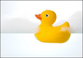
| 08/17/2008 09:20:59 PM |
Simply Duckyby h2Comment: Lighting, focus, color are all spot on in this above average shot. The composition is minimalism at it's best. The yellow ducky really pops off the white backdrop and instantly calls the eye's attention to it. Soap bubbles were a nice addition to add to visual interest and invoke the idea of a bubblebath with the ducky. |
| Photographer found comment helpful. |
| 08/17/2008 09:17:49 PM |
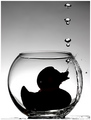
Antigravityby TechoComment: Now coming back to comment. How the?!?!?!?! Hmmm, gonna take a guess but first the critique. Love the black and white for it really calls attention to the silhouette and the 'airdome' and bubbles. Color would have probably been a distracting element. Good choice to go with the B&W. Love the crispness of details we see of the bubbles and the 'sparkling' water adorning the side of the bowl the ducky is contained in. Tones are nice and dynamic. Now, my guess is that you accomplished this visual illusion by gluing the duck down to the bottom of the bowl and then turning it upside down. The bowl is then placed it in a fish tank filled with water. The bubbles are air bubbles escaping out of the bowl as water rushes in the side. The image I would guess was flipped to make it look like the bottom of the bowl is rightside up. That is my guess. Even though I have a guess how this visual illusion was created it is still an above average composition that was executed well and very creative. |
| Photographer found comment helpful. |
Home -
Challenges -
Community -
League -
Photos -
Cameras -
Lenses -
Learn -
Help -
Terms of Use -
Privacy -
Top ^
DPChallenge, and website content and design, Copyright © 2001-2026 Challenging Technologies, LLC.
All digital photo copyrights belong to the photographers and may not be used without permission.
Current Server Time: 06/20/2026 03:08:01 PM EDT.