| Image |
Comment |
| 09/24/2010 10:14:06 AM |
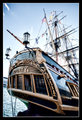
Always remember this as the day you almost caught Captain Jack Sparrow!by AmeedEl-GhoulComment: I was wondering if anyone would have the opportunity to walk aboard the Bounty for this challenge. Beautiful ship - the family and I had an opportunity to do the tour on board the ship when it was docked at port down here for a few months (and there was a pirate festival going on too:-) at the time ). Nice shot of the stern of the ship - shows off alot of the lovely detailed carvings. The angle is also interesting in that you have captured a lot of the masts and riggings of the main body of the ship. However, I think it would be an stronger composition if you had included the bow or front region of the ship. Taken at this same angle it would also have added interest over just a straight on level shot. However, that may or maynot have been possible depending on how many people might have been walking the docks (don't want people in the shot unless they were dressed in period pirate costumes) and or any obstructions that might not complement the shot. Still, a slightly above average shot and nice to see the Bounty again. |
 Photographer found comment helpful. Photographer found comment helpful. |
| 09/24/2010 10:01:42 AM |
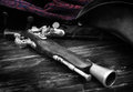
Buccaneerby TiNComment: B&W color tones are fabulous and dynamic on this compostion. The splash of red in the damask design on the jacket adds a bit of color and cements the idea that being a pirate is 'bloody' & violent business especially when the red is paired next to the period piece gun. Details and focus are great but I wish the barrel of the gun was in sharper focus for it is a touch soft. The main object that carries the idea of 'Pirate' is that period gun laying on worn wood planks, but the hat is present too - just not as much. I think the composition would have been even stronger had you pulled back from such a tight crop and included more of the captain's hat in the composition. Still, it is a great photo in the exceptional category that uses elements of pirate life to strongly convey the theme. |
| 09/24/2010 09:54:03 AM |
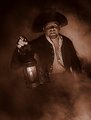
Arrr, who goes thar? by hawkeyefilmsComment: Love the sepia tones in this composition. It gives it the feel and mood of a time long past - and for some reason it specifically makes me thing that this would be a great photo to include as a picture illustration in the classic pirates tale, Treasure Island. Love all the attention to details. The fog makes it appear as if he is emerging from the shadows and adds a bit of mystique and menace. Lighting is great for the lighting your subject from underneath always casts shadows on the face that makes it look evil;menacing. Details: costume is great and even the detail with 'missing teeth' strengthens the imagery of a nasty and dangerous pirate. |
| Photographer found comment helpful. |
| 09/23/2010 09:14:10 AM |
Hornswaggler by loveComment: Great pirate portrait here! It really fits the theme showing off the one eyed pirate with the jolly roger flying it's colors not on the flag but on the patch itself! I give this full marks for meeting the challenge theme and for the great portrait head shot. Just two little critiques: The focus on the one visible eye is a little soft. I wish it could have been as sharp in focus as the eye patch. The other suggestion is that I wish you could have pulled back on the zoom or crop to include more of the pirate hat - just to further strengthen (120% :-)) the image of 'pirate'. I expect that this will be in the top 10 if not the top 5:-) |
| Photographer found comment helpful. |
| 09/23/2010 09:04:53 AM |
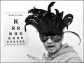
Trainee Pirate Eye Testby daisydavidComment: ROFL, the "Pirate Aye Chart"....what a wonderfully creative and funny idea! I like how you presented this in just straight black and white - very clean and minimal in it's presentation. But I am very confused as to why you put a mardi gras mask on the model? The mask just doesn't project pirates to me (oh, man she's getting very picky right?:-) ). If the model had been wearing just a simple pirate patch (can be a simple black patch) and a bandana wrapped around the head pirate fashion (a plain one color scarf or piece of long rectangular cloth) it would have greatly helped strengthen the composition to speak 'more pirate'. As it is here you have two conflicting genres: pirate and mardi gras. This is a great photo; slightly above average but had you put more attention to detail into the shot it would bump it up into the exceptional category. |
| Photographer found comment helpful. |
| 09/23/2010 08:54:26 AM |
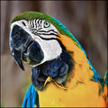
"Poor devil had his tongue cut out, so he trained the parrot to talk for him"by TammsterComment: Great and wonderful details and fabulous color on this pet portrait of this parrot. It is far above average in the technicals - color, details, and clarity. However, it needed that extra boost IN THE picture itself to have a strong connection to the pirate challenge. The connection you make to pirates is in the title and I am one who fully believes that a stronger composition would be "show, don't tell". One possibility would be showing the bird on a persons shoulder with a treat being held out to the bird with a hook 'hand; would have shown a stronger connection to pirates. The title should complement not carry the shot. As I stated earlier, this is a great animal portrait and would score well in a challenge so themed. Unfortunately, I cannot give this full marks for it fails to show a strong connection to the theme...but I will still rate it slighty above average. |
| Photographer found comment helpful. |
| 09/01/2010 09:58:46 AM |
get luckyby AliciaComment: Didn't get to comment on this last night....OMG, Alicia you certainly have cojones to enter this into a challenge:-)!
""But then I thought - what the heck. I have to shoot for myself first.""
So very true. |
| Photographer found comment helpful. |
| 07/24/2010 10:38:00 PM |
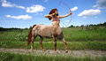
Centauressby snafflesComment: A good attempt in creating this mythical creature. I like how you decided to have an action shot of the the centauress aiming her bow (the archer in me is trying not to wince in that the bow and arrow is not quite being held right). Your pasting the centaur into the scene is good; no haloing around the main subject. However, the centuar does not appear grounded; fully there in the scene. By that I mean she appears to be floating because there is no shadow cast on the ground (you do have shadows on the underside of the horse belly and under her arms but no shadow on the ground. Creating a shadow would fully ground her as being there on the trail. (not sure which program you are using so you may have to poke around to accomplish what I am suggesting) One way to do that is copy and paste your centaur into another layer set at Normal 100% over the original then lower the Brightness to -300. You now have a full black silhouette. Flip that such that it now mirrors the centaur. Apply a geometric effect that will skew or slant it to the left. Lastly, adjust the Normal setting on the layer from 100% down to 7-15% which will make it a faint grey transparent like a shadow. I think that the tail hair is a tad too sharp edge in some spots and is a little to close in resemblance to her head hair. Feathering to avoid hard edges a maybe some directional blur to give a windblown look might help to improve it. Lastly, the composition overall looks a tad washed out (at least on my monitor). It could do with a little boost in the contrast department with playing with the Shadows/Highlights/Midtones to get a greater tonal range throughout the image. Hope some of my suggestions help with future compositions. |
| Photographer found comment helpful. |
| 07/24/2010 10:13:26 PM |
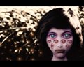
Modern Panoptesby odriewComment: The creature of "all eyes" in Greek mythos. Very effective in the creation that captures the idea of this being - an above average compositon. The decision to make the main eyes one color while the others are another is interesting. On one hand it makes the main eyes stand out and stare at me/viewer (which probably is giving some the heeby-jeebies). On the other hand the red eyes sometimes call attention away from the main eyes. I am wondering why the choice to not present Panoptes without any pupils because the glowing orbs in the backdrop at times draw focus away from the facial eyes. They are similar in shape and 'texture' ....unless that is the intent to make us think of the 'hundred eyes' without actually showing all of them on the body of the creature (the head-shot is creepy enough). |
| Photographer found comment helpful. |
| 07/24/2010 09:51:26 PM |
Homo 'Lightbraker' Sapiensby Snorri94Comment: Creating homo-sapiens as a mythical creature that has 'mystical' powers - gutsy. A very cool shot that invokes the idea of man holding the power to illuminate the night, to cast forth a rainbow from the breath of life, and to raise water in a forceful burst that is lovely in the colorful spray of blue droplets I see. I *love* the idea,, the mood, the creativity, and the capture with what might be very little post processing (I find that very impressive)! However, I just can't see Man as a 'creature' - yes, we could argue semantics in that man evolved from apes. To my mind I see this as a demigod or god and can't get past that imagery. I think you did a wonderfully effective job in creating the imagery of this being a god/demigod (and if ever a Mythical God/Goddess challenge came up I would vote this highly with full marks 8+), but just not a creature. Don't get me wrong, this is NOT a true DNMC but it does not fully capture the idea of creature - and it is more magical than mythical. For those reasons I can't give full marks but it is still above average.
Coming back to this....I just thought of the Titans but that again is a deity. Giants on the other hand are not. Hmmm, I *still* can't get past the imagery and feel that this is a magical deity (you did too good of a job on that!) - nothing in the composition gives me the indication of 'Giant'. |
| Photographer found comment helpful. |
Home -
Challenges -
Community -
League -
Photos -
Cameras -
Lenses -
Learn -
Help -
Terms of Use -
Privacy -
Top ^
DPChallenge, and website content and design, Copyright © 2001-2026 Challenging Technologies, LLC.
All digital photo copyrights belong to the photographers and may not be used without permission.
Current Server Time: 06/21/2026 11:58:27 AM EDT.