| Image |
Comment |
| 02/14/2011 03:18:33 PM |
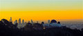
Griffith J. Griffith, the Philanthropist so nice, they named him twice!by PetRockComment: Nice view - haven't seen the Los Angeles downtown skyline and the Griffith Observatory in years. I like how you composed the shot in a long letterbox format so that you can see the sweep and span of the city. I am waffling on weather the composition would be stronger if the observatory was on the far right with the downtown buildings dominating the left half or if would be best if the observatory was on far left looking out at the expanse of city to the right. Hard to tell, but I think the composition would be stronger if you found a spot where the tall buildings of downtown had some separation from the the observatory; as it is now they are clumped together such that it is hard for these two main elements to shine. |
 Photographer found comment helpful. Photographer found comment helpful. |
| 02/14/2011 03:08:57 PM |
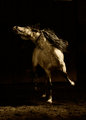
Disdainby reephotoComment: The power and the poise of this horse comes through very strongly. He/She is very displeased with something or someone. The violent shake of the head and the stretch of the neck is as if the horse is turning up his/her nose at something unseen in the photo. I like the sepia/ brown tones in photo for you take notice of the horse and the emotion much much more than had there been color. |
| Photographer found comment helpful. |
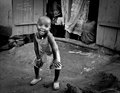
| 02/14/2011 02:52:49 PM |
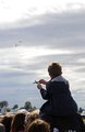
I'll be a pilot!by HistoricusComment: I love the emotion and mood captured here! The young boy gazes at the fighter planes in the distance as he plays with his toy - imagining that that is what he will make his future. He dreams of being able to fly one day. The shot is good but has soooo much potential to catapult into the exceptional score category. The composition would be stronger if you cropped out the people's heads below such that all we see is the young boy (cropped just below the elbow) and the wide blue yonder with the planes off in the distance. The people do nothing for the shot other than to take away focus from your star attraction - the little boy and the planes. Also cropping out a little off the right so that the boy is in the bottom right corner would strengthen it more. Our eyes would see the young boy with his toy plane first then travel off to the blue sky with the planes off in the horizon. |
| Photographer found comment helpful. |
| 02/14/2011 02:38:53 PM |
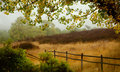
Morning in the fieldby jnenvirComment: Love the soft hues of green and golds that decorate the scenery. The bushes in the lower left corner and the dappled branch of green and yellow leaves act as a natural frame for the photo. I also like you you have the fence emerge from the right corner to act as a leading line as it stretches out towards the fields. This is a lovely country morning with some soft rich colors. |
| Photographer found comment helpful. |
| 02/14/2011 02:35:49 PM |
Gentle Morning by kawesttexComment: Simple, clean and elegant. Minimalism beautifully captured. Love how the trees emerge from the soft white environment. Nice touch with the three trees that are in the foreground that seem to come/ step forward towards us. |
| Photographer found comment helpful. |
| 02/14/2011 01:45:42 PM |
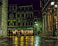
Venice Nightsby EBJonesComment: I like the quiet city street scene you have captured here - the wet cobblestone street captures the warm glow from the shop window and the streetlamps. Two people walk the romantic city streets of Venice. The biggest thing that is distracting about this shot is the it goes overboard with the Topazed colors. The color overpowers the eye. There is also a loss of detail in the upper half of the building above the store and the columns to the right seem too smooth - more loss of detail. However the stairs, the street the store and the lampposts have good detail. |
| Photographer found comment helpful. |
| 02/14/2011 01:38:34 PM |
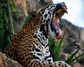
ROAR...I'm sleepy!by BuddyBaumComment: You have some nice detail here in this shot. I can see some fine details in the fur itself. And look at those teeth, yikes! A good shot but there are areas that could make it a better shot. The eyes are always a strong point - you create visual interest when you can establish eye contact. We don't have that here and that hook is lost. However you could have played up the strength you have captured in the shot - that great wide toothy yawn/roar. Cropping can make or break a composition. I think that if you had cropped that rock that is in the bottom left of the scene out it would help strengthen the photo. I would also suggest cropping out 15% of the left side. The reason: cropping such that the body of the leopard is in the left bottom corner gives the illusion that he/she is emerging from that corner. That emerging then strengthens that stretch, the great toothy roar. And it also brings the viewer closer to your main subject by cropping out distracting elements. |
| Photographer found comment helpful. |
| 02/14/2011 01:26:56 PM |
Have a White Christmasby kenskidComment: Cute poodle ...and oh my gosh, her nails are painted red! She is definitely dressed for the celebration. Nice catch lights in the eyes. This is a good photo of this dog but the composition could be stronger if it was a tighter focus on the poodle and a lower angle. First, bring us more up close and personal to this little pooch. There is just too much backdrop on either side of the dog such that it draws focus away from your main star. The other area that needs improvement is taking the shot at a lower angle such that the sofa or bed would have just be a line ....hmmm let me explain that better: There is too much of the surface of the bed/sofa showing that had you taken it at a lower angle the surface that the poodle rests on would not show so much and thus the focus is more on dog. |
| Photographer found comment helpful. |
| 02/14/2011 01:17:21 PM |
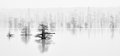
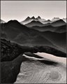
Layersby jbsmithanaComment: Great shapes and lines of the mountain-scape. Love how the clouds/fog drape themselves around the peaks. A slightly above average shot that could move into the exceptional category if the crop were different to keep focus on the strong elements in the composition. The bottom 1/3 of the shot calls too much attention away from the fabulous view of the mountain peaks. The light toned areas of the bottom third act like a beacon that draws attention away from the darker toned areas of the composition. |
| Photographer found comment helpful. |
| 02/14/2011 01:09:16 PM |
This Year's Model by gsalComment: What a great smile on this adorable little girl! She has a smile that lights up her whole face and radiates warmth. Lighting and B&W tones are fantastic. You captured the spirit of this little girl beautifully. Now I do have one critique and that is that I wish you had cropped closer to keep the main focus on the girl. There is too much empty space that does nothing to complement the picture overall. Cropping out 40% of the right half such that you have a vertical shot containing only the little girl and the open door to the left would strengthen the composition. You would bring the focus 100% onto the girl. Still a great shot but a tighter crop would make it stellar (8) |
| Photographer found comment helpful. |
Home -
Challenges -
Community -
League -
Photos -
Cameras -
Lenses -
Learn -
Help -
Terms of Use -
Privacy -
Top ^
DPChallenge, and website content and design, Copyright © 2001-2026 Challenging Technologies, LLC.
All digital photo copyrights belong to the photographers and may not be used without permission.
Current Server Time: 06/20/2026 03:16:47 AM EDT.