| Image |
Comment |
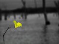
| 01/23/2006 07:58:29 PM |
41245050-M.jpgby stare_at_the_sunComment: love the color of the leaf, kind of a last of the season feeling. I think thick dark part on the top detracts from the pic a little though, maybe make it a little straighter? or really off level... |
 Photographer found comment helpful. Photographer found comment helpful. |
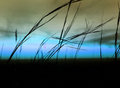
| 01/23/2006 07:55:35 PM |
46697616-L.jpgby stare_at_the_sunComment: maybe less horizon and more grass agains the sky? I too like the colors and it is elegant in its simplicity. |
| Photographer found comment helpful. |
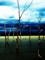
| 01/23/2006 07:53:55 PM |
41245144-L.jpgby stare_at_the_sunComment: I think the grainyness looks better in the black and white but I love your colors, very moodsy (i meant to type moody but i kept putting the s in it and finally left it :) and stark I really love the color of the water and the darker clouds on the horizon |
| Photographer found comment helpful. |
| 01/23/2006 07:38:18 PM |
49195882-L.jpgby stare_at_the_sunComment: I love how you captured the shadow! I actually like the redish look, looks old, and the texture of the leaf and snow really work well together |
| Photographer found comment helpful. |
| 01/23/2006 06:40:51 PM |
The Ivory Co_stby SJCarterComment: It does have a very pinkish hue on my monitor, maybe more of a rust color would be better but it may just be my monitor. |
| Photographer found comment helpful. |
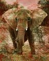
| 01/23/2006 06:37:38 PM |
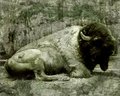
Dying Heritageby SJCarterComment: very nice, your colors are great, maybe a hint red, just on the main part if thats possible. Really screams plains to me when i first saw it which doesnt make sence since there looks to be trees in the bg. The head is great for me, but I wish I could see just a glimmer of the eye. |
| Photographer found comment helpful. |
| 01/23/2006 06:33:28 PM |
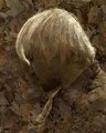
Turned Awayby SJCarterComment: I like your colors, the texture of the hair and the different textures of the leaves, i really like the leaves on the neck. What I dont like: the hair looses some of its texture because of the mask, could you lessen it just on the hair? and the darker halo around his, i mean your head. |
| Photographer found comment helpful. |
| 01/23/2006 06:29:14 PM |
Aging Iconby SJCarterComment: Incredibly artistic, i love the colors, the black of the face really makes the eyes stand out, looks like hes blending into an old crumbly wall. Love it. One thing I might have done is put the eye in more of a 3rds position, crop the top and left just a bit, id love to see several different crops on this one. |
| Photographer found comment helpful. |
| 01/23/2006 01:18:01 AM |
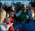
Take Me To Your Leader.....by espy2Comment: Rose,
You dont appreciate Ben's comments because they were after you had a conversation in your thread. Because he went back and looked at your photo and tried to tell you what was could be done different with it doesnt mean he is wrong. Your subject is interesting, it has a standing out in a crowd feel and the colors are great, but the bluring is off. How else can one say it. What really stands out is the fence behind her which should be blured and the thing in her hair which is half blured and her hand which is half blured. That stands out to someone voting especially those that think the dof should have been in camera (which I am not one of to clarify). One thing to ask is if you could go back and do this again could you do it better. |
| 01/20/2006 11:49:42 PM |
|
| Photographer found comment helpful. |
Home -
Challenges -
Community -
League -
Photos -
Cameras -
Lenses -
Learn -
Help -
Terms of Use -
Privacy -
Top ^
DPChallenge, and website content and design, Copyright © 2001-2026 Challenging Technologies, LLC.
All digital photo copyrights belong to the photographers and may not be used without permission.
Current Server Time: 07/17/2026 10:03:16 PM EDT.