| Author | Thread |
|
|
01/23/2006 07:53:55 PM |
|
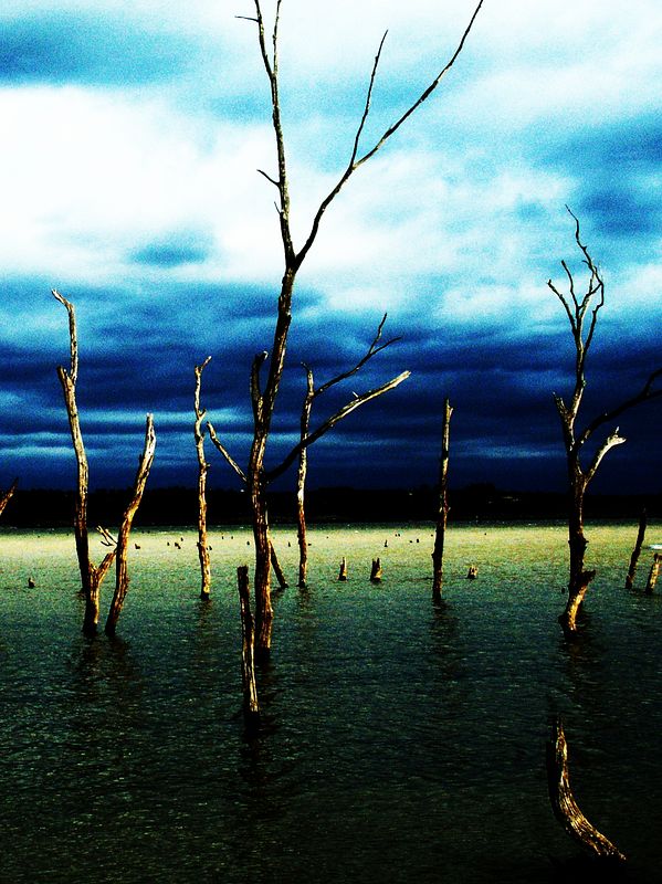
I think the grainyness looks better in the black and white but I love your colors, very moodsy (i meant to type moody but i kept putting the s in it and finally left it :) and stark I really love the color of the water and the darker clouds on the horizon |
|
 Photographer found comment helpful. Photographer found comment helpful. |
|
|
01/23/2006 05:15:09 PM |
|
I really like the dark forboding tones and mood that the deep colors establish. My only nit is that the horizon is slightly tilted. Otherwise, outstanding job. :-) |
|
| Photographer found comment helpful. |
|
|
12/19/2005 05:06:37 PM |
|
I think this is better than b&w. I would love a copy of this. |
|
| Photographer found comment helpful. |
|
|
11/22/2005 01:49:57 PM |
|
I like this shot better than the black and white. I think the post processing colors really add "mood" to this photo. |
|
| Photographer found comment helpful. |
|
|
10/23/2005 09:48:58 PM |
Too much post-processing for my taste. I much prefer  |
|
| Photographer found comment helpful. |
Home -
Challenges -
Community -
League -
Photos -
Cameras -
Lenses -
Learn -
Help -
Terms of Use -
Privacy -
Top ^
DPChallenge, and website content and design, Copyright © 2001-2026 Challenging Technologies, LLC.
All digital photo copyrights belong to the photographers and may not be used without permission.
Current Server Time: 06/10/2026 06:29:13 PM EDT.