| Image |
Comment |
| 05/27/2006 02:39:33 AM |
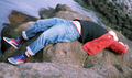
Anyway the wind blowsby bergwaltersComment: ::: Critique Club :::
Hi, my name is Kari and from the critique club.
First Impression - the most important one:
Interesting shot .. good lines .. interesting boxers (grin)
Composition:
its like the feet and arms hit the thirds vertically and the tummy hits the top thirds .... which to me seesm a little centred .... I can see the rocks are a little more vertical than your crop depicts ... would cropping it a little more upright have changed the composition enough to take in the leading lines of the water further?
Subject:
Meets the challenge .. in fact seems downright at home here :)
Technical (Colour and light):
I love natural light ... and you used it well.
To grow its vote?:
You seem to be challenging yourself outside of your comfort zone .. and this is good. It takes time to develop the skills to pull off the higher scores .. and sometimes you have managed to do this from your portfolio.
Summary:
You have a good eye .. keep building your skills .. .you are doing great.
If you've got any questions about this critique, please feel free to contact me via the PM system.
Cheers
Kari |
| 05/27/2006 02:32:40 AM |
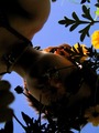
Flower Childby vergComment: B] ::: Critique Club :::[/b]
Hi, my name is Kari and from the critique club.
First Impression - the most important one:
Its not the dark that got me .. It is an interesting take on the challenge.
Composition:
It feels either upside down ... or around the wrong way ... the leading lines e.g. the body seems to take me away from the picture not into it ... maybe a look at either the mirror or flipped image would create.
Subject:
It meets the challenge ... but is this really her natural environment.
Technical (Colour and light):
Ok dark .. lets talk about it here ... it is dark .. but that does not detract for me nor my partner (I asked him ... kiwipix on here) ... we both feel that this is ok ... but for a portrait I think that people would have trouble with this. I think that you have achieved more than some in your picture, but if you had changed the lighting and perhaps changed the perceived upsidedownness of the picture it would be different ... believe it or not ... it would not be your picture .. which holds its own .. but these are my thoughts.
To grow its vote?:
Take a safe picture ... and you will score higher ..stretch yourself and challenge others thoughts and you will grow personally.
Summary:
It didn't brown .. which is good ... I think you challenged the norm .. and yourself with a new type of shot. keep it up.
If you've got any questions about this critique, please feel free to contact me via the PM system.
Cheers
Kari |
 Photographer found comment helpful. Photographer found comment helpful. |
| 05/26/2006 09:00:28 PM |
American Gardenerby jrjrComment: ::: Critique Club :::
Hi, my name is Kari and from the critique club.
Interesting to do a critique on your image but it is difficult if you don't give us any information in your photographers comments. When we do a critique, we go past just the photographic result, that's what voters comments do. The critique looks at what you were trying to achieve, how you wanted it to look and what issues you had in getting the image captured and ready for voting.
First Impression - the most important one:
Sorry it wasn't till I read the comments that I thoguht about the humour (more fool me) ... this is an interesting take on the typical gardener.
Composition:
I don't feel this really meets many rules of composition. This is not on thirds (I don't think) .. the ruler itself seems to be centred in the frame .. would could have used the background plants to create a leading line .. but choose not too ... it meets the challenge .. but just misses that extra something. Also I think may have look better rotated slightly so that the ruler was straight ... as you can see also that the light line at the top is also quite crooked.
Subject:
Meets the challenge .. and does so well ...
Technical (Colour and light):
Natural light always good .. the flaring at the top could have been burned .. but I think is adds a nice frame ...
To grow its vote?:
This is so out of the box from what you normally seem to do it is great. keep challenging yourself .. it is good to see.
Summary:
Well done ... keep it up.
If you've got any questions about this critique, please feel free to contact me via the PM system.
Cheers
Kari |
| Photographer found comment helpful. |
| 05/26/2006 08:54:02 PM |
Jullietby PanoComment: ::: Critique Club :::
Hi, my name is Kari and from the critique club.
Interesting to do a critique on your image but it is difficult if you don't give us any information in your photographers comments. When we do a critique, we go past just the photographic result, that's what voters comments do. The critique looks at what you were trying to achieve, how you wanted it to look and what issues you had in getting the image captured and ready for voting.
First Impression - the most important one:
Beautiful model .. but it does take more than the model to have a fantastic shot.
Composition:
This is fine ... the DOF is ok ... could have been shallower allowing more blurring of the background to make her the only focus instead of doing what I do in my office and staring out of the window.
Subject:
meets the challenge .. and meets it well ...
Technical (Colour and light):
This is where your issues were. I am not sure if you had access to additional lighting at work ... or anything as you have not added any comments to assist is what you were looking for in the shot.
Office lighting is harsh at the best of times .. and with only half the face lit she this picture is not as flattering or beautiful as it could have been.
To grow its vote?:
Check out those who score higher ... see what the differences to your shot were .. and think about how you can add more interest into your shot. unfortuantely ... shots at the office in this challenge .. didn't seem to do great.
Summary:
You done good ... she looks lovely ... and comfortable (my workmates hate me taking their pics).
If you've got any questions about this critique, please feel free to contact me via the PM system.
Cheers
Kari |
| Photographer found comment helpful. |
| 05/26/2006 08:46:43 PM |
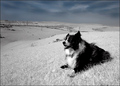
Working Dogby marboComment: ::: Critique Club :::
Hi, my name is Kari and from the critique club.
First Impression - the most important one:
Its a dog .. but one of a very select few that I don't really mind.
Composition:
Well done, I think that slightly more on the left may have put the dog on true thirds .. but is works ... the leading lines through the landscape and the sky add.
Subject:
Meets the challenge, but has challenged peoples thinking.
Technical (Colour and light):
Well done .. natural and lovely. Hard to tell if this is selective desat or not .. and that I like.
To grow its vote?:
Put in a person . .you know that is what people thought should be there.
Summary:
Great .. nice challenge to the way of thinking .. and well thought through. Keep it up.
If you've got any questions about this critique, please feel free to contact me via the PM system.
Cheers
Kari |
| Photographer found comment helpful. |
| 05/26/2006 08:37:04 PM |
busy alexby gocComment: ::: Critique Club :::
Hi, my name is Kari and from the critique club.
You have a lot of processing steps in your comments, but nothing to tell me what you were looking to get from your shot. Having this information helps with the critiquing further as when we know what you strive for we can tailor comments to that.
First Impression - the most important one:
Interesting shot ... taken in an office ... not too ho hum.
Composition:
This is where it works .... that person is in one third .. where the computer takes a half ... the phones line may behave like a leading line, but it doesn't seem to .. interesitng DOF .. and most appropriate that we can't read his screen ...
Subject:
Meets the challenge ...
Technical (Colour and light):
Good, well done .. office lighting is harsh as mentioned in the comments you got ... such is life really. you did great with what you had.
To grow its vote?:
It is a good solid shot, but not a stunning interesting shot. It works for the challenge, but I can't see this shot scoring higher ...
Summary:
Great work .. good to challenge yourself to do different things that you are not use to keep up the great work.
If you've got any questions about this critique, please feel free to contact me via the PM system.
Cheers
Kari |
| Photographer found comment helpful. |
| 05/26/2006 08:28:49 PM |
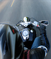
Portrait of a Riderby seebrownComment: ::: Critique Club :::
Hi, my name is Kari and from the critique club.
First Impression - the most important one:
Fellow riders UNITE!! ... great shot .. when I looked through the challenge I was wondering how the hell this was done .... congrats.
Composition:
I like this the speed feeling the clarity that the focus is true on the bike .. and that people are truely led to look at where you are going. My only question would have been could there have been more on the right side of the pic ... to have a person drawn in a taken with the journey so to say.
Subject:
Meets the challenge .. to some it didn't and this hurt your score .. there is nothing in portraits that says you have to include the face .. and I am very extremely proud that your wore your helmit .. to have seen the face in the mirror would mean sacrificing safety and this should not be done.
Technical (Colour and light):
Great .. natural .. good levels.
To grow its vote?:
play it safe .. put in a face and make sure you don't challenge yourself.
Summary:
Well done .. great shot .. truely an environmental portrait.!
If you've got any questions about this critique, please feel free to contact me via the PM system.
Cheers
Kari |
| Photographer found comment helpful. |
| 05/26/2006 08:22:54 PM |
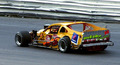
Brian DeFebo #53 Asphalt Modifiedby bs-photosComment: ::: Critique Club :::
Hi, my name is Kari and from the critique club.
First Impression - the most important one:
Its a picture of a car .. definately an environment .. but I can't say this is a portrait. But hey you said that in your comments and I belive that you knew this was not going to score great. Like me entering something to challenge the norm ... not good on the averages .. but can be quite fun.
Composition:
The lines in the back are good they drag the eye through the picture ...
Subject:
DNMC ... great environment shot in some ways .. but I think would appeal only to a certain crowd .. to me its a pic of a car .. and like rugby ain't exciting ... but appears well taken for the shot it is.
Technical (Colour and light):
colour is fine .. lighting is fine .. love that natural light thing it seems to work.
To grow its vote?:
Meet the challenge .. but that is boring ... keep challenging the norm ...
Summary:
I like it for the out of the box ... I think you were lucky this time not to brown ... but then again I checked you probably should have scored better .. keep shotting your portfolio is really coming along.
If you've got any questions about this critique, please feel free to contact me via the PM system.
Cheers
Kari |
| Photographer found comment helpful. |
| 05/26/2006 08:16:06 PM |
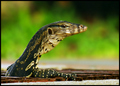
Underworldby kloutitComment: ::: Critique Club :::
Hi, my name is Kari and from the critique club.
Interesting to do a critique on your image but it is difficult if you don't give us any information in your photographers comments. When we do a critique, we go past just the photographic result, that's what voters comments do. The critique looks at what you were trying to achieve, how you wanted it to look and what issues you had in getting the image captured and ready for voting.
First Impression - the most important one:
Ok .. I hate things that are yukky to me and this is one of those things ... I am a kiwi and we don't have this sort of stuff. This is fastastic seeng it so close yet knowing it ain't going to hurt me.
Composition:
Meets thirds .. as the head is on te horizontal ... has leading lines .. as the neck drawd into the picture ... has such cute wee eyes ;)
Subject:
Does it meet the challenge ... it is in its own environment ... so .... YES .. to me it does. But remember that is my opinion .. you have been hurt scores wise by the DNMC crowd ... as it is a fantastic picture.
Technical (Colour and light):
Great .. good crisp colours ... good DOF ... and nice lighting.
To grow its vote?:
Hard to say in another challenge this may have won ... so truely difficult with the DNMC vote ...
Summary:
Fantastic .. keep challenge people of what they think meets the challenge ... I like the outside the box thinkers :)
If you've got any questions about this critique, please feel free to contact me via the PM system.
Cheers
Kari |
| 05/26/2006 08:09:37 PM |
Day Traderby owenComment: ::: Critique Club :::
Hi, my name is Kari and from the critique club.
First Impression - the most important one:
You did well not to get cruel comments. This seems to be so totally out of the zone for you .. so good going to enter.
Composition:
This is great ... plays well the the thirds and leading my eyes into the shots with the arm taking a slight leading line.
Subject:
meets the challenge, but also confirms why I didn't enter. The only problem with this shot is that it is the workplace and the environment, and neither is what I would call sexy .. or interesting. Is a good shot and that is what you have been scored on.
Technical (Colour and light):
Clear crisp .. good use of DOF ... nice colours and solid office type lighting.
To grow its vote?:
This is the issue .... I think there are few of the top pictures that are taken in their own natural environment (anastasia excluded) ...but that interesting environments were sought out for the pics.
Summary:
Great shooting .. nicely away from your 'normal' shots and I think a good stretch for your skills. Well done.
If you've got any questions about this critique, please feel free to contact me via the PM system.
Cheers
Kari |
| Photographer found comment helpful. |
Home -
Challenges -
Community -
League -
Photos -
Cameras -
Lenses -
Learn -
Help -
Terms of Use -
Privacy -
Top ^
DPChallenge, and website content and design, Copyright © 2001-2026 Challenging Technologies, LLC.
All digital photo copyrights belong to the photographers and may not be used without permission.
Current Server Time: 07/19/2026 01:07:52 PM EDT.