| Image |
Comment |
| 05/27/2006 09:01:22 PM |
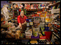
The Shop Assistantby DjabordjaborComment: ::: Critique Club :::
Hi, my name is Kari and from the critique club.
First Impression - the most important one:
A truely underrated and fantastic entry into this challenge.
Composition:
person on thirds .. yt is does seem contrived .. the building up of candy and mags is just like I think it should be for this type of shop.
Subject:
Meets the challenge extremely well.
Technical (Colour and light):
Flourescent (I think that is above the person) is hard .. and here it worked ... good sharp colours and lovely movement capture.
To grow its vote?:
I ahve no idea but your commentors did .. re engaging the person etc .. I think it would like fake personally .. I think it is great as it is.
Summary:
You have an awesome eye ... keep up the work.
If you've got any questions about this critique, please feel free to contact me via the PM system.
Cheers
Kari |
 Photographer found comment helpful. Photographer found comment helpful. |
| 05/27/2006 08:55:24 PM |
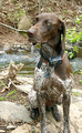
Sofia Huntingdogby neophyteComment: ::: Critique Club :::
Hi, my name is Kari and from the critique club.
First Impression - the most important one:
Dogs are so bloody difficult to shoot ... well done.
Composition:
This is very frame centred .... and I do miss the paws .. sorry to repeat whatyou have already heard.
Subject:
Meets the challenge ... and is in her environment .. what is funny is how many of the comments you received that found just that very distracting.
Technical (Colour and light):
Is well lit naturally ... it seems slightly oversharpened to me ...
To grow its vote?:
I don't know that animals did well in this challenge ... it seems that voters till wanted a person in the shot ... if you had Ed the hunter there as well I think it may have done better.
Summary:
is a lovely shot .. good work.
If you've got any questions about this critique, please feel free to contact me via the PM system.
Cheers
Kari |
| Photographer found comment helpful. |
| 05/27/2006 08:50:01 PM |
|
| Photographer found comment helpful. |
| 05/27/2006 08:47:43 PM |
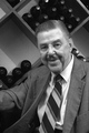
An artist in his studioby Ian-AndrewComment: ::: Critique Club :::
Hi, my name is Kari and from the critique club.
First Impression - the most important one:
This picture is true to the challenge - an environment and the actual artist ... real stuff really.
Composition:
Ok I go with kiwipix on this .. (he knows more than me and I live with him so I listen) .. I don't mind that the background is dark .. when I used to work on stuff I only ever focused on my work .. so this is what he seems to do here in this picture. a slightly shallower DOF may have worked so that the background distracts less though. Although I recropped based on the front of the pic and the guy with slight alteration of lighting and it also worked.
 Subject:
Meets the challenge well.
Technical (Colour and light):
I am not sure if you used flash or lighting .. either way it is a little harsh on the guy. its advanced editing so trying to eliminate this would have been a fun thing to do.
To grow its vote?:
more focus of the bloke and less of trying to darken the environment .. different croppings ... lots of ways .. but I was disappointed as you would have been at how this did .. I thought it was great for the challenge.
Summary:
Good work keep it up ... you have a agreat eye.
If you've got any questions about this critique, please feel free to contact me via the PM system.
Cheers
Kari Message edited by author 2006-07-04 06:09:02. |
| Photographer found comment helpful. |
| 05/27/2006 08:36:36 PM |
Team Tuskerby ArtanComment: ::: Critique Club :::
Hi, my name is Kari and from the critique club.
First Impression - the most important one:
I don't understand why you asked for a critique on a picture that you have quite honestly canned yourself. I think it may be just because the button is there that you pushed it.
Composition:
Is fine .. I appreciate the time you have taken to straighten the picture and ensure that the lines are nicely aligned.
Subject:
Meets the challenge, yet I would not expect to see the reins being held from outside the box by someone .. I would have thought the horse would be out of the box or the lad in it for that to be a need.
Technical (Colour and light):
Balck and white overkill in my opinion .. and it is only my opinion. Some thing s deserve to be seen in colour and animals seem to work best wtih that in mind.
To grow its vote?:
Don't sprain your ankle before a shot .. trust me I know you know what I am talking about.
Summary:
good luck moving forward.
If you've got any questions about this critique, please feel free to contact me via the PM system.
Cheers
Kari |
| Photographer found comment helpful. |
| 05/27/2006 08:28:46 PM |
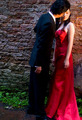
Stolen Kissby scared_of_the_darkComment: ::: Critique Club :::
Hi, my name is Kari and from the critique club.
First Impression - the most important one:
Doesn't seem quite to fit the challenge .. and there is an issue with the lighting ...
Composition:
Interesting with the two of them in the same part of the frame ... cropping hte lower part of the frame removes the lighting distraction and may have helped ... creating the impression of seeing more of the females face.
Subject:
Not sure if it meets the challenge ... but is a lovely shot ...
"Photograph a portrait that says something about the subject within the framework of their own environment."
Technical (Colour and light):
Here are some of the issues ... the bottom of the skirt is lit well .. and the wall behind them is lit along with her arm ... but there seens to be a need to light her and emphasise what she is doing there ....
To grow its vote?:
Think about the challenge in an exact manner and then go and shoot .. this is a great shot just not a natural environment ... is a great shot for before a dance .. or something like that ...
Summary:
Godo work .. you have a great eye and an awesome portfolio building up .. keep it up.
If you've got any questions about this critique, please feel free to contact me via the PM system.
Cheers
Kari |
| Photographer found comment helpful. |
| 05/27/2006 08:20:36 PM |
Doctor at workby talikfComment: ::: Critique Club :::
Hi, my name is Kari and from the critique club.
First Impression - the most important one:
I don't like that Doc .. she got needles .. and i hate them ... great work
Composition:
This is quite well done .. she is not centered .. she looks comfortable .. she also looks like she knows what she is doing.
Subject:
Sort of meets the challenge ... although it does not contain what would be the environment .. by being stark it creates the impression.
Technical (Colour and light):
Good work here .. nice and crisp and works in black and white.
To grow its vote?:
I think it may be the lack of the environement that didn't help here ... but the shot is good .. don't give her a copy for her wall it will scare kids.
Summary:
Good work again ... interesting shot ...
If you've got any questions about this critique, please feel free to contact me via the PM system.
Cheers
Kari |
| Photographer found comment helpful. |
| 05/27/2006 08:16:47 PM |
Preschool Daysby jenesisComment: ::: Critique Club :::
Hi, my name is Kari and from the critique club.
First Impression - the most important one:
Teacher .. defiantely ... a little nervous in front of the camera .. lovely smile.
Composition:
Composition is ok ... having her to one side of the picture works well ... having the books and stuff around her creates the environment.
Subject:
meets the challenge .. and does so well.
Technical (Colour and light):
It is ok .. not fantastic .. but ok ... I like the colours .. as it is a class type setting they work.
To grow its vote?:
and like some of the others I would like to see the kids ... one of the other entries did this

and hit the top 5 ... is only one major difference between the pics .. and that is kids.
Summary:
Good job .. but as you seem to guess not your best ... keep shooting you got a great eye.
If you've got any questions about this critique, please feel free to contact me via the PM system.
Cheers
Kari |
| Photographer found comment helpful. |
| 05/27/2006 05:53:20 PM |
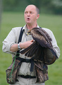
Peter says "ouch!"by KHoltComment: ::: Critique Club :::
Hi, my name is Kari and from the critique club.
First Impression - the most important one:
Interesting shot ... I want to know what he is saying though, I think it would be interesting.
Composition:
the falcon hits vertical thirds but I am not sure this is intentional or not as the rest is very centred.
Subject:
Meets the challenge extremely well ...
Technical (Colour and light):
The DOF is good and well used here ... I thin kI would have liked less of the guys body and a tighhter crop on his face and the bird to create that forceful image those birds have.
To grow its vote?:
Not too sure .. different cropping .. slightly different angle .. hard to tell .. I think you did really well with this shot though .. it was a tough challenge.
Summary:
Well done, keep it up you are doing great!
If you've got any questions about this critique, please feel free to contact me via the PM system.
Cheers
Kari |
| Photographer found comment helpful. |
| 05/27/2006 05:50:15 PM |
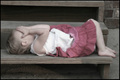
Lessons Learned Youngby beermanComment: This is a lovely image, a little too soft for me ... but lovely .. it doesn't portray failure to me at all .. |
| Photographer found comment helpful. |
Home -
Challenges -
Community -
League -
Photos -
Cameras -
Lenses -
Learn -
Help -
Terms of Use -
Privacy -
Top ^
DPChallenge, and website content and design, Copyright © 2001-2026 Challenging Technologies, LLC.
All digital photo copyrights belong to the photographers and may not be used without permission.
Current Server Time: 07/18/2026 09:53:05 AM EDT.