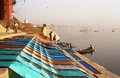
DPChallenge: A Digital Photography Contest You are not logged in. (log in or register
 
Browse Settings
Currently viewing:
Registered Userkari1

Show comments:

Per page:

Order:

Comments:


Comments Made by kari1
Pages:   ... [179] [180] [181] [182] [183] [184] [185] ... [222]
Showing 1811 - 1820 of ~2213
Image Comment
Washermanpet!
01/14/2006 03:04:19 PM
Washermanpet!
by doctabrez

Comment:
::: Critique Club :::

Hi, my name is Kari and from the critique club.

The critique I am doing is for "Washermanpet"

Great fun to do a critique on your image but it is difficult if you don't give us any information in your photographers comments. When we do a critique, we go past just the photographic result, that's what voters comments do. The critique looks at what you were trying to achieve, how you wanted it to look and what issues you had in getting the image captured and ready for voting.

First Impression - the most important one:
It made me glad to live in New Zealand ... look at that smog ... I love anything that makes me appreciate home.

Composition:
I like the way that this picture has leading lines taking the eye further into it.

Subject:
Does it meet hte subject. Well the city is in the background .. .the focus is not on that. It could be part of t he city, but it doesn't scream that ... but I felt that it was and that it did meet the challenge and personally marked it accordingly .. others may have had the same questions about "on challenge".

Technical (Colour and light):
I wonder if this could be sharpened .. or if by doing that it becomes too it becomes too granualted. I like the lighting in the picture .. and the colours, but I think the sharpness is what is letting it down. Also, I know this is a minor issue, but if when you resize it you do it to the maximum it helps with the impact on opening.

To grow its vote?:
A number of issues raised .. Shapening ... Size ... keep thinking about these are you shoot.

Summary:
I really like the photo during voting and I still like it. I wish I had more details for your picture and the story behind it as this would be cool.

If you've got any questions about this critique, please feel free to contact me via the PM system.

Cheers

Kari
Photographer found comment helpful.
Geometric
01/14/2006 02:52:16 PM
Geometric
by shamrock

Comment:
::: Critique Club :::

Hi, my name is Kari and from the critique club.

The critique I am doing is for "Geometric"

First Impression - the most important one:
Neat shot .. like the glass .. not sure of the DOF.

Composition:
I like this set up ... it is very centred (but who really cares) ... the mirror effect of the glass is fantastic ... overall a very good photo.

Subject:
Now this does meet the subject ... shape in a toy ... I like it.

Technical (Colour and light):
Its the narrow depth of field that is the issue here. I think that this is a subject where the blurring of the DOF did not work. Really wanted something crisp. This appears to be an issue for a number of commentators.

To grow its vote?:
Wow this is hard .. that was a tough challenge ... I think look at the DOF .. and check and try cropping in different manners ... trying to look at thirds and leading lines for the eye.

Summary:
I think this is cool .. I commend your son on putting together the image. ... I commend you on a good photo ...

If you've got any questions about this critique, please feel free to contact me via the PM system.

Cheers

Kari
Photographer found comment helpful.
Mother and Son, Country Silhouette
01/14/2006 02:40:46 PM
Mother and Son, Country Silhouette
by PhotoTess

Comment:
::: Critique Club :::

Hi, my name is Kari and from the critique club.

The critique I am doing is for "Mother and Son, Country Silhouette"

First Impression - the most important one:
What a beatiful silhoette, the sky looks fantastic .. and really helps to capture the feeling of love in the air.

Composition:
I like the setup of this picture, I can't imagine how many times they did this to achieve the shot you got. My main issue would be in the cropping, I think that trying various croppings that get the subjects on the third lines may have ienhance the picture. There was a lot of black at the bottom this didn't really do a lot for the picture, there is nothing against it, but did it help the image ... not really sure here.

Subject:
Mum and son ... this totally meets the subject.

Technical (Colour and light):
I think that this is really quite good in this picture, Can I ask if you used a filter here?

To grow its vote?:
This was a tough competition .. I personally think you did fantastic with a great shot.

Summary:
Lovely shot, great concept and well worked. This is your highest scoring so far .. .and it deserves to be. Keep it up you are improving and doing a great job.

If you've got any questions about this critique, please feel free to contact me via the PM system.

Cheers

Kari
Photographer found comment helpful.
Recovering on New Years Day
01/12/2006 07:34:12 PM
Recovering on New Years Day
by _eug

Comment:
I really like this shot. The tree as a natural border works well for me. What really appealed is it is a sight I see daily in Wellington, New Zealand on my way to and from work. It is great to see this happens elsewhere.

I think that the crop makes the photo look more of what you would see wondering around.

Things that I may have tried to take it up a notch would be a mild reduction in brightness of around -10 and up the contrast around 10 as well. This deepens the colour and may have pulled it through a little more.

Kari
Photographer found comment helpful.
cherries
01/12/2006 07:28:21 PM
cherries
by noseprints

Comment:
I really don't like the border here, it is distracting by not being even and takes away from the picture as is too heavy.

I like the picture itself ... it is really quite interesting.

I found the lighting a bit dark, I would like the light to work slightly more on the cherries - give them context in the picture.

I like the depth of field that you have used ... the cropping also works .. I don't even think that a huge border should be used to compensate for cropping - even a thin border works for this.

Hope this helps.

Kari
Photographer found comment helpful.
natural back lighting
01/12/2006 02:03:16 PM
natural back lighting
by steveh552

Comment:
Thsi would be lovely with a cuple of changes - Straighten the picture - by rotating it right (I think right is right). Make it 640 on the longest side. After resizing ... sharpedn .. this will ensure the lines are crisper. I do like your concept .. I think better execution and it would have scored better.
Photographer found comment helpful.
INDIAN SALTY DISH(DALL)
01/12/2006 01:55:48 PM
INDIAN SALTY DISH(DALL)
by sandeepsalwan45

Comment:
Good concept but the picture is not fosed, and I think there is camera shake. Also the dish is centred - this would have looked better on thirds.
Photographer found comment helpful.
Dessert Anyone
01/12/2006 01:54:58 PM
Dessert Anyone
by kingsley

Comment:
I would loved to have scored this higher, but it just doesn't have the impact and is an extremely small picture.
Photographer found comment helpful.
Radicchio - Recipe for a Better Salad
01/12/2006 01:54:19 PM
Radicchio - Recipe for a Better Salad
by ltaylor

Comment:
Nice idea, but it just doesn't look crisp (the picture that is).
Photographer found comment helpful.
vanilla sky pudding
01/12/2006 01:53:47 PM
vanilla sky pudding
by goc

Comment:
I found this image very distracting, is it near a mirror. Also very centred.
Photographer found comment helpful.
Pages:   ... [179] [180] [181] [182] [183] [184] [185] ... [222]
Showing 1811 - 1820 of ~2213


Home - Challenges - Community - League - Photos - Cameras - Lenses - Learn - Help - Terms of Use - Privacy - Top ^
DPChallenge, and website content and design, Copyright © 2001-2025 Challenging Technologies, LLC.
All digital photo copyrights belong to the photographers and may not be used without permission.
Current Server Time: 09/08/2025 10:50:06 PM EDT.