| Image |
Comment |
| 09/23/2005 05:15:40 PM |
"Rule thru the Three's"by sfarrell23Comment: Okay, had a huge comment, but I got distracted and lost it.
The blue and red die have more visual color weight, the blue has tirds positional weight, but neither are the subject. The green has less color weight, but has focus weight, but the view is drawn off by the tape measure leaving the scene, and the eyes leaves, and the brain becomes disinterested. |
| 09/23/2005 04:49:06 PM |
look thoughtfullyby armandusComment: I like the positioning of this photo, composition a whatnot, but she looks a little washed out and flat. |
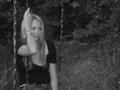
| 09/23/2005 04:46:27 PM |
waitingby muckpondComment: I think you gave the photograph good tension by facing the subject out of the frame, leaves you wondering what she's waiting for.
I would have preferred her a little to the left. Also, I've read (and notifced more sinc reading it) that facing objects to the left creates more tension. I tried it on this picture, and it changes from waiting for a friend and bored, to waiting to go into a hospital room or something more forebodeing.
I like the tonal range, and how the flattened but still textured wall (or whatever leads your eye to her. Nice use of negative space. Move her a little center, and facing left and I really like this much better. |
 Photographer found comment helpful. Photographer found comment helpful. |
| 09/22/2005 08:53:57 PM |
|
| 09/22/2005 08:44:50 PM |
|
| Photographer found comment helpful. |
| 09/22/2005 08:42:00 PM |
|
| Photographer found comment helpful. |
| 09/22/2005 08:41:07 PM |
|
| Photographer found comment helpful. |
| 09/22/2005 03:20:35 PM |
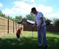
The Mentor - (finding a new way to get back in the swing)by ltaylorComment: I voted this low because:
1. Tonality/range. Your subjects are in the darkness and the sky is washed out. Better to take pictures into the dark than to lose them against the sky
2. Doesn't have a clear subject to begin with. If you're going to make grandpa the subject, make sure that that is clear in your composition. Likewise for the boy, but If he is the subject, then he nees to be closer in the frame, or have much less distraction (fence, grandpa, sky, house)
4 just to be sorta nice. Not trying to be to harsh, but I hate when people vote me down without telling me why, so I thought I'd tell you. |
| Photographer found comment helpful. |
| 09/21/2005 10:02:00 PM |
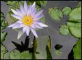
Lily Pond Flowerby ktm7Comment: I'd suggest looking into a good circular polarizer to cut down on the reflections on the water. |
| Photographer found comment helpful. |
| 09/21/2005 09:51:46 PM |
|
Home -
Challenges -
Community -
League -
Photos -
Cameras -
Lenses -
Learn -
Help -
Terms of Use -
Privacy -
Top ^
DPChallenge, and website content and design, Copyright © 2001-2026 Challenging Technologies, LLC.
All digital photo copyrights belong to the photographers and may not be used without permission.
Current Server Time: 06/10/2026 11:40:21 PM EDT.