| Author | Thread |
Comments Made During the Challenge  |
|
|
09/27/2005 04:37:24 AM |
|
 Photographer found comment helpful. Photographer found comment helpful. |
|
|
09/25/2005 05:53:50 PM |
|
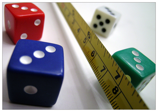
nice still. great color and lighting the white is white that is good.... but i can't seem to clearly see 1 point of intrust found in the tthird...IMHO this type of shot isn't suited well for the challenge...i suspose the infocus 7 inch marker is right at the intersection of the lower third and the right...but it just (again IMHO) doesn't show the rule and a good use of it well enough...gl great set |
|
| Photographer found comment helpful. |
|
|
09/25/2005 04:20:59 PM |
|
meets challenge focus is strange, not sure where to look, good colour |
|
| Photographer found comment helpful. |
|
|
09/23/2005 11:32:22 PM |
|
Very cleverly done. Masterful use of all the techniques of photography, from lighting to DOF to color and exposure. All of it, in one picture. Great job! |
|
| Photographer found comment helpful. |
|
|
09/23/2005 07:28:50 PM |
|
Interesting DOF makes for a nice effect. |
|
| Photographer found comment helpful. |
|
|
09/23/2005 06:10:31 PM |
|
The narrown depth of field doesn't work here and the shadows from multiple light sources just don't look good at all. One strong light source from the back-left would have sufficed. |
|
|
|
09/23/2005 05:15:40 PM |
Okay, had a huge comment, but I got distracted and lost it.
The blue and red die have more visual color weight, the blue has tirds positional weight, but neither are the subject. The green has less color weight, but has focus weight, but the view is drawn off by the tape measure leaving the scene, and the eyes leaves, and the brain becomes disinterested. |
|
|
|
09/23/2005 04:01:06 PM |
Fits challenge=5
Color/lighting=1 -nice variety of colors and good lighting.
DOF/focus=1
Wow factor/uniqueness=0
Attractiveness=0
|
|
| Photographer found comment helpful. |
|
|
09/23/2005 03:40:13 PM |
|
| Photographer found comment helpful. |
|
|
09/23/2005 03:35:53 PM |
|
What is the meaning of this? I don't understand. |
|
|
|
09/22/2005 12:41:20 AM |
|
I just don't get what I am supposed to be focusing on or how the elements relate to each other. |
|
|
|
09/21/2005 10:51:29 PM |
|
| Photographer found comment helpful. |
|
|
09/21/2005 04:54:01 PM |
|
Well constructed. Cleaver, colorful and creative. Good luck! |
|
| Photographer found comment helpful. |
|
|
09/21/2005 11:45:33 AM |
|
I get it. I probably would have used a different placement of the dice. The depth of field needed to put the ruller in focus also puts the green one in focus. However, the blue and the red ones take up more of the frame. Would be stronger to have the larger dice in focus. The intersection is pretty much on the 7, but it is not clear to the observer why that is important. Nice effort though. |
|
| Photographer found comment helpful. |
|
|
09/21/2005 11:15:28 AM |
|
This idea somewhat played in my head as well. You captured it better than I would have. I would have liked a little more light as the measuring tape is dark and noise persists. 8! |
|
| Photographer found comment helpful. |
Home -
Challenges -
Community -
League -
Photos -
Cameras -
Lenses -
Learn -
Help -
Terms of Use -
Privacy -
Top ^
DPChallenge, and website content and design, Copyright © 2001-2026 Challenging Technologies, LLC.
All digital photo copyrights belong to the photographers and may not be used without permission.
Current Server Time: 07/02/2026 01:29:39 AM EDT.