| Author | Thread |
|
|
12/08/2007 04:52:29 PM |
|
hey you know who cares about the rule of thirds! Added this to my favorites. |
|
|
|
12/08/2007 04:49:28 PM |
|
I like this photo. Very nice composition. |
|
|
|
10/08/2005 08:19:43 AM |
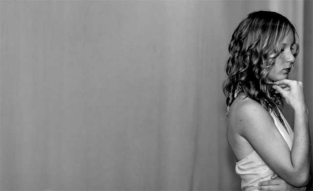
so...you're the guy hogging all the comments that nobody in the mid-5s ever get ;-)
i imagine you knew what to expect from dpc going in, and i applaud you're going with what you wanted rather than what was expected. |
|
Comments Made During the Challenge  |
|
|
09/27/2005 05:36:06 PM |
|
Beautiful example of the rules of thirds. |
|
|
|
09/27/2005 01:07:35 PM |
|
Looks very posed, and I personally don't like the crop. |
|
|
|
09/27/2005 01:33:20 AM |
|
to me...the picture is off balance...the model is facing the right side of the frame when all the space is on the left....try to make sure that your subjects are positioned so they are looking or facing toward the center of the frame rather than toward an outer edge...thats just wait I have learned from all my reading...other than that...everything else looks great...love the b/w....8 |
|
|
|
09/26/2005 11:54:05 PM |
|
the only thing I don't like about it is the dark band on the far right behind the subject... it seems to push her out of the frame - more accurately it seems to shrink the frame horizontally. then again it adds to the tension of her looking past- and being at - the edge already. |
|
|
|
09/26/2005 05:10:05 PM |
|
Rule of thirds needs your point of interest on or near the intersetion of the thirds lines. In this case, you'd move you model left in frame, the vertical is ok |
|
|
|
09/24/2005 05:29:10 PM |
|
I would have moved her slightly left or cropped the pic less tightly on the right but good image and meets challenge |
|
|
|
09/24/2005 05:07:21 PM |
|
She seems a little too close to the edge of the photo. |
|
|
|
09/23/2005 04:46:27 PM |
I think you gave the photograph good tension by facing the subject out of the frame, leaves you wondering what she's waiting for.
I would have preferred her a little to the left. Also, I've read (and notifced more sinc reading it) that facing objects to the left creates more tension. I tried it on this picture, and it changes from waiting for a friend and bored, to waiting to go into a hospital room or something more forebodeing.
I like the tonal range, and how the flattened but still textured wall (or whatever leads your eye to her. Nice use of negative space. Move her a little center, and facing left and I really like this much better. |
|
 Photographer found comment helpful. Photographer found comment helpful. |
|
|
09/22/2005 05:37:01 PM |
|
| Photographer found comment helpful. |
|
|
09/22/2005 12:26:46 AM |
|
Obviously she is looking away intentionally, I respect that choice, but it looks a little boring to me and the background is dull. 5 |
|
| Photographer found comment helpful. |
|
|
09/21/2005 12:33:35 PM |
|
A little too close to the sidefor my liking... |
|
| Photographer found comment helpful. |
|
|
09/21/2005 09:21:04 AM |
|
Clever. I like the highlights on the hair and her pensive looe. This has a good use of black and white. Maybe upturned eyes would have worked a bit better for me. |
|
| Photographer found comment helpful. |
|
|
09/21/2005 08:33:17 AM |
|
Good photo and good use of the thirds. The only problem. Your subject is looking the wrong way. |
|
| Photographer found comment helpful. |
|
|
09/21/2005 06:12:22 AM |
|
What a great picture ... and great lady ... pity though it does not seem to meet the rule of thirds ... |
|
| Photographer found comment helpful. |
|
|
09/21/2005 02:07:43 AM |
well composed according to the rule
great tonal gradation in this image the hair of the model is captiured most beautifuly in shadow and highlight
aptly titled well presented (ie choosing not to boarder this image would suffer from it)
GL |
|
| Photographer found comment helpful. |
Home -
Challenges -
Community -
League -
Photos -
Cameras -
Lenses -
Learn -
Help -
Terms of Use -
Privacy -
Top ^
DPChallenge, and website content and design, Copyright © 2001-2026 Challenging Technologies, LLC.
All digital photo copyrights belong to the photographers and may not be used without permission.
Current Server Time: 06/28/2026 09:29:50 AM EDT.