|
|
|
Showing 211 - 220 of ~888 |
| Image |
Comment |
| 11/04/2006 11:19:13 PM | Daddy's Girlby jpochardComment: this is about the most precious thing ever, you're right, it deserved better. I bet a good black and white conversion could have given it that "artsy" feeling that voters are looking for. :/ |  Photographer found comment helpful. Photographer found comment helpful. |
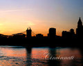
| 11/04/2006 10:27:59 PM | Cincinnati Skyline Silhouette Posterby jpochardComment: Nice colors and a well exposed silhouette, the sky looks a little flat. you might try selecint it and giving it a curves tweak.
I really feel like this needed to be pulled back and recomposed, the bridge intersecting with the stadium is not ideal. In shots that include reflections, especially buildings, I think the reflections should not touch the edges of the frame.
Really what is wrong here is the fact that you don't have much left to look at with the distracting cross-up of the silhouettes of the bridge and not much interest to the other shapes present. The building to the right is a main contender, but it's too close to the edge of the frame to help the comp.
In the end, what started as a reasonably good idea failed in the context of a skyline. What generally people, and what I, want to see in something like this is the details of the scene and be impressed with the architecture and the city, what we have here is a fairly pretty sunset, but it's more about the coloring in the water that take precedence here. Possibly I might change my mind somewhat if the sky and water were balanced in contrast and visual weight.
I just looked through you portfolio, the other one hits the nail on the head. If you want to make a silhouette, you need to clearly define and highlight the interesting shapes in the skyline from a good vantage point that will separate them from each other. | | Photographer found comment helpful. |
| 11/04/2006 08:12:25 PM | _MG_4961.jpgby lahulfmanComment: you know, I don't think I have anything to help for you on this one. It really is just a fantastic shot, so simple and elegant. great work, your brother should be proud to have you as his photographer. | | Photographer found comment helpful. |
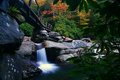
| 11/04/2006 05:15:11 PM | Bridge over waterfallsby igoofryComment: Okay, this is overall a really very nice photograph. Nice framing with the leaves, and good eyeflow and leading lines. Expousre and contrast are perfect.
I might like a bit more at the bottom of the frame to raise the falls up a bit. Also, the bridge and color foliage have a somewhat competing effect overall with the falls. Possibly shooting through something with a similar viewpoint framed by leaves that encompases the bridge with the rail leading down from a corner, into the trees, into the right falls, and then leaving some negative space to flow through to the left falls and then back down the bridge and on and on. Could be better if there is a vantage point for such a thing. | | Photographer found comment helpful. |
| 11/04/2006 04:06:24 PM | Truck Frontby escapetoozComment: I like this well enough, seems a little cool on the white balance, but that might be intentional. ?
I think that framing this so that her face was directly in front of only th grill would help, and keep the bright line of the hood from crossin her head. Uusally it would be better to have a cleaner backgound, but this is a pretty cool one. I think to heighten the effect some grunge processing, lightly applied, could help to grit this up and make the truck/prop fit in better.
There's not much to be said for leading line here, the re-framing would help, and skewing the angle some more so that theres a nice diagonal toward her face to lead the eyes. The headlight becomes a distraction so close to the edge there. Better to get her closer to one with just a bit of separation between it and her head to preserve the scene information and make it more in tune with the rest of the comp.
A strand in front of the eye can be a good thing and add some character, a full lock of hair is too much, especially when it covers the Iris. | | Photographer found comment helpful. |
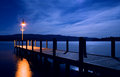
| 11/04/2006 12:33:32 PM | Newfound Launch.jpgby DJWoodwardComment: Theres a lot going right with this picture, the leading lines, the clearly defined focal point, great lighting and nice complementary tones. As Judy stated, it is quite a beautiful scene.
So what is wrong here, you say? ..... Kissing.
What? Yes, you're kissing elements with all the uprights touching the horizon line. If you had raised yourself up a bit somehow, and composed so that all the elements of the pier remained attatched to the water this would actually simplify the composition into shaped elements. The triangle of the pier jutting into the square of water, with the light crossing the horizon and touching the sky. This would also increase the psychological perception of the distance of the hills across the lake, and make the scene feel more expansive. It would also help if you could also find and angle just so that the pylons were all or mostly separated and the lamp post was not "growing" out of a pylon.
The last element may not be true to your vision of the scene, but I think a person standing staring into the moonlight, softly lit by the lamp would take this to a completely different level. Message edited by author 2006-11-04 13:04:14. | | Photographer found comment helpful. |
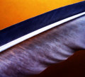
| 11/03/2006 08:49:26 PM | feathered.jpgby loveComment: Theres a nice symmetry here with the darklightdarklight stripes and the blown candy center of this.
The bright orange draws you in first and lets the eyes wander down over the dark vane, leading into the blown and info-less rachis with the thin barb details. The detail then becomes a glorious study in the soft rigidity of a feather. It's like the curves of a woman, soft yet unyielding and firm when necessary. The hint of orange shining through is lovely, and the eye is softly let down to the lower dark portions.
Overall I really like it as a composition and a detail study, but it lacks a real focal point, or and anchor to really keep the eyes trapped on this view. There's an overall slow, sensual feel to the study, but it fails to deliver the final blow somehow. Unfortunately, I can't grasp an idea of how to make that happen within the context of the study, it's on the tip of my tounge, but It's not coming. If I think of something, I'll try to revisit the issue. | | Photographer found comment helpful. |
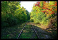
| 11/03/2006 09:15:16 AM | Railroad Challengeby dallasduxComment: Besides the re-sizing problem, theres a problem of subject here. There is none, really. The perspective lines lead you to the centere of the picture, brush can lead you off to the sides, but your eyes choose the right because of the brightness. Eyeflow is decent through the right side, but there's nothing on the left that draws you over. You instinctively look right because the brightness has more visual weight, but there's really nothing of supreme interest in the picture. It becomes more of a study in centered compositions, but the lighting here is just too off balance, and fails the balanced shapes of the composition by giving too much visual weight to the right.
The flat, empty sky does nothing to add. The same shot in a morning fog, or with someone or something off in the distance to be led into would be much better. The idea of the fog would be to add volumetric or streaming light coming from the sun-side trees, soften the light, and add more leading lines to draw the eyes back to the left and increase it's visual weight. | | Photographer found comment helpful. |
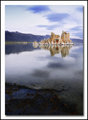
| 11/03/2006 12:17:59 AM | Mono Lakeby gaurawaComment: I've looked at this picture off and on while I try to get this stupid app restarted, had to eventually call out the developer, so I'll do this while I wait.
Theres a balancing problem in this composition for me, I think somehow this may be a problem of viewing at web size for this picture, but I can't be sure that would fix it.
The composition seems like it should work, the foreground detail with the background element, all in sharp focus. I think that the foreground in this instance does not serve to highlight and lead into th the main point of interest here, and actually becomes a visual distraction in the context that it competes for attention rather than complements. The heavy reflections also make for a huge separation of the two elements by creating heavy negative space between the two and an absence of leading lines.
I'm thinking that a polarizer to cut the glare and hopefully leave dark waters and algae/grass with a bright focal object to lead into would be better here. Also, moving the eyepoint downward and leaving more of the grassy elements in and possibly find some leading line up from the bottom, even if only a series of those small pools, would increase the impact of the tufa towers by leading into them. The clouds at the top also seem overly bright to me, but that might just be personal preference. The bisection of the towers by the mountains also serves as a distraction that might be somewhat overcome by lowering the eyepoint, or possibly isolating the towers by framing them in only. | | Photographer found comment helpful. |
| 11/01/2006 11:22:00 PM | |
|
Showing 211 - 220 of ~888 |
Home -
Challenges -
Community -
League -
Photos -
Cameras -
Lenses -
Learn -
Help -
Terms of Use -
Privacy -
Top ^
DPChallenge, and website content and design, Copyright © 2001-2026 Challenging Technologies, LLC.
All digital photo copyrights belong to the photographers and may not be used without permission.
Current Server Time: 06/10/2026 11:40:47 PM EDT.
|