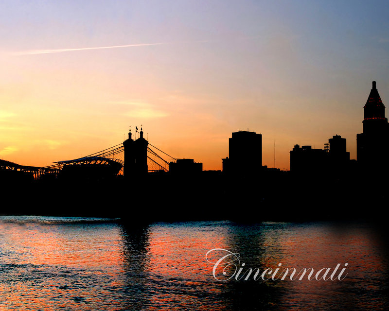
Nice colors and a well exposed silhouette, the sky looks a little flat. you might try selecint it and giving it a curves tweak.
I really feel like this needed to be pulled back and recomposed, the bridge intersecting with the stadium is not ideal. In shots that include reflections, especially buildings, I think the reflections should not touch the edges of the frame.
Really what is wrong here is the fact that you don't have much left to look at with the distracting cross-up of the silhouettes of the bridge and not much interest to the other shapes present. The building to the right is a main contender, but it's too close to the edge of the frame to help the comp.
In the end, what started as a reasonably good idea failed in the context of a skyline. What generally people, and what I, want to see in something like this is the details of the scene and be impressed with the architecture and the city, what we have here is a fairly pretty sunset, but it's more about the coloring in the water that take precedence here. Possibly I might change my mind somewhat if the sky and water were balanced in contrast and visual weight.
I just looked through you portfolio, the other one hits the nail on the head. If you want to make a silhouette, you need to clearly define and highlight the interesting shapes in the skyline from a good vantage point that will separate them from each other. |