I've looked at this picture off and on while I try to get this stupid app restarted, had to eventually call out the developer, so I'll do this while I wait.
Theres a balancing problem in this composition for me, I think somehow this may be a problem of viewing at web size for this picture, but I can't be sure that would fix it.
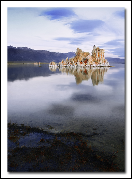
The composition seems like it should work, the foreground detail with the background element, all in sharp focus. I think that the foreground in this instance does not serve to highlight and lead into th the main point of interest here, and actually becomes a visual distraction in the context that it competes for attention rather than complements. The heavy reflections also make for a huge separation of the two elements by creating heavy negative space between the two and an absence of leading lines.
I'm thinking that a polarizer to cut the glare and hopefully leave dark waters and algae/grass with a bright focal object to lead into would be better here. Also, moving the eyepoint downward and leaving more of the grassy elements in and possibly find some leading line up from the bottom, even if only a series of those small pools, would increase the impact of the tufa towers by leading into them. The clouds at the top also seem overly bright to me, but that might just be personal preference. The bisection of the towers by the mountains also serves as a distraction that might be somewhat overcome by lowering the eyepoint, or possibly isolating the towers by framing them in only. |