| Image |
Comment |
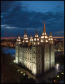
| 05/11/2006 03:19:13 PM |
A Beacon to the Worldby rjksteschComment: The level at which you took this shot works perfectly. There is plenty to look at above and below, and of course the focus is right at eye level. The blue in the lake and sky work well together. |
 Photographer found comment helpful. Photographer found comment helpful. |
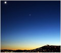
| 05/11/2006 03:14:38 PM |
PEÑÍSCOLAby lulomaComment: I really like the sky and the deep blue color. If you cropped the moon (if that's what it is) in the upper left hand corner it may make this a stronger shot. |
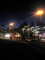
| 05/11/2006 02:58:21 PM |
Twisty roads aheadby boyhuntsforblissComment: The angle you use here really works with the title. The sky may be a bit bright to convey a night shot and the shadow by the car doesn't help matters. I know the moon was bright during challenge week and you did a good job using it to your advantage since it appears there's no other lightsource nearby. |
| Photographer found comment helpful. |
| 05/11/2006 02:54:39 PM |
Left Behindby funny pieComment: Nice composition, but the highlights around her hand pull the eyes away from her face. Great expression. |
| Photographer found comment helpful. |
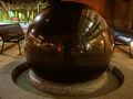
| 05/11/2006 02:52:42 PM |
No Quarterby dayberryComment: The reflection on the sphere adds a lot to this picture, but the green in the upper left corner draws the attention away from the main subject. Perhaps a different angle just wasn't possible. A bit more color in the sphere would probably balance it out. |
| Photographer found comment helpful. |
| 05/11/2006 12:05:32 PM |
The Stripby vitaminGComment: Nice job demonstrating the length of "the strip". Pesonally, I would have cropped either side so we could see more detail. |
| 05/11/2006 12:04:08 PM |
|
| 05/11/2006 11:54:31 AM |
Night Fishermanby Bear_MusicComment: The color here jumps off the screen! Cropping a bit off the top and right would probably make the fisherman more of a subject. |
| Photographer found comment helpful. |
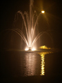
| 05/11/2006 11:53:21 AM |
The Night The Light Came Loose In Georgia!by 777STANComment: This looks like it was challenge to capture with the lighting. The yellow light and reflection on the right is a more interesting subject (to me anyway) than the fountain itself. The light on top competes a bit with the fountain. |
| Photographer found comment helpful. |
| 05/11/2006 11:50:48 AM |
Good nightby FrallComment: There's a lot going on here and the bright lights distract from your subject. |
| Photographer found comment helpful. |
Home -
Challenges -
Community -
League -
Photos -
Cameras -
Lenses -
Learn -
Help -
Terms of Use -
Privacy -
Top ^
DPChallenge, and website content and design, Copyright © 2001-2026 Challenging Technologies, LLC.
All digital photo copyrights belong to the photographers and may not be used without permission.
Current Server Time: 07/17/2026 12:32:47 AM EDT.