| Image |
Comment |
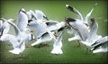
| 02/15/2009 12:20:23 AM |
RIMG0008-gulls-gaussian-blu.jpgby jomariComment: I like the final version that looks somewhat like a comic, but I'm drawn to this one. The birds just seem to glow and pop against the green grass. |
 Photographer found comment helpful. Photographer found comment helpful. |
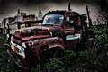
| 02/15/2009 12:10:47 AM |
04 - Truckinby VitaminBComment: Processing brings out the moodiness of the shot, although I would like to see it a tad lighter. It's fine as is, but this makes me want to explore some of the darker areas and see what is there. |
| Photographer found comment helpful. |
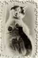
| 02/15/2009 12:03:12 AM |
Batgirl from Belowby cginoComment: At first this looks like an ordinary "old fashioned" cat photo, but then it gets interesting. Your processing makes it looked like a photo of a photo, instead of Batgirl on a skylight. But then if it's a photo, how can the paws be facing up like that? Cool effect. |
| Photographer found comment helpful. |
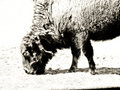
| 02/14/2009 11:55:48 PM |
Number 5 - The Buffalo by KelliComment: At first glance I preferred the original, but the more I look at this the more I like it. The editing pushes it just a bit beyond reality and that's the appeal of it. It looks almost like a drawing and then gets me thinking about something on the wall of a cave. |
| Photographer found comment helpful. |
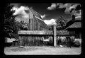
| 02/14/2009 11:53:22 PM |
Old building rusticby MelethiaComment: I prefer this one over the other edit because the processing really seems to fit the scene. I bet this was a wonderful place to explore and take photos. |
| Photographer found comment helpful. |
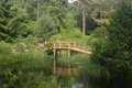
| 02/14/2009 11:45:47 PM |
APAW-5-Original-2308.jpgby PGerstComment: Your subject here is interesting and I think a boost in contrast and getting the bridge off the center will make this quite the shot. |
| Photographer found comment helpful. |
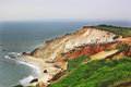
| 02/14/2009 11:43:36 PM |
Gay Head Cliffs (APAW-4)by PGerstComment: I think the saturation is fine, although the lower right tends to draw the eye a bit. If you boosted the blue in the water (as suggested by others) it would balance things out a bit. This must have been amazing to see in real life, your photo makes me want to go there and shoot and shoot and shoot. |
| Photographer found comment helpful. |
| 02/14/2009 11:35:20 PM |
761623by undieyatchComment: Wow - that contrast is just awesome! This reminds me of a photo book filled with pictures from the early 1900s, even though it has a solar panel. |
| 02/14/2009 11:31:00 PM |
Nikko Hydrant '05by Pug-HComment: Good crop to bring the viewer right into your subject. This takes on an almost human characteristic - it reminds me of somebody in a potato sack race. |
| Photographer found comment helpful. |
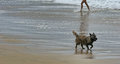
| 02/13/2009 10:27:30 PM |
Legsby RetroesqueComment: I like how the pooch and human are lined up. It's creates a slightly unbalanced feeling, but I think it works really well here. |
| Photographer found comment helpful. |
Home -
Challenges -
Community -
League -
Photos -
Cameras -
Lenses -
Learn -
Help -
Terms of Use -
Privacy -
Top ^
DPChallenge, and website content and design, Copyright © 2001-2026 Challenging Technologies, LLC.
All digital photo copyrights belong to the photographers and may not be used without permission.
Current Server Time: 06/18/2026 01:11:53 PM EDT.