| Image |
Comment |
| 10/06/2006 02:04:18 PM |
|
 Photographer found comment helpful. Photographer found comment helpful. |
| 10/06/2006 02:02:35 PM |
|
| Photographer found comment helpful. |
| 10/06/2006 02:02:03 PM |
Phone on the Roadby annahComment: The color tones are very nice and really make this photo work. Another possible composition for this would of been one with artistic tilt having the stripe come from a corner. Nothing wrong with this composition though, it was just a thought I had while looking at this. Very well done! |
| Photographer found comment helpful. |
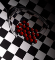
| 10/06/2006 01:58:43 PM |
patternsby ralphComment: The red, white & black make a great combination and the cool refraction doesn't hurt this very nice photo either. Well done! |
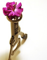
| 10/06/2006 01:55:58 PM |
A Farewell to Armsby RKTComment: I don't think any other photo in the challenge related the unrelated better than this one did. Add to that, that this fun, quirky, artistic and technically excellent. Great job! |
| Photographer found comment helpful. |
| 10/06/2006 01:16:41 PM |
Riderby LevTComment: This is very nice. The technicals are all dead on, but it seems more the intangibles that make this rather interesting. Some thing about the riders look/expression that blends very well with the tones of the photo. Well done! |
| Photographer found comment helpful. |
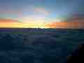
| 10/06/2006 12:36:40 PM |
Birthday Sunriseby jaianniahComment: This composition is a little too busy, try to compose so that there is a flow, a pattern or a rhythm when there is no clear subject. |
| 10/06/2006 12:30:48 PM |
Wisconsin Sunriseby andy4444Comment: The potential for this is lost because the small sizing makes it very difficult to see the details. You really want to use the full 720 pixels this challenge allows(or at least the normal 640). |
| Photographer found comment helpful. |
| 10/06/2006 12:28:53 PM |
Eyes that don't forgetby JeremyFleuryComment: The close-up is a great choice for showing all the detail. But much of the detail gets lost in the extreme differences between shaded and full sun areas. Look for opportunities that are more favorable, like full shade or full sun. |
| Photographer found comment helpful. |
| 10/06/2006 12:28:49 PM |
Cape Harbourby jacoloComment: The small sizing makes it very difficult to see details, you really want to use the full 720 pixels this challenge allows(or at least the normal 640). There also is some tilt to this, makes the boat look like it's going downhill. Little things, but they could make almost a full point difference in your score. |
Home -
Challenges -
Community -
League -
Photos -
Cameras -
Lenses -
Learn -
Help -
Terms of Use -
Privacy -
Top ^
DPChallenge, and website content and design, Copyright © 2001-2026 Challenging Technologies, LLC.
All digital photo copyrights belong to the photographers and may not be used without permission.
Current Server Time: 05/15/2026 08:29:43 AM EDT.