| Image |
Comment |
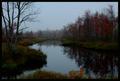
| 10/07/2005 02:35:41 PM |
Afloat on Muddy Waterby JutildaComment: To me, it looks like this was almost...."forced" into complementary colors using a photo-editing program. The look itself isn't bad, but compared to other entries in the challenge, doesn't meet my concept of comlimentary colors. |
 Photographer found comment helpful. Photographer found comment helpful. |
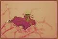
| 10/07/2005 02:34:30 PM |
Complementary Reflections - Green and Redby notesinstonesComment: For me, this photo is too dark overall to really get a good sense of complementary green and red as indicated by your title. The landscape itself looks nice, and good composition, but I wish there was a bit more light and less shadows/darkness. |
| Photographer found comment helpful. |
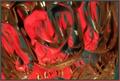
| 10/07/2005 02:33:21 PM |
3Dimensional Lightby DmaskezeComment: For me, if the background was more of a solid color and without the noise, the red and green would show up better. Interesting light play. |
| 10/07/2005 02:32:39 PM |
ROPEby CONRADComment: The rope appears more on the orangish side of red, rather than a complimentary red to the sky blue. A little less saturation on the highlights and a bit of a deeper red and I would have scored it higher. I like the composition. |
| 10/07/2005 09:16:05 AM |
Reflecting Crystal Dreamsby madison461Comment: I can see the red and green - those definitely being complimentary, but the photo appears out of focus, and compared with other entries in this challenge doesn't have the same "wow" factor. |
| Photographer found comment helpful. |
| 10/07/2005 09:14:57 AM |
Italian Fareby KitKatComment: For me, the lighting and overall color of this photo is too yellow, and compared with other entries in this challenge does not show complimentary colors as looked at on a color wheel. |
| Photographer found comment helpful. |
| 10/07/2005 09:13:30 AM |
Nothing to hideby davinciComment: While I find this an interseting setup and concept, for me, it doesn't meet the challenge of complimentary colors and I have given it a low score. The composition isn't bad, but the light is a bit bright and I find the fingers dristracting. Maybe a bit less yellow color overall would help? Like I said though, an interesting concept - shows creativity and imagination. |
| Photographer found comment helpful. |
| 10/07/2005 09:11:42 AM |
Black and White: Fear of Shadowsby TheLittleIslandComment: I'm taking a literal interpretation of this challenge, and so since your photo is in black and white and not color, I'm giving it a lower score. Also, I find the large black shadow object on the right side very distracting - although I realize that it the "shadow" you fear. Perhaps if it had a more definitive shape it would help? |
| Photographer found comment helpful. |
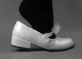
| 10/07/2005 09:09:48 AM |
if the shoe fits...by trumpetwalrusComment: For me, this challenge is about colors, not black and white. Had this been in the shoe challenge a while back, I would have scored it better. |
| Photographer found comment helpful. |
| 10/07/2005 09:08:56 AM |
Blue or Brown ?by gaurawaComment: Foe me, this photo actually reminds me of some type of graphic gradation background that would be used in a psychedellic poster or graphic arts brochure. There really is not focal point for me, and so I have given this a low score. |
| Photographer found comment helpful. |
Home -
Challenges -
Community -
League -
Photos -
Cameras -
Lenses -
Learn -
Help -
Terms of Use -
Privacy -
Top ^
DPChallenge, and website content and design, Copyright © 2001-2026 Challenging Technologies, LLC.
All digital photo copyrights belong to the photographers and may not be used without permission.
Current Server Time: 07/27/2026 01:15:35 AM EDT.