| Image |
Comment |
| 10/28/2005 11:12:17 PM |
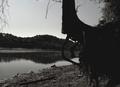
Moonlight Serenadeby rayg544Comment: My favorite part is the shape of the tree and trunk itself. Had this been a bit crisper, with more contrast and greater grain, I would have scored it higher. |
 Photographer found comment helpful. Photographer found comment helpful. |
| 10/28/2005 11:11:22 PM |
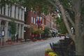
Downtownby ElaineComment: For me, this is a nice enough snapshot of a city street, but compared with other entries the subject matter doesn't hold my interest. There is grain, but again for me, I find that sepia or black and white photos with grain have greater impact. I wonder how this would look in black and white and a bit of added contrast? |
| Photographer found comment helpful. |
| 10/28/2005 11:08:40 PM |
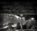
Umbrellasby ImagineerComment: Interesting abstract shot. I can see the umbrellas, but my eyes have to work hard at it. Some grain, but compared to other entries, for me, it doesn't hold my interest as much. Guess I'm not into abstracts - sorry. |
| Photographer found comment helpful. |
| 10/28/2005 08:37:07 PM |
Stalkingby lunixComment: While I find your treatment interesting, for me, you've turned your photo into a graphic element. Compared with other entries it doesn't hold my interest too much and while the rule of thirds is good and so is negative space - again for me - there is too much white space. |
| 10/28/2005 08:31:30 PM |
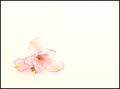
Alstromeria on Whiteby Buckeye_FanComment: I generally like simple compositions such as yours, but for me there is just a bit too much white space here. Also, I find the choice of black for the border a bit overwhelming and takes away from the photo's softness for me. I wonder how the border would look if you chose the purple color from the flower? |
| Photographer found comment helpful. |
| 10/28/2005 08:29:34 PM |
Shellsby viljoendaleComment: Nice shells. I think a softer lighting would improve this and maybe reducing the blue saturation overall. Good idea though. |
| Photographer found comment helpful. |
| 10/28/2005 08:27:26 PM |
Gardeniasby Eagle EyeComment: Good concept and nice triangular composition with the flowers. If there was a bit more sharpness overall and maybe a bit less blue saturation, I would have scored it higher. |
| 10/28/2005 08:24:44 PM |
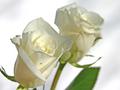
Ivory Rosesby SammieComment: Nice composition and I like the coloring too. I want to gently remove the little spider off the foreground rose as I find him distracting, but it was probably his home and he was there first. :-) Nice shot - good luck in the challenge. 9 |
| Photographer found comment helpful. |
| 10/28/2005 08:20:25 PM |
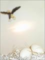
Life and Death!!by vikasComment: Wow - similar to my shot -- eek -- lol. I like the blurred eagle swooping in from the background. Nice added touch with the bit of brances too. |
| Photographer found comment helpful. |
| 10/28/2005 08:29:29 AM |
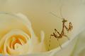
Little One by wsteynComment: I don't care for insects, but this is a cool shot. 10 |
| Photographer found comment helpful. |
Home -
Challenges -
Community -
League -
Photos -
Cameras -
Lenses -
Learn -
Help -
Terms of Use -
Privacy -
Top ^
DPChallenge, and website content and design, Copyright © 2001-2026 Challenging Technologies, LLC.
All digital photo copyrights belong to the photographers and may not be used without permission.
Current Server Time: 05/10/2026 04:34:17 PM EDT.