| Image |
Comment |
| 04/17/2006 02:46:39 PM |
|
 Photographer found comment helpful. Photographer found comment helpful. |
| 04/17/2006 02:45:30 PM |
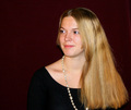
First Posing Sessionby olddjComment: Hopefully some of the studio experts will take the time to comment on your photo. I am just a rank amateur but I thought I'd at least offer you some feedback in case you get none.
First impressions:
- I like the pose.
- Good color.
- The focus works.
- She young looking and natural so not going overboard in the processing works here.
- And I like the composition in general.
Things I'd look to try out/fix if it were me:
- Lose the necklace. Either that or use a smaller one so that it doesn't cut off at the bottom. Also it detracts in general IMO so I'd probably just go with something less eye catching.
- Darken the background more or lighten it up. As is her blouse does not quite blend into the background although it nearly does on my end. The fact that this is so makes it a bit of a distraction for me. I personally would make it darker to blend perfectly with her blouse.
- She has nice long hair, which to me seems like a golden opportunity (pardon the pun) to add some real impact to the shot. Such as having her off to the left and her hair flow through the frame to the right.
Anyway, those are just some thoughts. Good luck and I hope you do well! |
| Photographer found comment helpful. |
| 04/17/2006 02:25:12 PM |
The One of my Dreamsby KivetComment: Nice. I like the high key look and those eyes look good. A similar problem I had with my entry was the pupils weren't big enough. Your's is fine but I think if they were bigger it would make this look even better although I'm not sure how to accomplish that myself especially with the lighting you're using here. Regardless of that, this is a very good image! |
| Photographer found comment helpful. |
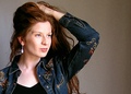
| 04/17/2006 02:20:48 PM |
self portaitby alpharichComment: The pose and composition works. However the background and lighting are a real issue here. I'd try using a darker background for starters. That bright white not only is distracting but it makes the whites in your eyes look darker. Also try bouncing the flash (if possible) at the ceiling rather than directly at you so as to avoid those harsh shadows. It may under expose the shot in general if you don't have other lighting equipment to compensate but at least doing it this way you can brighten things up in post using photoshop or the like. |
| Photographer found comment helpful. |
| 04/17/2006 02:13:47 PM |
Adrianeby saracatComment: I like her pose and how you cropped/composed this. The background looks good although the left side has an odd coloration to it that doesn't match the hue of the right side at least not on my end.
Back to the model, I like how you stayed true with this shot (i.e. keeping some/all of the age lines in there). However I'm wondering if a slight compromise would have worked better. I'm thinking just a little bit of smoothing/lighting up on the cheek area so that her skin complexion balanced out better with the rest of her face. Since her cheek is darker and more contrasty the details stand out more which takes some of the focus away from her eyes, which look good.
Well that's it. Good luck! |
| Photographer found comment helpful. |
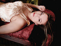
| 04/17/2006 02:00:37 PM |
The Lookby bryantbusComment: I'm surprised I'm not seeing more seductive photos. This is very nice. I like the classic red velvet chair matching her lips. I like the overall treatment you've done with this.
On the negative, the hair could use some more definition/highlights. That dark patch is a bit distracting. Maybe have a dedicated light to bring shine to that part of the hair? Also, her outfit looks very wrinkled. Not sure if that is just the look of the garment or not. Regardless if it was smooth I think it woudl have really enhance the shot even further, IMO.
Just my thoughts. Hope you do well and I look forward to seeing more of your work! |
| Photographer found comment helpful. |
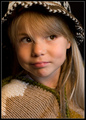
| 04/17/2006 01:51:47 PM |
Natural Blondeby FotoMunkiComment: Very cute. Looks like you captured her personality. Also the focus is spot on. Gets a 7 in the first go around. |
| Photographer found comment helpful. |
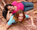
| 04/17/2006 01:48:31 PM |
Best Friendsby NeuferlandComment: I like the colors which go well with their playfulness. Also this looks and feels professional. My only issue is the pose of the girl on the bottom. Not really sure what is wrong perhaps it's because her arm and foot isn't in the shot? Maybe having her in a similar pose as the other one would work better? |
| Photographer found comment helpful. |
| 04/17/2006 05:00:28 AM |
My mental leap in realising my challenge idea!by obsidianComment: Originally posted by Pug-H:
I'm surprised this did so poorly; it doesn't deserve so many 1s and 2s. It's a kind of shot that you would see in some electrical store's advertising brochure (or junk mail...). Creative, but flawed (the shadow, as mentioned). |
Insert an attractive woman and some DPC approved colors and presto this scores a 5.9! ;) Message edited by author 2006-04-17 05:01:51. |
| Photographer found comment helpful. |
| 04/17/2006 03:03:37 AM |
|
| Photographer found comment helpful. |
Home -
Challenges -
Community -
League -
Photos -
Cameras -
Lenses -
Learn -
Help -
Terms of Use -
Privacy -
Top ^
DPChallenge, and website content and design, Copyright © 2001-2026 Challenging Technologies, LLC.
All digital photo copyrights belong to the photographers and may not be used without permission.
Current Server Time: 06/19/2026 06:49:55 PM EDT.