| Image |
Comment |
| 05/09/2006 01:37:54 AM |
|
 Photographer found comment helpful. Photographer found comment helpful. |
| 05/09/2006 01:32:01 AM |
|
| 05/09/2006 01:29:49 AM |
|
| Photographer found comment helpful. |
| 05/09/2006 01:28:31 AM |
|
| Photographer found comment helpful. |
| 05/09/2006 01:26:56 AM |
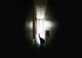
Driven Past Crazyby JutildaComment: Great entry. I probably would have bumped up the highlights a bit to be more eye catching like what movie photos tend to be but otherwise perfect. |
| Photographer found comment helpful. |
| 05/09/2006 01:15:39 AM |
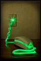
Deadly Phone Callby posthumousComment: The lighting of this is very cinema-like. I probably would have bumped up the brightness just a bit since movie posters tend to be fairly bright in general. |
| Photographer found comment helpful. |
| 05/08/2006 11:49:10 PM |
Smoking Bulletby xianartComment: Greetings from your own critique club.
First Impression:
Clever and Striking!
Composition:
Works quite fine. I can't see this looking any better in another compostion.
Subject:
Very fascinating. It has that pop art look. You should probably get this printed out or at least a print version online because this could be something that sells for you.
Technical (Colour and light):
The color and lighting are exceptional. The light really gives shape and dimension to the ashes and the color makes it really pop.
Improvement:
None really. However, if you tried this again for DPC I might remove that background noise so it looks cleaner and appeal to the neatimage folks, which are aplenty.
Summary:
Great image. A strong take to the challenge but most of all creative. Your score doesn't do this justice by a long shot. Message edited by author 2006-05-08 23:49:48. |
| Photographer found comment helpful. |
| 05/08/2006 09:57:30 PM |
Essence of Indiaby DigiFotoBuddyComment: Greetings from your own critique club.
First Impression:
Looks professional.
Composition:
Very good. The space is filled well and with purpose. Not much more I can say other than well done.
Subject:
She looks relaxed and comfortable, something that is often missing with a lot of other portraits I've seen at DPC. Again, well done in accomplishing that.
Technical (Colour and light):
The lighting is very good. The detail is captured without any harsh transitions. The light on the hair is sufficient. However for DPC purposes you might want to have a bit more contrast so those without calibrated monitors won't ding you because it looks too dark. That one area of the hair with the brighter light does seem out of place but it's not distracting to me.
Improvement:
I really don't have any. As I mentioned above, for DPC purposes maybe brighten the hair more so that it's more visible across the board for everyone.
Summary:
Great image. I thought it was one of the best in the challenge and really I should be asking you about portrait shots rather than me critiquing yours. :)
Good luck on future challenges although I don't think you really need it.
Edited to fix spelling. Message edited by author 2006-05-08 21:59:22. |
| Photographer found comment helpful. |
| 05/08/2006 09:45:47 PM |
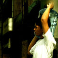
Palistinians go to Work in West Bank and Gaza againby GunnsiComment: Greetings from your own critique club.
First Impression:
Strong subject. Contrast between the silhouettes and the sky add to the strong theme.
Composition:
The composition is good. It's a little minimalistic but that works well with the early morning aspect.
Subject:
Strong subject however it's difficult placing the subject without first reading the title. Although I have no suggestions on how you could improve that unless there was a landmark nearby that could have been captured in the shot.
Technical (Colour and light):
The lighting and color is good. One issue I do have is there seems to be some "fuzziness" going on around the silhouettes. That may just be jpg compression. If so I would suggest using less compression. Looking at the properties this photo weighs in at just 24k and you are alloted 150k for challenge entries so be sure to utilized as much of that 150k as possible to avoid artifacts.
Improvement:
As I mentioned above, maybe find something that can tie the image more to the title without just relying on the title itself to describe the shot. This one is definitely difficult to do that since there are no faces to identify or unique structures but whenever possible try and do that. Also, utilize the file size you're afforded for the challenges. It does make a difference. Lastly, for an image to do well in DPC it needs a lot of wow factor. Even if this was a photo conveying peace in the Middle East I doubt this would help your score at DPC. At least not as well as a great sunset. So if you shot something like this again and wanted to do better with your score try and get something in that had some interesting cloud cover. That more than anything is what probably held you back in voting.
Summary:
Great take to the challenge. The subject was definitely news worthy.
Hope this was of some help. If you have any questions feel free to PM or email me. I look forward to seeing more of your work! Message edited by author 2006-05-08 21:48:05. |
| Photographer found comment helpful. |
| 05/08/2006 09:07:42 PM |
water coolieby blackenedwhiteComment: Greetings from your own critique club.
First Impression:
The color and grain is the first thing I notice.
Composition:
The framing of this is good and the negative space was used well.
Subject:
A bit bland. We don't really identify with the subject because what you decided to include in the photo doesn't tell us much. Where is he at? Where is he going? That sort of thing. Also, half his face is not in view so we don't really get a good sense of his expression/emotion he may be experiencing. I know with my candid entry I made a similar mistake.
Technical (Colour and light):
The color is good, which boosts interest. However, the lighting is a bit harsh. I think had this been a b/w image it probably would have felt more appropriate along with the grain. Speaking of which, the grain is probably a lot harder to pull off in a color photo than a b/w or sepia image.
Improvement:
Include more "story" in the shot. If there was a shop nearby or a group of people in the direction he was walking including that would have helped tell a story. Even if those people had nothing to do with him it would place him in better context so we know a little more about this person's life and let imagination go from there.
Summary:
A good take to the challenge. In terms of where this ranked, DPC tends to prefer cleaner images so the grain and the harsh light held this back probably more than anything else. However, don't take that to mean DPC voters are right voting this way. After all it's a site full of photographers who are very picky about certain things, which often times are just trival so just bare that in mind. The most important thing IMO is telling a good story with your photography and everything else is just secondary.
Edited for clarity. Message edited by author 2006-05-08 21:09:21. |
| Photographer found comment helpful. |
Home -
Challenges -
Community -
League -
Photos -
Cameras -
Lenses -
Learn -
Help -
Terms of Use -
Privacy -
Top ^
DPChallenge, and website content and design, Copyright © 2001-2026 Challenging Technologies, LLC.
All digital photo copyrights belong to the photographers and may not be used without permission.
Current Server Time: 06/21/2026 08:45:33 AM EDT.