| Image |
Comment |
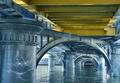
| 06/05/2006 02:03:20 PM |
under the bridge downtown by boysetsfireComment: Fitting that this got yellow with that touch of yellow in the shot. The water and the marble look so incredibly perfect that it looks like something designed in 3DS Max. |
 Photographer found comment helpful. Photographer found comment helpful. |
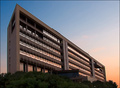
| 06/05/2006 05:28:48 AM |
Dawnby alexgarciaComment: Greetings from CTP2
Lighting/Color:
I like the lighting and the color is very pleasing.
Subject/composition:
Good subject for the challenge. The building creates an interesting diagonal and uses up the space well. The only thing that bothers me a little in terms of the composition is the space on top. The way it is now my eyes want to go up and out of the image on the left as oppose to down the diagonal line and into the sunset on the right. I think if you had more space at the top the image would be read more easily from left to right. However the shot is about the architecture and you captured it well.
Post Processing:
Overall it looks good. I tend to sharpen my images a lot also but one thing I try to do at least some of the time :) is avoid those halos. If USM is your only sharpening method (i.e. if you don't have smart sharpen) I would delete the effects of the USM around the very edges of the building. Or at least delete say 50% of the USM effect around the edges just so the halo isn't that prominent. Really the image will look sharp even if the borders of the building isn't tack sharp. If you want to keep that as sharp as it is another option would be to clone out the halo. Since this building has very straight lines I would use the pen tool to create a selection around the building and then invert the selection and use the clone or healing brush and paint over the halo edges. That way you can edit real close to the building edge without altering any of the pixels of the building itself. Anyway, the halo is not a huge distraction but I think voters will take points off for it regardless. |
| Photographer found comment helpful. |
| 06/05/2006 04:49:07 AM |
Buckingham Palace it is!by JudiComment: This is pretty funny. Should have scored better. Maybe next time cut down those trees and wait for the perfect sunset. Apparently you need those for "architecture" shots. :P Message edited by author 2006-06-05 04:49:30. |
| Photographer found comment helpful. |
| 06/05/2006 04:43:06 AM |
Past Memoriesby JudiComment: I can't remember seeing an image that scored this low with this much creativity in it and the execution is good. |
| Photographer found comment helpful. |
| 06/05/2006 04:30:48 AM |
|
| Photographer found comment helpful. |
| 06/04/2006 02:39:25 PM |
|
| Photographer found comment helpful. |
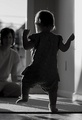
| 06/04/2006 02:38:12 PM |
One Small Step ... by tateComment: Congrats on the red. Btw, is that shutter speed correct? You must have one fast baby! :P |
| Photographer found comment helpful. |
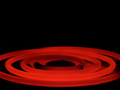
| 06/04/2006 02:48:02 AM |
Electric Rangeby JPetraliaXComment: Greetings from the Critique Club!
Technicals:
Nice job exposing this one. You can see the rings have depth to them and aren't blown out.
Subject/composition:
Good subject to depict heat. I like the tight crop, which adds an artistic aspect to an otherwise dull subject.
Suggestions for Improvement:
The only thing I'm not too sure about is the negative space at the top. It really doesn't do anything for me with this subject or how I read this photograph. So I'm wondering if maybe a square crop would be better or shooting at a higher angle so more of the rings filled the top?
|
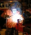
| 06/04/2006 02:35:48 AM |
225 AMPSby sailjoComment: Greetings from the Critique Club!
Technicals:
The lighting is sufficient to see the subject but doesn't do more than that.
Subject/composition:
Good choice in subject, however I feel the central theme of this challenge isn't the real focal point here. It's more about this person working in his environment more so than depicting "heat".
The composition is ok but like the lighting it doesn't do anything beyond just displaying the subject.
Suggestions for Improvement:
The lighting and composition are two areas where a lot of creativity can come in. In terms of the composition, I would see about shooting from a lower angle and facing more toward his right side rather than straight on. This should give the subject a larger presence in the frame and appear more powerful, which would go well with someone welding steel. If you can zoom in closer that would also help. The main area of interest here is that welder's mask and the sparks so the tighter you can make the crop the better especially given that busy background.
As for the lighting I think you have too much in the shot. I would try to utilize just the light coming from the sparks and eliminate as much ambient light as possible. The best way to do that is to shoot with a faster shutter speed and smaller aperture setting than what you used. I would suggest shooting in manual mode to set both the shutter speed and aperture manually if possible. Having less light in the scene will keep alot of that busy background in the dark and bring the focus squarely on the welding. Message edited by author 2006-06-04 02:58:12. |
| Photographer found comment helpful. |
| 06/03/2006 11:41:04 PM |
|
| Photographer found comment helpful. |
Home -
Challenges -
Community -
League -
Photos -
Cameras -
Lenses -
Learn -
Help -
Terms of Use -
Privacy -
Top ^
DPChallenge, and website content and design, Copyright © 2001-2026 Challenging Technologies, LLC.
All digital photo copyrights belong to the photographers and may not be used without permission.
Current Server Time: 06/22/2026 02:51:25 AM EDT.