| Image |
Comment |
| 06/11/2006 03:48:59 PM |
accordion with indicator ver. 2by visaksenComment: Looks like you just made some subtle improvements in the highlights and shadows which look better. You also went with a slimmer crop which does make the vertical lines appear longer. One thing I would have done here since it's advance editing is to clone out that dirt below the light indicator to make it look cleaner like the original. |
 Photographer found comment helpful. Photographer found comment helpful. |
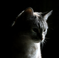
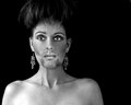
| 06/11/2006 03:37:16 PM |
High Contrast Challenge: infernal catby dragonladyComment: So you toned down the contrast eh? :P To be honest I don't think this would have worked well as a high contrast image if this was resubmited in that challenge but it would get high marks from me in a low key challenge. As for the image itself, I like it. The lighting is good. Maybe a hair blown out in some spots but it's not much of a distraction.
The only thing I'd like to see improved here is to include more detail in the cat's eyes or at least one of them. If there is some existing detail here in the shadows then maybe dodging the eyes would bring them out just enough to provide a bit of a glimpse.
Well that's it. Very nice image. Good luck! |
| Photographer found comment helpful. |
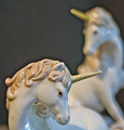
| 06/11/2006 03:29:35 PM |
Unicornsby eaglebeckComment: Much better than the original. The dark halo and grain I assume are things you want in the photograph. Both look more pleasing than in the original especially the dark halo which has a smoother transition into the background vs the original.
As far as the technicals are concern (lighting/composition, etc) there is some improvement here as well although I'm thinking you aren't using enough light and you are brightening it in post processing. However, the unicorns look whiter and the shadows are more subtle this time around and the reflections are less distracting so good job there.
The composition while pretty true to the original looks better in the retake. The background unicorn taking up less space really helped.
Overall, good improvement however I feel the image is still a bit on the soft side. The grain is definitely a love it or hate it thing so some people are still not going to like that you kept it. A good compromise if you wanted to appeal to more people would be to keep the background noisy but reduce the noise on the subjects themselves. Those figurines are pretty smooth in reality so removing the noise there would have really enhanced that aspect. |
| 06/11/2006 02:02:37 AM |
briaby arsenalComment: Hadn't seen this one before. That's is a killer crop. |
| Photographer found comment helpful. |
| 06/10/2006 08:42:04 PM |
|
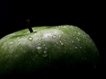
| 06/10/2006 05:51:53 PM |
Appealing by KarenNfldComment: Hey congrats Karen! The light falloff on the apple was perfect. |
| Photographer found comment helpful. |
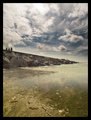
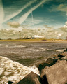
| 06/09/2006 02:41:26 AM |
dpz1.jpgby k4rpComment: Pretty awesome. I love these recent landscape shots. |
| Photographer found comment helpful. |
| 06/09/2006 02:39:37 AM |
|
| Photographer found comment helpful. |
| 06/08/2006 11:17:05 PM |
Slippy Top Knotby SJCarterComment: Originally posted by Art Roflmao:
LOL! Slippy never looked better. |
No kidding. Those estrogen injections must be paying off! :P |
| Photographer found comment helpful. |
| 06/08/2006 11:13:41 PM |
|
| Photographer found comment helpful. |
Home -
Challenges -
Community -
League -
Photos -
Cameras -
Lenses -
Learn -
Help -
Terms of Use -
Privacy -
Top ^
DPChallenge, and website content and design, Copyright © 2001-2026 Challenging Technologies, LLC.
All digital photo copyrights belong to the photographers and may not be used without permission.
Current Server Time: 06/22/2026 07:26:30 AM EDT.