| Image |
Comment |
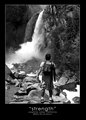
| 06/20/2006 06:11:15 PM |
strengthby RikkiComment: Nice. The only thing I would have liked better is if you took a more adventurous angle in the shot. Ok a lame pun but what I mean is an extreme angle coupled with the extreme environment would have gone rather nicely, IMO. Say shot at a much lower angle looking up rather than straight on? And also maybe slide the tripod a bit more to the left so you could get more of your side profile in the shot making it more obvious you are looking up? |
 Photographer found comment helpful. Photographer found comment helpful. |
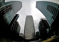
| 06/20/2006 06:07:56 PM |
|
| Photographer found comment helpful. |
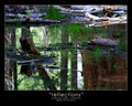
| 06/20/2006 06:07:12 PM |
reflectionsby RikkiComment: I think this is just too busy for the theme you were after. There's a lot of crisscross action going on here between the water reflection and the stuff above the water. I tried to do something similar called "reflect" in my portfolio. It's nothing special but I thought it had a good flow to it if anything and I think that's what your image needs here. Message edited by author 2006-06-20 18:07:31. |
| Photographer found comment helpful. |
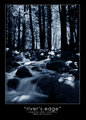
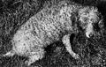
| 06/20/2006 05:58:09 PM |
river's edgeby RikkiComment: I like the blue tones but I'd think about brighting this up just a tad. I'd love to see some detail from those rocks even if it's just a hint. |
| Photographer found comment helpful. |
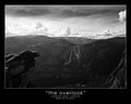
| 06/20/2006 05:41:11 PM |
the overlookby RikkiComment: This has a nice classic feel to it. If I saw this hanging somewhere I'd probably think it was shot with film. I can't really explain it since it looks like you did use neatimage on it. |
| Photographer found comment helpful. |
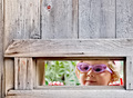
| 06/20/2006 05:39:01 PM |
mirror lakeby RikkiComment: Awesome! The image quality looks pretty good even at this size so I imagine this would look great as a large print.
If I have to find something to critize it would be the writing. Personally, I don't like the lower case for "mirror lake" nor the quotes and the font could be heavier. Also the font size seems a bit larger than you'd normally see in this type of framing. Ok, I hate the text treatment. :P But the photo rocks! :) Message edited by author 2006-06-20 18:08:35. |
| Photographer found comment helpful. |
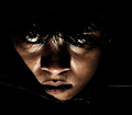
| 06/19/2006 05:25:10 PM |
Desvasidizedby blackenedwhiteComment: Greetings from CTP2
Dark images is what this challenge is all about and this came out pretty good. I'm actually surprised this did decent at DPC. I really don't have any suggestions other than to keep working on that look. I tend to favor more detail so for me I would have liked to see a bit more of that in your eyes. Not so much those fancy retinas everyone has in their photos but give me more bursting capillaries! :P Message edited by author 2006-06-19 17:26:07. |
| Photographer found comment helpful. |
| 06/19/2006 04:57:49 PM |
|
| Photographer found comment helpful. |
| 06/19/2006 04:53:29 PM |
|
| Photographer found comment helpful. |
| 06/19/2006 04:46:11 PM |
|
| Photographer found comment helpful. |
Home -
Challenges -
Community -
League -
Photos -
Cameras -
Lenses -
Learn -
Help -
Terms of Use -
Privacy -
Top ^
DPChallenge, and website content and design, Copyright © 2001-2026 Challenging Technologies, LLC.
All digital photo copyrights belong to the photographers and may not be used without permission.
Current Server Time: 06/22/2026 01:26:43 PM EDT.